Students from Aalto University design a new summer pavilion in Helsinki
11/06/2015
Photo: Kimmo Räisänen
In 2012, students from Aalto University designed an admirable project – a wooden summer pavilion – as part of the World Design Capital Helsinki (WDC Helsinki 2012) programme. The light-weight construction, located in the square between the Museum of Finnish Architecture and the Design Museum, was open all summer long and served as the main meeting place for the World Design Capital event.
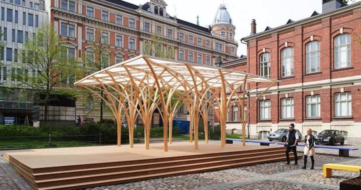
The World Design Capital pavilion now has a successor from Aalto University’s Wood Program. This year, Wood Program students built a pavilion named Säie on the empty lot between the museums to serve the public over the summer. The Säie Pavilion is a small, experimental city space open to everybody.
Arhitect Philip Tidwell, who participated in the design of the pavilion, revealed some of the new project’s secrets to .

A press release stated that Säie Pavilion is a garden pavilion that leads the thoughts of visitors to a dense forest and Gothic architecture. Could you describe in more detail how the concept of the garden and Gothic architecture was realised?
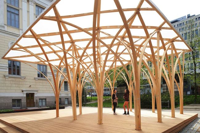
The pavilion was designed by students in the Wood Program at Aalto University as part of the summer exhibition at the Museum of Finnish Architecture. The exhibition is on the history of garden design, so the structure was meant to relate to this theme. But, of course, the interior also appears to some as forest-like due in part to the fact that the structure is wood (Finnish pine) and due to the many joints and overlapping elements. Additionally, the shapes formed by the bent elements form pointed arches, which evoke a somewhat Gothic character as well.

Does the Säie Pavilion design contain any references to traditional Finnish architecture forms?
References to traditional Finnish architectural forms are somewhat open to interpretation, but I would say the strongest references are to garden pavilions, follies and gazebos. These structures were usually just a simple roof supported by columns and were often elaborately decorated with wood carvings and ornaments. The Säie Pavilion has no explicit ornamentation, but the many thin structural elements bend and twist around one another to form a woven enclosure and together create a feeling of intricacy.

What are the architectural components that every contemporary architecture lover should pay attention to (materials, shapes, rhythm solutions, etc.)?
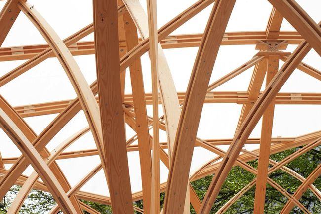
As far as what people should pay attention to architecturally, I would say that it is the material, form and system of joining work together in the pavilion to form its architectural character. The design was based on the initial concept of one student, but it was then developed by the ten students of the Wood Program together. To develop the design, they needed to study how wood could be bent into these forms, and the final solution is the result of many models and tests at 1:10, 1:5 and 1:1 scales. This allowed the students to determine the proper thickness of the elements, the form that they could achieve when bent and the structural capacity that they have after bending. The building structure is actually quite complex, because some elements act like springs and push upward, while others push downward to resist this force.

Which elements draw attention in terms of innovation and technology solutions?
This is probably the most interesting aspect about the pavilion from a technical point of view. It is not constructed using glued elements, which are typically used to achieve such bent forms in timber. Instead, the students wanted to test the possibilities of “active” bending, which means that each element is bent into its final position during construction and then held in place by another element. To do this we had to use high-quality Finnish pine with very few knots and combine this pine with high-strength birch plywood to manage the force concentrations that occur at the joints. The joints were thus cut from plywood using a CNC router at the Aalto workshops and fixed to the long pine elements. Then, on site, each of the columns was put in place individually and the elements were connected together. Finally the roof was assembled on site from pre-cut elements and lifted onto the column structure. Actually, the word säie refers to “strand” or “fibre” in Finnish, which is what is being evoked in the bending and twisting of the wood elements.

Is there any possible architectural provocation in this design? Does it have any secret?
I would say that one provocation in the design might be to question the relationship between structure and ornamentation. The many bending and twisting elements of the structure appear decorative, but they are also essential to the overall strength and stability of the structure. Using very thin and lightweight elements allows for a structure that is surprisingly lightweight but still very stiff. Above all, it creates a space that is open to many functions (yoga, lectures, concerts, etc.) but is also surprisingly evocative and enjoyable to simply sit under and have lunch.
The programme for Säie Pavilion this summer is being organised by the Museum of Finnish Architecture and can be found at www.mfa.fi/eventsatmuseum.