All-design or nothing
A look back at Dutch Design Week 2017
Daniela Treija
03/11/2017
Photo credits : Core Studio, Lucas Texiera, Kostas Lambridis, Design Academy, Iris Rijskamp, Femke Rijerman
Every year during the last week of October, a city that for the rest of the year pretty much lays low and doesn’t call undue attention to itself, once again impresses us with a big sway in the international design world.
While standing outside of the newly opened Eindhoven branch of the Dutch super-brand eyeglass salon Ace&Tate (I’ll allow myself to note here that its interior has been wonderfully designed by OS ∆ OOS – see for yourself via here), in which the interior designers were, at the moment, giving a talk, I struck up a conversation with a young student who had just begun her master’s studies at Design Academy Eindhoven. The small-talk went as small-talk usually does, and after the first few insignificant subjects had been chit-chatted away, we came to the logical topic of Eindhoven itself, and the young student’s observation that “yeah, Dutch people generally think that all of the nation’s weirdos congregate in Eindhoven.” With much laughing, we came to the conclusion that, in the case of these supposed “weirdos”, the rest of the nation is definitely not referring to Eindhoveners like the electric-wheel-chair-bound sermonizer who regularly buzzes around the city yelling to anyone who will listen that they should turn their lives over to God (since he himself has shared a Coca-Cola with Jesus), but rather the students and designers who make up a good portion of the city’s inhabitants.
Much discussed and much celebrated in honor of its paradoxical “basicness”, Eindhoven is once again proudly shining and smiling as it invites all interested parties to visit more than 600 exhibitions at 110 locations, featuring no less than 2600 individual designers. If these numbers seem excessive on paper, once you’re actually in Eindhoven, the sheer amount of events and shows going on at the same time is even more unfathomable. Everywhere you turn, design affairs and creative jolliness surrounds you – exhibitions, concerts, various happenings, talks, important people walking around, the press, business cards being exchanged at speedball rates, and, specially for Design Week, Wolkswagen taxis with iconic design objects mounted on their roofs will take you – free of charge – from one show to the next. From October 21 to 29 Eindhoven was a treasure trove of design – once a year it becomes a city that allows your inner, skeptical design meridians to cross...a place where you’ll discover both the beginning and the foot of the design rainbow...you’ll existentially ponder your own identity as a designer...you’ll gape in wonder at one thing, and five minutes later you’ll be scolding yourself for having wasted a couple of minutes reading about the concept behind a piece based on the end-times of a dystopian civilization... And to top it all off, you will have been wined and dined before having danced the night away.
Today’s special: a compact selection of my personal favorites from DDW, collected during a twelve-hour, intellectually intensive, non-stop, all-design-or-nothing marathon in which I visited as many exhibitions as physically possible, accompanied by some Instagram-filtered visual cues.
HARDCORE BY CORE STUDIO
Core Studio began its creative existence when several 2015 graduates of the Design Academy decided to join forces. Core Studio describes itself as a trend-forecast studio that analyzes trends and provides its clients with multi-faceted creative strategies and tailored design solutions. It was the need to fill the noticeable “gap” that existed between trend experts and the designers themselves that brought about the impetus for the members of Core Studio to provide this kind of service. Last year these emerging designers debuted with their exhibition POPCORE, which they followed up this year with the exhibition HARDCORE.

Lucas Munoz. Tubular. Tubular continues a series in which the designer experiments with bringing especially industrial elements out into the open. In Munoz’s works, materials and joining elements, usually used in engineering and meant for use only in structures hidden behind walls, take on a narrative and become employable in functional design.
The HARDCORE movement resonates around the idea of aesthetics and materials that invoke a feeling of trust and durability. HARDCORE is in diametrical opposition to the currently popular digital movement.
Core Studio extols material durability and its visual brutality, and invites the consumer to remember such trustworthy quality materials as stone and steel, which have always stood the test of time; it is necessary to have such objects in our field of view and environment, especially at a time when tactile values interact with the digital era.
Bonus points to Core Studio for choosing a fittingly contextual venue for their show – instead of a shiny, white, slightly industrial exhibition space, they went for an underground car park. Some of the people parking their cars were visibly perplexed to see people – dressed in puffer jackets and caps – milling about the garage and viewing an array of aggressive-looking objects.
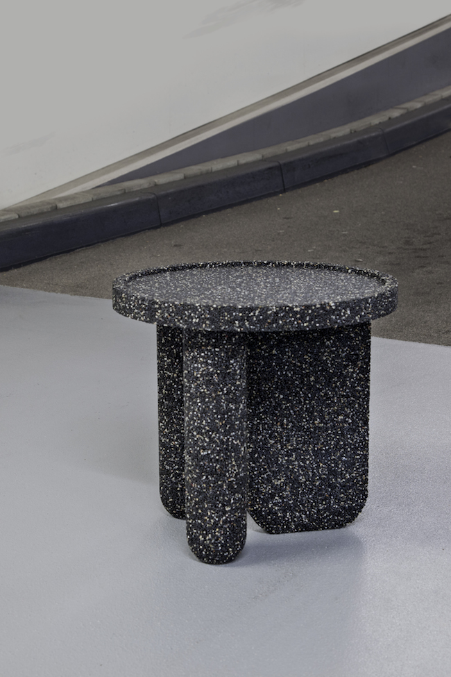
Tijs Gilde. Gravel Table. Inspired by the flooring industry, Gilde experimented with mixtures of various components. Gravel Table was created by mixing stone with pigments and binding agents, resulting in an object that, despite its material constituents, is suitable for not only outdoor use but indoors as well.
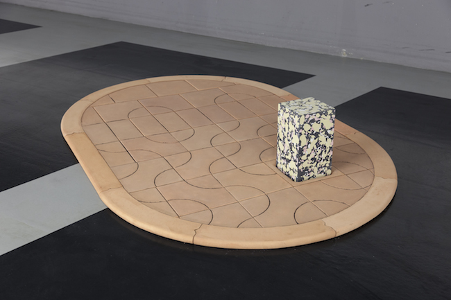
Iwan Pol. Sidewalk. In this project, Pol brings an alternative kind of pavement into the public space. “Life is too short to spend it walking on boring gray sidewalks,” says Pol.
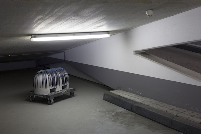
Fabian Briels. Bruno. “Among all of the chairs, easy chairs, benches, swings, wheelchairs, divans and sofas, Bruno is no exception. It is a seat created to be sat on,” explains Briels.
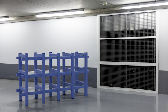
Onno Adriaanse. Foamed. Adriaanse experiments with visually preconceived notions and expectations. By having a basic grid structure, all attention is focused on the illusion that the entire cabinet is made out of one piece of foam. The glass shelves seem to be squeezed by the foam construction, making it even clearer that this is a cabinet without a fixed skin. The project raises thoughts about the contradiction of something that seems optically heavy, while it is made of material that is weightless.
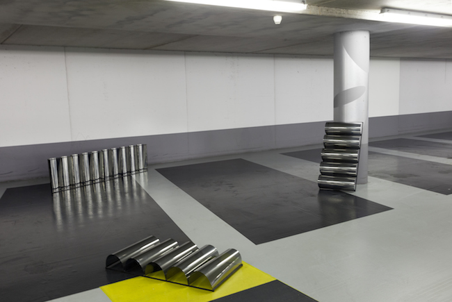
Nick ll have on the space. The light reflection is turning into an image that will be projected onto the walls.
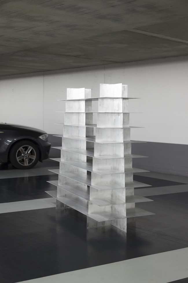
Bram Vanderbeke and Wendy Andreu. Double Pyramid. A double-pyramid-shaped shelving system constructed from laser-cut aluminum sheets assembled and joined in a manner that requires neither screws nor welding. The designers forecast that Double Pyramid could be the first object of a series of furnishings using this special assembling technique. The same technique can be used on various objects and structures and with a myriad of materials.
DUTCH INVERTUALS – FUNDAMENTALS

Dutch Invertuals is a group of 45 carefully selected designers established in 2009, among them such globally renown design figures as RawColor, OS ∆ OOS, Studio Sabine Marcelis, Bart Hess, and Studio Truly Truly, as well as degree candidates and completely fresh students that have just set foot into the design-world reality. Precisely this symbiosis of various generations of designers is, in my opinion, one of the main features of Dutch Invertuals. Twice a year they come together to compose new group shows in Eindhoven (DDW) and Milan (Salone del Mobile). It is notable that both the featured works and the conceptual approach for each exhibition are always newly created, making each group show unique. This year their newest creation is given the name of Fundamentals.
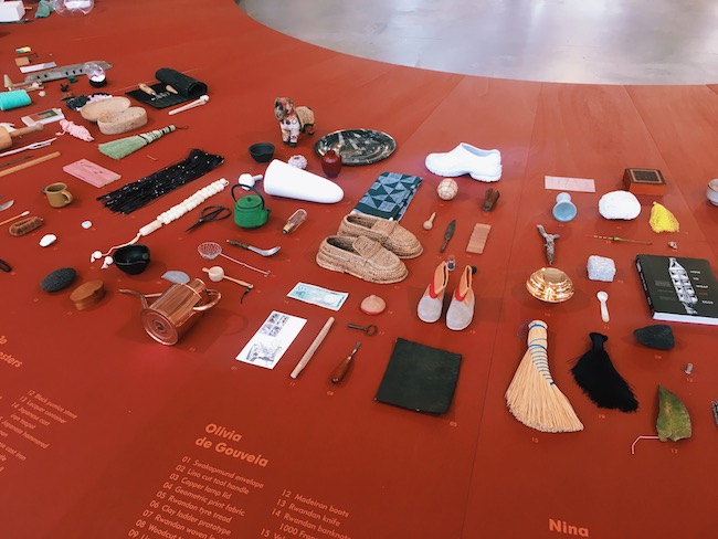
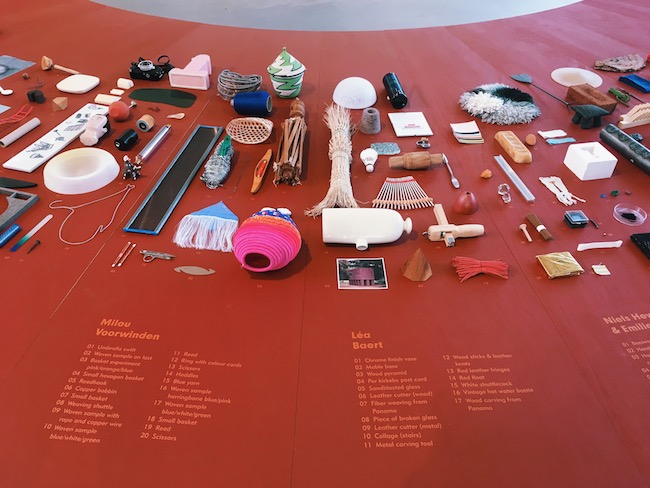
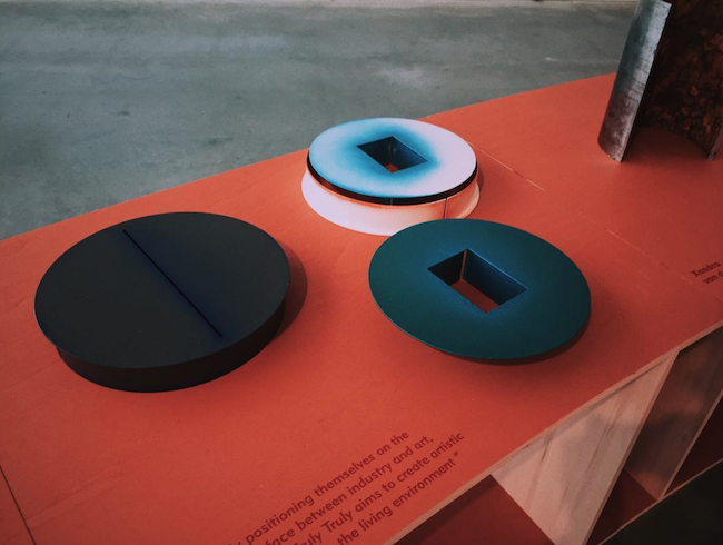
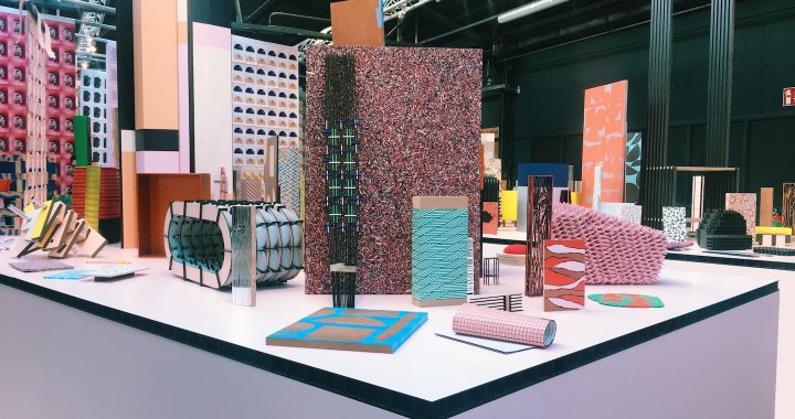
Fundamentals gives the visitor a chance to see the behind-the-scenes of the in-depth design creation process. Dutch Invertuals has invited its designers to select and exhibit objects that have found their way into their archives and workshops in whatever way or capacity, in an effort to reveal their personal collections and personalities. This invitation has resulted in a collection of more than 800 inspirational artifacts representing a variety of levels of function and aesthetics, and, indeed, provides a revealing portrait of the designers that make up Dutch Invertuals. But that’s not all – using these personal collections and identities as a starting point, the designers have created containers that represent their “fundamentals”, thereby allowing the viewer to follow along with each designer’s individual approach, working methods, techniques, and train of thought. Bravo!
ENVISIONS in cooperation with FINSA – wood in proces
Like Dutch Invertuals, Envisions is a collective of designers, but much younger – it announced its entrance on the Dutch design scene in 2016 with a remarkable creative splash. At Salone del Mobile 2016, Envisions took over the front pages of both the design press and the minds of design bloggers by exhibiting everything except the end result.

Envisionsheralds the design creation process as the defining factor of the end result. The experiments and solutions created during the process – but which didn’t win in the struggle to arise as a finished object or as part of one – are often times just as vitally important; they, too, are an inalienable part of the design, and without which the end result would not be, well, the end result. Unfortunately, these process elements are usually left in the dust of the workshops. Envisions’ trademark is to exhibit these experiments, duds, models, mistakes, and first ideas created during the design and manufacturing processes, thereby encouraging a dialog between the designer, the client, and the manufacturer...in addition to allowing the viewer to get an overlook of everything that is usually deliberately put out of the public’s sight.

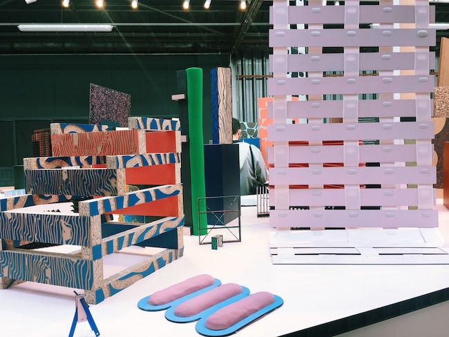
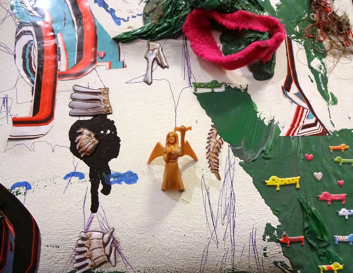
This year Envisions propositioned the Spanish wood manufacturer Finsa, offering (heretofore unseen) experimental cooperation between the designer and the manufacturing industry with the objective of exhibiting not, as one would expect, a showroom-ready finished product, but instead, researching all of the potential possibilities, material characteristics, and alternatives. The results of this joint project are diverse and especially aesthetically pleasing solutions and attempts created with sheet materials such as chipboard, MDF, veneer, melamine, and even paper.
Design Academy Graduation Show MINED
When entering the Design Academy’s Graduation Show, I always get the feeling that if someone were to harness the power of the creative energy coursing through these three floors, it would beat, by a mile, any nuclear explosion or rocket being launched into outer space. And this the case every year, without fail. The works on exhibit here are unique, diverse to the max, and cover numerous themes, once again proving that with good design, any field or cultural/social condition can be affected, changed, and improved. From concepts dealing with artificial intelligence interpreters that would make the idea of AI itself more humanistic, to the modernization of dry toilets and adapting them to the Western way of life. From aesthetically elegant sex toys made of ceramic, to a digitally scanned exhibition of Emīls Melderis’ sculptures that have been transferred to virtual reality, each one embellished with its historical context. Everything is possible! And definitely a shout out to all the Latvian design gals and guys, that participated in the graduation show - this year’s graduate works of Latvian students at the Design Academy were especially fascinating and content-rich. #proud

Ottonie Von Roeder. POST-LABOURATORY (Department: Social Design / MA)
‘Post-Labouratory’ by Ottonie von Roeder explores a speculative future scenario in which our jobs and professions are taken over by robots. The project is an answer to the rapid automation of the workplace and the resulting cultural crisis. In Von Roeder’s version, people have the opportunity to withdraw from labour as a financial need. By creating robots that fulfill their duties, therefore to support people in finding work that can fulfil their true desires.
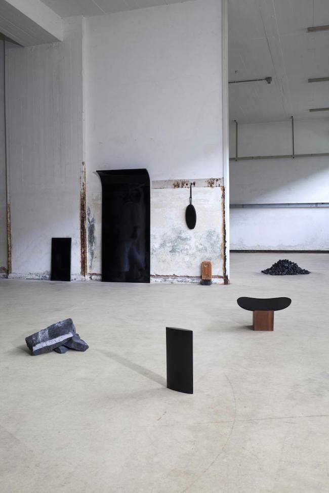
Florence Louisy. INERTIA (Department: Man and Well-being / BA)
The world’s blackest marble can be found in the marble quarries of the Belgian town of Mazy. This peculiar marble has an especially high carbon content, which gives it the property of having a very high thermal inertia, i.e., once it has taken on heat, it will give this heat off very slowly. Inspired by the stone’s natural characteristics, Louisy has created a series of interior objects – A bed warmer, dish warmer, stool and polished wall tablet – which, when heated up, will spread the warmth throughout the home in a much more aesthetic and appealing way than today’s heating systems.

Jānis Melderis. EMĪLS MELDERIS – THE VIRTUAL EXHIBITION (Department: Man And Communication / BA)
With his graduate project, Melderis gives the viewer insight into the stories and true contexts behind the sculptures created by his grandfather, Emīls Melderis. By using 3D scanning technology, Jānis has translated his grandfather’s works from their physical location – at his country house or in the archives of the National Art Museum – to a digital environment in which each sculpture is enveloped with visuals and sounds that explain the historical context and situation in which each work was created, thereby allowing the viewer to better understand each piece’s essence and reason for being made. A video trailer for the virtual exhibition can be seen here: vimeo.com
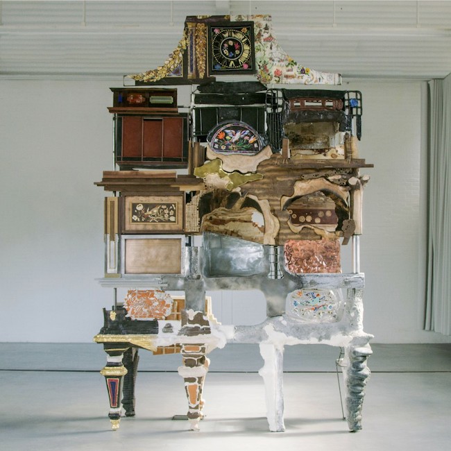
Kostas Lambridis. ELEMENTAL CABINET (Department: Contextual Design / MA)
With this work, Lambridis wishes to illustrate a dilemma that designers often face – how to make the correct choice among the almost infinite number of techniques, materials and other elements one must decide among when creating something. Citing the world-famous 18th-century Badminton Cabinet (worth 20 million euros), Lambridis has created his version of it by producing a piece of furniture that consists of as many different materials as possible, thereby emphasizing an especially non-systemic approach to design. The cabinet’s horizontal layers are grouped by being made of either natural or man-made materials. The left side of the piece reflects a desire for order in design and a scrupulous attention to detail, whereas the cabinet’s right side alludes to unfinished materials and rough, undefined forms.
Marie Caye. THE LAST JOB ON EARTH (Department: Food Non Food)
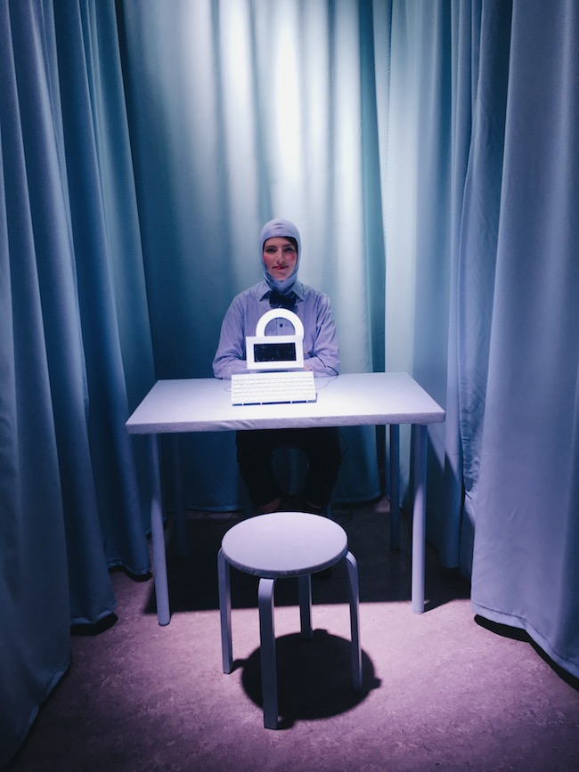
The Last Job on Earth is a performance/installation that, based upon the remarkable development of artificial intelligence, illustrates musings on a potentially new profession of the future – Artificial Intelligence Interpreter. In the installation, the viewer is invited to sit down and face an AI translator. Using a keyboard, the viewer communicates via a computer program, with the computer-generated answers spoken aloud by a person, i.e., a human interface.

Dita Pāne. MARQUETRY PRODUCTION (Department: Man and Well-being / BA)
Wood marquetry is a forgotten, especially labor-intensive wood inlay technique, it’s obsoleteness directly linked to the industrial revolution. After carefully studying the technique, Pāne has come up with a modern version of this craft through the use of CNC laser cutting. Unlike the traditional approach to this technique, in which expensive materials and lacquers were used, Pāne has created a series of furniture and wall- and floor-panels using unfinished birch plywood. Thanks to the clean materiality and the simplicity of ornamentation, the ascetic furnishings make for a specially tasteful update of wood marquetry – circa 2017.

Keisuke Fujita. VOLTAIC REALISM (Department: Man and Communication / BA)
Around the globe, an average of 800,000 people commit suicide every year. And every second, numerous people post on Twitter that they wish they were dead. Most of these, of course, are only digital outbursts, without any residual weight or reaction. Fujita’s objective is to materialize these tweets, thereby giving them physical mass.
Fujita discovered that for a tweet to show up in the twittersphere, about 0.0054 g of carbon are used. Taking this fact, Fujita has created a real-time installation in which each registered suicidal tweet causes 0.0054 g of material to be scratched off a human-sized block of solid carbon placed in the middle of the installation.
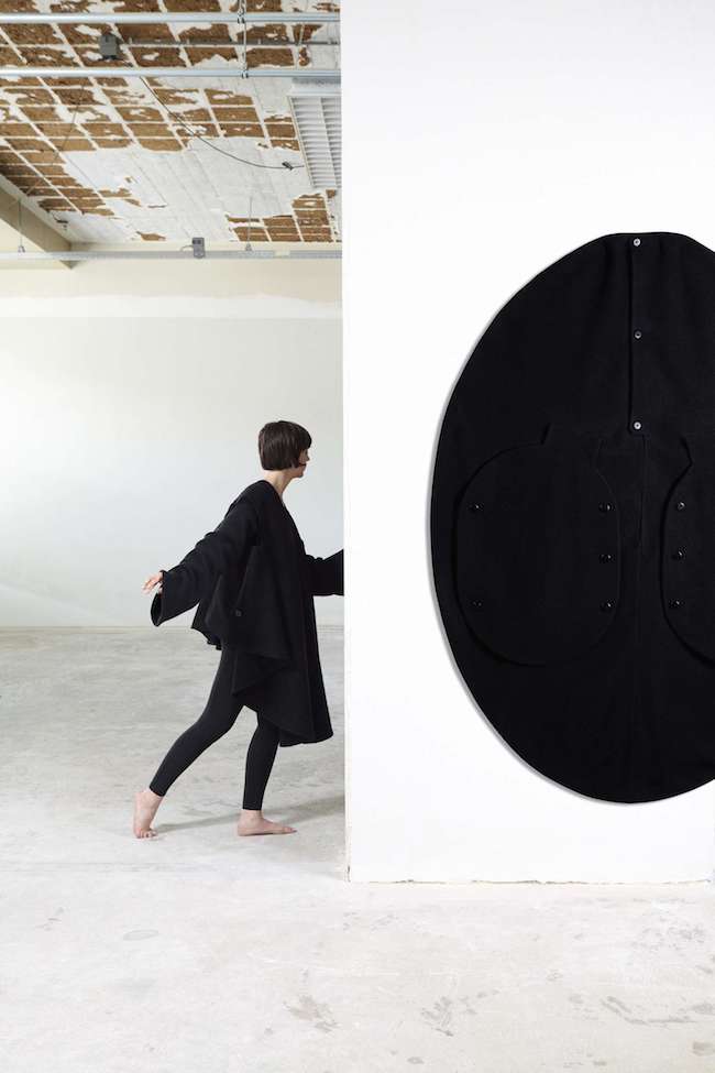
Kristofers Reidzāns. VICE VERSA (Department: Man and Activity / BA)
By combining clothing archetypes with interior objects, Reidzāns has created a series of duo-functional items that can be used both as furnishings and clothes.
A decorative wall rug that improves the acoustics of a space can be transformed into a coat; a curtain becomes a shirt; and a room divider converts into a voluminous vest. A clever invitation to not keep your clothes hidden in your closet.
---
I appear to have provided you with only the tip of the design iceberg, that during these days was Eindhoven. Nevertheless, I think it will serve as a good impression of in what manner and how "the design” spends its life in the Netherlands, in this case how Dutch design is being presented during the Design Week. One thing is clear – the Netherlands do not only equate with divine cheeses or being the epicenter of the global flower market; the country is also a premier example of how good design – and its versatility and variety of forms – can be infused within society’s mindset. These sorts of trips do, of course, make one feel a bit sheepish about one’s own shabby garden and a lack of this kind of design thinking at home.
It is not mandatory of good design that one must be able to set it down on a shelf in a posh boutique, or that it can be worn by a wealthy socialite. Good design is not only able to communicate its designer’s chosen story and conclusions; it is not only able to serve as a good dry toilet in a chic concept-apartment in Western Europe. Good design is also design that provokes, that makes the viewer marvel, or even shake their head in bewilderment. Good design is also the creative process behind design, the mistakes that were made and observed. Good design encourages one to contemplate and pay attention to aspects that seem not worthy of attention. Good design is also good cooperation: the old working with the young; the famous with the unknown; and experienced corporative companies listening to young, foolish and daring designers. Step by step, good design makes our daily lives not only more “luxurious”, but also more sustainable, healthy, socialized (or the opposite – introverted), practical, and beautiful. In any case, after experiencing Dutch Design Week, one really does feel as if design can save the world! #yolo
 Material produced with the support of the State Culture Capital Foundation of Latvia
