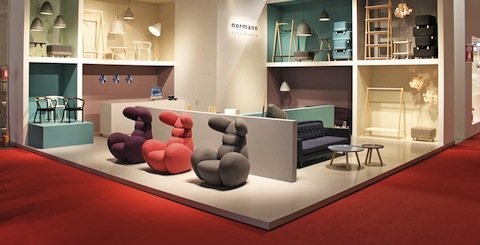
Scandinavians in Milan
06/05/2012
Photo: Kristīne Budže and publicity materials
Scandinavian designers and furniture makers participated in Milan's Design Week and the international furniture show i Saloni, which took place April 17 – 22.
It could very well seem old fashioned to judge design based on its geographical origins and national boundaries. However, putting this inclination and other, more contemporary research discourses aside, the phenomenon of Scandinavian design is still alive. And not just from a historical perspective, but as an actuality of the 21st century.
The Nordic Phenomenon
Scandinavian modern design has always kept itself honorably apart from everything else going on in the world, concentrating more on domestic problems rather than trying to corral-in or whiz by the field's global activities. This is how the aggregate of characteristics and features that we call “the typical Northern European understanding of space, form and function”, came about. It was also just recently when the Scandinavians, en masse, didn't give in to the universal European zeal for gallery design; which now looks to have come to a dead-end, at which the greater part of foreigners studying in Dutch schools are, albeit stylishly, shuffling around in a state of confusion. Nordic design traditions from the first half of the 20th century, especially the post-WWII period, seem truly timely and appropriate for the global economic situation of the 21st century. The Scandinavians are neither trying to build the bicycle from scratch, nor being carried away by the latest hot trends – such as the dominant accent on process, rather than product, which was evident in Milan this year. Instead, they continue with what has been proven to work well – utilizing new, millennial technologies and supplying the aesthetic demand. Exhibition visitors and buyers of design are visibly yearning for typical Nordic design insight – much like guests at a lavish party who have overindulged on cakes and conceptual constructs, and now ache to sooth their morning hangovers with a sip of refreshingly clean spring water.
In the last few years, the Scandinavians have undoubtedly been the center of attention in the exhibitions of Milan Design Week, both those held in the city center and at the stands of the i Saloni furniture show at the Rho Exhibition Center. One of the reasons for the qualitative and quantitative dominance of Scandinavia at Milan is the fact that the global financial and economic downturn didn't affect the Nordic countries as harshly as elsewhere; at least when compared to the rest of Europe. The crisis has not conspicuously put the breaks on Scandinavian production capabilities, allowing them to present new collections year after year. The accent on design's social aspects, laconic expression and clearness of message, which is organically intrinsic in the Scandinavian outlook on things and their shapes, is something that businesses and designers elsewhere in the world are trying to emulate. However, in the hands of outsiders, this attempt at Nordic-like design mostly brings to mind a borrowed piece of clothing that neither fits you comfortably, nor convincingly shows its true worth to onlookers. This just goes to prove that the overnight miracle of transforming oneself from a provider of enthusiastic consumer wants to a true practitioner of social responsibility is a magical fairy tale that's a bit too unbelievable.
Although from the sidelines we may look at Scandinavia as a unified region with, if not identical, then very similar values and demands in design work, it is nevertheless clear that it is not a uniform field, and that it contains quite a few inner conflicts. Already from the start, the beginnings of modern design were different for every Nordic country, mainly due to individual economic and political conditions. And this continues to be true up to the current day, where each country's national design, and its associated industry, are being developed individually instead of looking for similarities among neighbors. The Scandinavians have never presented a united regional platform in Milan either, but rather, more or less formally, have created separate circles of representatives based around just one country.
The Norwegians
The Norwegians seem to be tired of proving to themselves, their neighbors, and the rest of the world that the design coming from this currently richest Nordic country is just as high quality as that of their neighbors. Their attempts at creating Norwegian design exhibitions that are huge in both form and publicity – like those still recently seen at London's 100% Design – have ceased; they have now left their designers to fend for themselves in the global market.
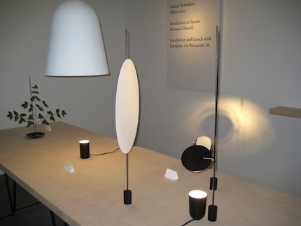
Daniel Rybakken's works on view at the “Rossana Orlandi” gallery
The hottest Norwegian-born designer of the moment is Daniel Rybakken. A couple of years ago, he surprised the international design-judging public with his lighting mysteries – installations that could just barely be identifiable as lamps; he is still continuing on the same path, edging ever more closer to becoming a serious player in design. Last year, his works could be seen in the special Salone Satellite section, which was devoted to the success stories of young designers. This year, Rybakken's light bodies could be seen at the Rossana Orlandi gallery.
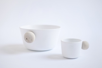
The “Bo” dishware collection. Sarah Gresberg, designer
A noteworthy presence among Norway's new designers this year was the three-person design team known as Fog. Fog Studio is a cooperative project by three young Nordic women – Anneli Hoel Fjærli, Caroline Olsson and Sara Gresberg. Their functionally and conceptually uncomplicated product line of daily objects, including tea cups and lamps, is aesthetically refined.

Glass mortar and pestle – “Marble”. Sarah Gresberg, designer
The Finns
Once again, the Finns at Milan played their card of Helsinki being the 2012 World Design Capital. Among the many exhibits at the triennial's design museum, the Finns were also scheduled to make an appearance – the architectural trio of Samuli Naamanka, Sami Rintala and Dagur Eggertsson were supposed to construct a special pavilion for a traveling exhibition, in which issues of sustainable architecture and design were to be discussed. The pavilion is part of the Take Nord Shape project. I must admit that I couldn't find the pavilion itself, just promotional ads about it...

The chair “Kiki”. Ilmari Tapiovaara, designer. “Artek”, producer. Photo: Tuomass Uusheimo
The Finns were also convincingly represented by the flagship of classic modern design, the company Artek. After wandering around in search of an alternative exhibition space, and even a stint at the Rossana Orlandi gallery, this year Artek had returned to the Ro exhibition complex; and that is precisely where they continue to do their best business. Artek are skillful restorers and promoters of historical Finnish design for the modern day. Again and again, they resurrect from the forgotten past designs that were created decades ago – and enhance them with current products created by the best local designers and specially invited international designers. This year, Artek sang a song of praise to the Finnish designer Ilmari Tapiovaara and his chair Kiki – which was highly awarded in Milan in 1960, but is still one of the most popular chair designs in Finland, a staple of conference halls and auditoriums. Artek celebrated the 21st century with Harri Koskinen's chair – Lento. The designer began producing the Lento series in 2006, and this spring, he presented the newest additions to his collection in Milan. When speaking about Artek, it's always worth mentioning the design of the company's exposition. Mike Meire was behind it this year, creating, in the small space allotted, a bi-level Scandinavian showroom in which each object played its part in a unified theater production.
The chair “Lento”. Harri Koskinen, designer
The Swedes
It's not as if Ikea, the Swedish mass-producer of affordable furniture, is a stranger at Milan, but the location of its exhibition was quite a surprise this year – Ikea was put in among the Dutch and various other conceptual designers in the Ventura Lambrate district. A couple of years ago, Ikea's spot in the Zona Tortona district (which has always been ruled by chaos – illustrated by the exhibition of the latest collection from a “premium-class” company being set up just a few paces away from the sloppy renditions of self-expression cobbled together by a design student) was never questioned. But this year, the placement of Ikea next to exhibitions by small galleries, schools and design studios was akin to putting a bull in a china shop. The objective of the Swedish giant's Ikea PS collection – to not only acquaint their customers with an anonymous low-cost furniture line, but to remind them that each piece of furniture has been created by a designer – is admirable. There weren't any big names among the designers of the Ikea PS collection this year, nor were there any breathtaking pieces; but as a whole, the furniture-laden exhibition – almost as big as a regular Ikea mega-store – showed that, even for the mass market, the Swedes don't lower their standards of design quality.
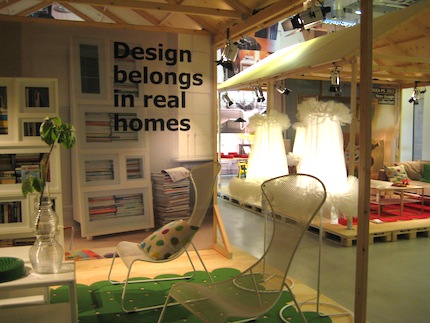
The “Ikea” exhibition in the “Ventura Lambrate” district
Among this year's Swedish design-furniture companies, Blå Station's concept – a very personal approach and stories done by the firm's designer Johan Lindau – stood out among the rest; it was also the reason why the new pieces presented in Milan by Blå Station were chosen to be slated for production. The take-home message: at first, almost every idea is met with a skeptical and disbelieving attitude by the company; conviction in the attainment of a successful product grows only in step with the evolution of design.
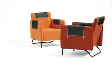
The chair “Taylor”. Mia Gammelgaard, designer. Produced by “Blå Station”. Johan Lindau, head designer at “Blå Station”, rejected the idea of the chair in its first incarnation. After the designer implemented a few, minute changes – which altered the basic design concept of the chair – “Taylor” was gladly accepted by “Blå Station”.
If I had to choose the most Scandinavian object on view in Milan, I'd give first place to the work of the design duo Studio Vit – lamps with bases of white marble and no shades, just light bulbs in various sizes and shapes. Minimalism in its purest form. The name of the lamps is just as laconic as their design – “Marble Lamps”. Ironically, the two Swedish designers that constitute Studio Vit, Helena Jonasson and Veronica Dagnert, received their master's degrees from St. Martins and have chosen to create their very Nordic designs in London.
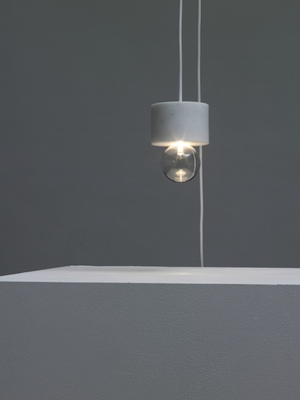
“Marble Lamps”. Designed by “Studio Vit”. Photo: Annabel Elston © studio vit 2012
The Danes
The most thought-out and purposeful national presentation in Milan was done by the Danes. Their exposition in Italy highlighted various different aspects of Danish design. Participants included design studios and companies, Danish design schools, and professional associations; and it was all brought together in the contemplative publication “Danish Design 2012” – a compendium specially created for Milan.

The paper lamps “Papercuts”. Louise Campbell, designer
For the fifth year already, one of the obligatory stops for professional visitors of Milan Design Week is the exhibition created by Danish Crafts, the national handcraft association of Denmark. Their exhibition is called Mindcraft, and it deftly breaks down the borders between handcrafts, design, art and production. The exhibition was located in Ventura Lambrate this time, and was one of the most convincing expositions in the district, placing the Danes right up next to the best examples of Dutch conceptual reasoning. This year's Mindcraft curator was Cecilie Manz, one of Denmark's most highly acclaimed designers. Among the biggest names on the list were the fashion designer Henrik Vibskov, known in Riga as the costume designer for the opera “War Sum Up”, and Louise Campbell, one of the most talented and internationally renown designers from Denmark.
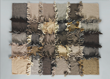
“Hallingdal” fabric used in the rug “Fringe”. Designed by “Front”
Among the numerous Danish manufacturers represented in Milan, the most interesting exhibition was by the textile company Kvadrat; it was dedicated to the wool and viscose upholstery fabric Hallingdal 65, created by the designer Nanna Ditzel in 1965. Hallingdal was Kvadrat's first product, and has now achieved archetypal status in the design field of wool fabric. For over 45 years, since it was first produced, Hallingdal has been used in the interiors of both private homes and public buildings, including hospitals and airports. For the exhibition in Milan, the company invited seven curators from different areas of the globe to choose designers that would create new works using the legendary fabric. The best selection came from designers chosen by Tord Boontje, who represented the UK; these included the once-scandalous Swedish duo Fredrikson Stallarda and the London-based, Tel Aviv-born design duo Raw Edges.
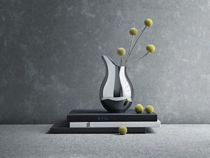
Metal vase from the dishware “Mama”. Ilse Crawford, designer. “Georg Jensen”, producer
In Milan, the Danes really had the field covered. They even had stylish spots in the Como Corso 10 art gallery, where top billing was given to dishware by the Georg Jensen label (their first lines were created only in silver, but now they use various different metals). Georg Jensen has been called the only true luxury label to come out of Scandinavia, and in Milan, they honorably defended this title. Designer Ilse Crawford was invited to work for the label, for which she has created a special dishware collection.
