Modernism Is a Mistake
An interview with Dutch designer Marcel Wanders in Amsterdam
22/09/2014
 Material produced with the support of ABLV Charitable Foundation
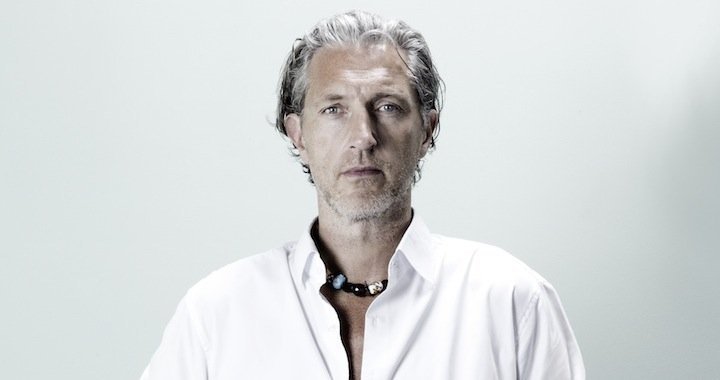
On this first really warm spring day in Amsterdam, people were swarming not only on the park greens, but also in the Stedelijk Museum, which was exhibiting a retrospective of Dutch designer Marcel Wanders (1963); titled “Pinned Up. 25 Years of Design”, the exhibit was open until June 15th. On one of the numerous exhibition walls hangs a huge portrait of Wanders – with smoothly-combed hair and a golden clown nose. It is the same picture that was on the cover of a 2002-issue of the French design magazine Intramuros, illustrating the designer's cynically playful attitude. Alongside this now-classic clown nose image is an almost identical one, except in this one the smoothly-combed hair is going gray; this is Wanders today. And he is no longer so serious. The golden clown nose is the logo for Wanders' design studio. Wanders himself says that the image is not of a clown, but rather of a court jester – because the jester was the only one who was allowed to make fun of the king. All that's left is to guess who this king could be. Possible answers can be found on other walls in the exhibition, some of which feature quotes by Wanders. One, for instance, is about how modernism (and its motto: “Less is more”) is deceptive, and that it is not only functionality that is important in design, but also a passionate love. It will come as a surprise to no one that Wanders is a thorn in the side of many, and he has been well aware of this fact ever since his first forays into the design world. It only follows that the local press has been hotly divided in its opinions on the Stedelijk exhibition – even if only because many consider a museum exhibit featuring commercial design as pure sacrilege.
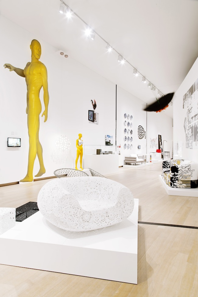
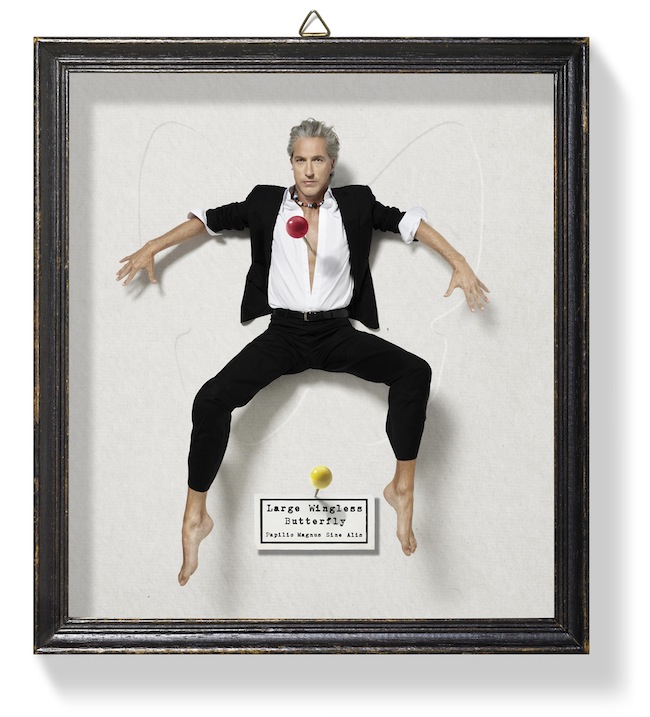
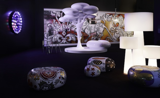
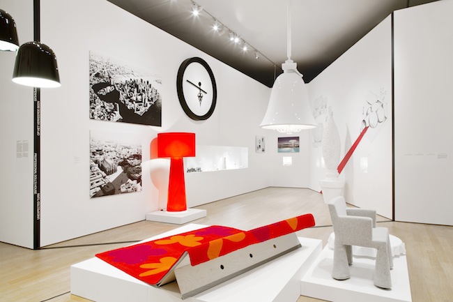
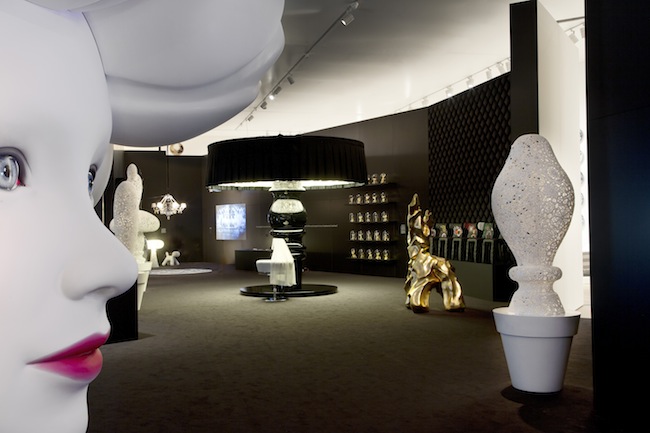
The exhibition at Stedelijk was the first retrospective to be held for the designer on such a scale in the Netherlands, and covers his 25-year-long career from the 1980s to the present day. In the promotional poster for the exhibition, Wanders had himself photographed in a picture frame, pinned down by a huge, red push pin – indicating that by being voluntarily and blatantly pinned to the wall, he has put all of his cards on the table. The exhibit contained more than 400 of Wanders' design-objects – furniture, lamps, jewelery, packaging design and so on, as well as design sketches, sculptural objects and interior design projects. There were three sections to the exhibition: The White Zone analyzed Wanders' work in ten thematic cross-sections (innovations, archetypes, dialogs, etc.); the Black Zone featured his most extreme projects; while the Lounge Zone presented Wanders' oeuvre as the artistic director of various design brands. It is well known that Wanders was at the helm of the founding of the Dutch design company Moooi, and he has also worked with such brands as Alessi, Kartell, Flos, Target, Puma,Baccarat and Mandarina Duck, among others.


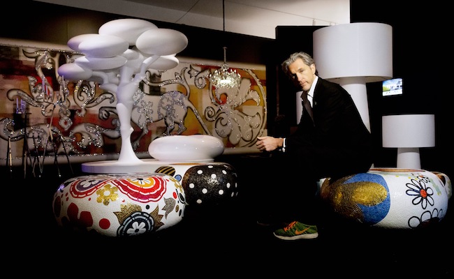
Marcel Wanders in 2002 and 2014
Wanders is largely self-taught (he was “thrown out” of the Eindhoven Design Academy), but he did receive a diploma from the 3D design department at the Arnhem Art Institute (now known as ArtEZ). Despite these apparent setbacks, the young and ambitious designer started winning competitions and receiving commissions quite early on. His “Mobilis” (1987) chair was even featured in the pages of Domus magazine – and getting published in Domusis considered to be quite an accomplishment for even veteran designers. In an interview with a daily newspaper from Rotterdam from the 1980s, the then-twenty-something Wanders was already brazenly asserting that one day he would be a great designer.
International recognition came to Wanders with his “Knotted Chair” (1996), which he had created under the wing of the newly-established Dutch cult-design company Droog Design (and which is still considered to be as stylishly relevant as ever). In the mid-nineties, Wanders discovered, and even spelled out, his approach to design: “...to create an environment of love, live with passion, and make our most exciting dreams come true.” He likens the design profession to being a poet of life and a magus. In 2001, together with his partner Casper Visser, Wanders founded the brand Moooi; the company sells design-products that have been created not only by Wanders, but also by other designers who adhere to his philosophy. Among the non-Wanders items sold through Moooi are a gigantic floor-lamp that consists of a black horse with a small lampshade on its head, by Front; Maarten Baas' burnt-black chairs; and Bertjan Pot's spherical lamps made from hardened, crisscrossed string.
Colorful stories that one just itches to share with others are part of every single piece of work that Wanders makes. Even the components of his own physical image – such as the colorful beaded necklace that is revealed under his unbuttoned white shirt and black suit jacket – have their own story. Wanders calls the necklace his “diary”, since every bead comes with a story; from a Viagra tablet to a kidney stone.
Since the late 1990s, Wanders has taken on alongside product design the field of interior design – which he once conceded as being “a completely different animal” that requires a different kind of thinking and an increased awareness of context. Transforming interior spaces into fairy tale-microcosms is something that Wanders is arguably good at. Be it the seven-meter-high yellow, naked mannequin (2002) in London's Mandarina Duck luggage shop, or one of his latest projects – the hotel Andaz Amsterdam Prinsengracht (2012); Wanders was given free reign in terms of the hotel's design, which resulted in such a peculiar wonderland that the press has nicknamed the establishment “Alice in Amsterdam”. One of Wanders' interior design projects currently under construction is the luxury apartment building Quasar, in Istanbul; slated to open in 2015, Wanders has been entrusted with designing the building's lobby. Wanders' “Midas touch” can also be applied to his success in real estate development. He is co-owner of not only the above-mentioned Andaz Amsterdam Prinsengracht, but also of the one-time school building in the center of Amsterdam that now houses his studio and, since 2008, a Moooi showroom. Wanders renovated the building to his liking, and rents out space to businesses in the creative industry.
I press the doorbell at the main door of the Westerhuis building, and tell the receptionist through the intercom that I've come for my scheduled interview. I am buzzed in and take the elevator to the fourth floor – Marcel Wanders' design studio. Upon exiting the elevator, I find myself in a hallway carpeted by one of Wanders' floor-coverings; the same carpet can be seen through the glass panes that reveal a wide-open studio with tables, computers, and several people who are busily moving about. I am greeted by a dark-skinned woman, and after a few of her questions, I realize that I have been mistaken for an interviewee seeking a position of employment. The snafu is quickly taken care of, and I am soon standing in the elevator again, this time with Marcel Wanders at my side, and heading two floors up. Significantly taller than me, and dressed in his “uniform”, he laughingly jokes that I should let him now, if I ever end up working for him.
The interview takes place in a snow-white boardroom, and contains a table that is just as blindingly white. One wall is lined with windows opening up to a view of the roofs of Amsterdam's Old Town; when illuminated by sunlight, the room is so bright that several times during the interview, my eyes begin to water as if I were standing in a snow-covered field and suffering from snow-blindness. I wryly think to myself that the designer has managed to literally blind me with his brilliance. But during the interview, Wanders reveals himself to be the complete opposite – grounded, open and sincere.
You have a retrospective going on in a museum. How does that make you feel?
A bit strange. Most of my works are design-related, after all, and their context was of the utmost importance. In putting together an exhibition of designed works, you travel around the world selecting pieces that have already been made, plucking them out of their original environment so that they can all be put into one anonymous, white box. We have various different manufacturers and various different concepts. We have very inexpensive products and unbelievably expensive ones; huge objects from interior design projects, and miniatures. The white box – into which all of these pieces have been assembled – has its own manufactured context. In this sense, it is really strange to put together an exhibition like this because now people also look at my works differently – mainly from a visual aspect. But in my works, the visual is usually just a dependent feature.
Twenty-five years in design is definitely reason enough to put together a retrospective. You feel as if you've spread your wings over your whole fantastic body of creative work – at least that's the way you judge it from your own point of view. You've created this universe of ideas and thoughts that has been energized by 25 years of a passion for living. And here it is, all stuffed into the framework of one exhibition. Of course, it's wonderful to be able to show this. But in the process of creating the exhibition, you must die, and the works must freeze. The feathers fall out of your wings and you stop breathing.
I am truly honored by all of the people who have worked on putting together the exhibition. And I am just as honored by everyone who comes to see it – people who spend an hour getting to the museum, and then another hour to view the whole exhibit. Those are two hours of their day – an enormous amount of worth! But at the same time, they will, most likely, be only able to devote twelve seconds to every piece, and that's nothing. It's a joke! If someone came up to me and said: “Hi Marcel. You've created these wonderful objects. But I only have twelve seconds to give to each. Quickly, tell me something about them!”, I'd tell them to sod off! Go to hell! That's not being serious.
Consequently, I'd say that a retrospective is both a wonderful and extremely painful experience.
Regarding the beginnings of your creative career, the media often mention the fact that in the late 80s, you were “thrown out” of the Eindhoven Design Academy (called “Industrial Design in Eindhoven” at the time). In order to understand the reasoning behind the frequent mentioning of this fact, I'd like to ask you again – what sort of impression did this event leave you with, in terms of becoming a designer?
Some of my biographical aftermath really is closely related to his event. One them of is my tenacity, which allowed me to become what I am today. When I was expelled, I was hellishly angry. When I applied to Eindhoven, I wasn't yet sure of what design actually was. But after having studied for nine months, I understood very well what design was, and I knew that this profession was as if tailored for me. And that's when they kicked me out! One should take into account that back then, Eindhoven was the only institution of higher learning in the Netherlands where one could get a degree in industrial design. That's why I was angry and disappointed. But at the same time, I was absolutely sure that I would become a designer – and a great one, at that. I came to that decision on my own. Since there weren't any other industrial design schools at the time, I understood that I had to educate myself, starting with acquiring a comprehension of what is necessary for one to become a designer – what sort of knowledge, what kind of skills. In this sense, the event was fortuitous because I took care of my own education. Consequently, I studied things that no one else was studying at the time. I researched things that others didn't. It must be mentioned that when I was at Eindhoven, the school was still under the direct influence of Bauhaus. The faculty had no doubt that modernism was the only possible direction in which designers should develop and work. In addition, I fell in love with design in a completely primitive way – to me it was exciting and interesting, and I loved creative experimentation and always looking for something new. It seemed pointless to me to attempt repeating an already existing tradition. The road of experimentation seemed much more logical to me. I was ready to make all of the possible mistakes out there, and not just immediately think of having an excellent end-product.
I believe that is exactly what school is for – to allow for mistakes and to learn from them. Great products must be created after schooling, not during it. It should even be forbidden to create something good while you're still learning. You have to learn well, not manufacture well.
When I was studying, another strong voice alongside Bauhaus was that of the postmodernist Memphis Group. As students, we were warned about this “horrible example” of how badly design can go. If we had even just tried to copy Memphis in our works, we would most likely be punished with a bad grade; however, no one even tried to explain to us the philosophy of this group. Nevertheless, the Memphis Group left a shocking impression upon a good number of students; these young people suddenly understood that there is not just one unchanging order in the world – something completely different is also possible!
Have you ever had the urge to open your own design school, or at least develop an educational program according to your understanding of how design should be taught?
At the beginning of my career, I was linked to educational institutions. But I had to go through the experience of watching how students who had been under my tutelage were later thrown out of school, or failed their exams. Obviously, my approach did not fit into the overall educational system. Deep in my heart, I believe that schools are horrible institutions that have no interest whatsoever in their students. There are a whole slew of wonderful people who work in this field, and who passionately believe in their ideas, but I still think that students are not being taught correctly. The system, at least in the Netherlands, is such that everybody passes their first year – no matter how talented or untalented one may be – because it's financially advantageous for the school to hold on to everyone at the beginning. But by the fourth year, shortly before graduation, a whole bunch of students “fly the coop” because now they must show their results, and these results haven't turned out well for everyone. I've seen this happen several times, and in my opinion, it is horrible – in the first few years, the school gives the student the confidence that he is capable of something, but then, in his final year, this young person comes into contact with outright criticism.
In my opinion, the instructors should be very direct and demanding in the very first year, and after this year, the strong must be winnowed out from those who don't really belong there. The school should then sign a contract with the students who show potential; the contract would ensure that the student will not be expelled, and that the instructors will do their job dutifully and honestly. Herein starts a three-year collaboration – without any grades, without any points. The instructors' only responsibility is to teach and explain everything that they passionately love about their field. There is no room for critique because any sort of critique during the learning process is redundant; it is based on deep-rooted prejudices of the past and makes the student do what you already did yesterday. It is impossible to critique new experiments. The only thing that the instructor must do is inject a belief in the positive – in terms of design and in the world as a whole. When the teaching is done, the instructor should be graded. It is idiotic to think that a student must create something great during the learning process. There's enough time for that after school. The most important thing in these four years is to learn. I created complete crap in school, but I learned an awful lot and I was insanely honest with myself. In short, I am a complete anarchist when it comes to education. And life has proved that I cannot be given students for just one out of their four years in school. I have to teach from start to finish, or else upon leaving me and returning to the established school system, they will, most likely, fail – that is, “fail” according to the entrenched standards. Because how are the schools of today structured? Ask the students to do something specific and then see if they succeed at it. And then they are judged according to some sort of preexisting scale. Where is the innovation? Where is the new?
But at the same time, the objects you create often refer to the familiar; they utilize archetypal forms and are like a protest against the cult of the new. Instead of playing with cultural history, why don't you attempt to create completely new forms?
I want to create things that are connected to our society, to each of us. In addition, it's not even possible to create something completely new. If there was something like that in this room, we would probably not even be able to see it because human senses are not adapted to adequately sense something that has never existed before. I think that it is important that the world around us be both based on cultural history and reflective of changes.
I always say that, firstly, I rob the brains of others – the brains of the potential users of the end-product. You see, that is the material with which I have chosen to start working. That is exactly why people perceive the things that I create as being close to them and special – because they seem familiar to them. If I created something that is unimportant to others or unnecessary, how could I make it special?
It's not as if all of my pieces are created in this way. For instance, the “Airborne Snotty Vases” (2001) seemed even foreign to us, at first. But once you get to know their back-story – that they are vases in the shape of sneezed-out snot – they cannot be said to be completely unrelated to us. (Laughs) I believe that a good starting point is a material that we understand, with which we are familiar, and then the designer must think about how it can be transformed through time and space so that we can develop from it a relationship between the object and the user. And the result of all this? A closer connection between us and the things that surrounds us. It then follows that we are less apt to get rid of them because, in our eyes, these things have worth.
Working on interior design projects usually means cooperating with a client, which is different than working on product design. What is the dynamic of the relationship between the designer, Marcel Wanders, and his client?
Although the greater part of my projects are done without the client's involvement, even in product design one must think about the consumer – who, in my case, is also at the root of the idea. Consequently, all projects are, more or less, linked to a specific context that must be taken into account. For instance, in creating the interior design for a hotel in Miami (The Mondrian South Beach Hotel Miami, 2008), one is given a completely different setting than, for instance, working on a hotel in Amsterdam ( (The Andaz Amsterdam Prinsengracht, 2012). If one didn't take that into account, the results would be really weird. Every thing has its place, and not without reason. If you travel to a hotel in Miami, but you feel as if you're in Moscow, then you most likely have arrived at an amusement park – and not even an authentic one. Just like in Las Vegas, where you're supposed to feel like you're in Venice – which seems idiotic to me. In short, there is always a context that must be taken into account, and that's true whether you're working with a client or not.
In addition, I only work with people with whom I have a mutual respect. I take on my client as an unpaid, short-term employee. He regularly visits my studio and guarantees that the work I do becomes increasingly better. If the client doesn't have anything to add to the process, then I don't want to work with him. Every client knows something that I don't, and that gives the work additional quality. That's why I always listen to them very carefully, and together we can do something that I never would have been able to do by myself.
Do you remember when you first fell in love with ornamentation?
Over time, I have understood that we live in a society that has gotten past the postmodern phase. Exactly where we are I can't say precisely, but in any case, we're no longer living in open denial of modernism; instead, we're building something new that will be named sometime in the future. Meanwhile, instead of taking steps forward – after having just gone through postmodernism – the field of design has raced back towards modernism. Of course, modernism suits design almost as if it had made for it – it is rational, easily explained, the clients are satisfied, and so on. But modernism, in my opinion, is a mistake. It is not rooted in a sustainable philosophy. I am becoming ever more convinced of this, and that's why in my practice, I struggle against modernism in any way I can come up with.
Why is modernism not a sustainable design philosophy?
Modernism looks at the past as if it were irrelevant. But what does that mean? It means that anything that I have done today will, by tomorrow, be no longer be needed by anybody. Modernism was created by a “throw-away” society – because nothing ages as quickly as the new. If we don't create the new with respect towards the past, then tomorrow it will already be old. Instead, we have to create things that are ancient already at the time of their creation. The new must be old.
And ornamentation is one of the ways to fight against modernism?
Ornamentation is one of my experiments. Why ornamentation, specifically? It's hard to say; I simply do every possible thing that my imagination comes up with in order to counter modernism. Minimalism, too, I believe, is an invention of modernism, and I've never been able to comprehend why minimalism is so great that it should become my environment.
Imagine that I make my daughter a birthday present – in the best tradition of minimalism. Before I give it to my daughter, I tell her in a very serious voice: “Listen dear, I've made you something great. It is inside this gray box, it is unbelievably light, and it was so elementary to produce – without any waste of time.” The box has no ribbons, no flowers. This gift box definitely doesn't create a feeling of how great and wonderful the present inside it is. It reflects neither me nor my daughter, and it lacks personality. Meanwhile, my lovely daughter is standing in the corner, sobbing, because she thinks that her father no longer loves her. See – that's modernism's gift to the world. But that's not enough for me! If the modernists think that they can wipe away whole layers of culture that have been carefully accrued up to that point, then they are not worthy of their profession.
(Again in a mock serious voice:) “Listen, I make things that are simple and that require as little of my effort as possible. That is sufficiently enough for people. They won't get a fraction more of my time and energy – because they don't even want more! A flower on a gift box? No, I won't put one on because it's not worth my time. It wouldn't be rational.” (Back to a normal voice:) But people aren't rational! We have created such a narrow view of ourselves. We are not rational beings, but rather completely irrational beings, and that is exactly the beauty of humanity. That's wonderful!
I'm simply trying to create something that makes us happier in our everyday lives. To create an environment that makes us feel inspired, beautiful – like kings and queens.
Speaking about placing flowers on gift boxes – how involved are you in your studio's work?
There is nothing in my studio that starts or finishes without me. In the steps that take place between A to Z, I am helped by an unbelievably talented team. But I nurture the philosophical concept behind every project myself, and I am the one who puts the stamp of approval on every end-result.
Which part of the process is your favorite?
The hardest one, of course. It's different for every project. My favorite moments are the ones from which I learn the most. Putting the screws into a chair? I've done enough of that in my time that I can now entrust somebody else with doing that. There's nothing new that I could learn from that anymore. In the areas where I've already done my share of time, I can be a great adviser to my teammates, and I find it inspiring to hand down my knowledge. The key to waking yourself up from a snooze is personal growth, and an essential part of that is professional growth. And that's what I'm looking for – unceasingly new experiences.
You've mentioned that you admire Philippe Stark. Why so? And does Philippe Stark admire you?
I remember Stark once remarking in an article that all designers are crap, except for maybe Marcel Wanders. I take that as the highest possible compliment that can come from Stark, since he is not one to throw around complements (laughs). Of course, I don't know if he still thinks that way. Although he did agree to be in the jury for last year's Moooi Awards, which is a rare thing for him to do, and something that I very much appreciated. But I think that Stark is number one in design because he has been able to change the preconception of what design is, and he has done this from standing on his side of the “world of objects”, at that. Instead of following in the ruts of tradition, he changed our way of design-thinking. There are not many who have been able to do this in our time.
25 years of design are behind you. What is ahead?
I have always looked at design as a very light and white universe. As a field in which we're creating a new world, and which tomorrow will be enchantingly beautiful. But as I reviewed what I had already done, at some point I realized that I don't recognize myself in it anymore. Many chambers of my soul – doubt, apprehension, frustration, fear – have not been mirrored in my works. All of this was not to be found in this “white positivity” that my design works were emitting. That's why it was important to me to find a way in which to express the other facets of my personality. Concurrently, I understood that I wouldn't be able to do this from my position on the pedestal of design – these works would have to have a different sort of relationship with their audience. Another kind of intimacy. That's why over the last five years, I've been directing my creative work more in the direction of art. This is where my video works – virtual interiors – fit in. This is also where I group the “Phoebes” – the girls with the lamps. It's opened up a new spectrum of possibilities for me, and I'm really excited to be working on pieces like this.
What are you afraid of?
One of the most constant ones is the fear of death. If the key to my work as a designer is the search for sustainability, then it must eventually come up against the inevitable – namely, the fact that life is not sustainable. It is not for nothing that most artists want to achieve immortality with their works, to transcend their lives and bodies and stay in this world forever. This fear has definitely been one of the central themes of the works I've done in the last year.
Also, doubt about what it is that I am doing as a designer. When you invest all of your energy into creating projects that don't age either physically or morally, and then when you visit one of your designed interiors five years later, you see that it has changed into ugly chaos. It's a question of – as a designer, how far can you stretch your ability to control the end result? Because in the end, you're just a part of a bigger system. All of these doubts are worth speaking about out loud. You must be true to yourself. That's exactly why I started creating video works – virtual interiors that are not meant to be executed in real life, and that never will be. They will exist forever and they will never change. Another powerful source of doubt – and which I believe is present in the work of every designer – is the fear that we are lying. Yes, we tend to say that we do honest work, but how true is that? A client asks me to create a logo that expresses how free-thinking and open his company is, but have we checked to see if what he is saying is true of the company? Do we have to check up on that? No, we simply do what we were asked to do, and as best we can. We designers are liars, no matter how purely we approach our work. These are widespread doubts that few speak about openly.