The serious fun of the architectural office CEBRA
Q&A with Mikkel Frost, founding partner of the Danish- and Abu Dhabi-based architectural office CEBRA, and the editor of the three-volume elaborate monograph, CEBRA_files
20/07/2017
In 2001 in Aarhus, Denmark, the architect trio of Mikkel Frost, Carsten Primdahl, and Kolja Nielsen came together under the name CEBRA, with the resulting office now regarded as being a trend-setter of Scandinavian architecture. CEBRA also operates internationally, and since 2015 has had a branch in Abu Dhabi, where it is building an important cultural project in the city’s historic centre.
CEBRA realises projects in Europe, Russia, and the Middle East, and focuses on residential, cultural, and educational buildings. They make architecture that is expressive, colourful, and innovative, but always contextual and user-oriented; as Mikkel Frost describes their work: “We believe strongly in adapting to the context on all levels rather than exporting so-called signature pieces.”
CEBRA’s credo is: “architecture must be nutritiously benevolent as well as a feast for the eyes”; their mantra: “architecture is serious fun” – because, despite all the seriousness of the subject, they do their work with visible humour and passion.
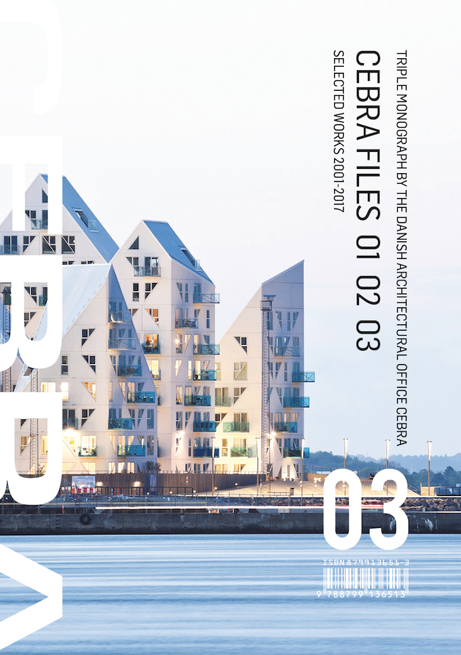
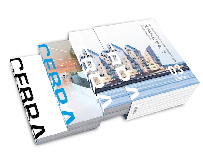
The three-volume elaborate monograph, CEBRA_files, documents more than fifteen years of thought-provoking architecture. In its 1,200 pages with around 1,500 illustrations, CEBRA’s team of fifty employees share their strong passion for architecture as they take the reader on a chronological journey through interviews and stories accompanied by expressive drawings, diagrams and photographs.
CEBRA is known for its thought-provoking architecture. How did you manage to reflect the office’s unique philosophy in this publication?
Apart from the actual writing – a number of articles called “CEBRA tales” – it simply jumps from the pages. The tales are a number of anecdotes describing how we work and interact with clients and the world. Through these short texts, we indirectly manage to also illuminate the thoughts that lie behind our actions and the designs we live and die for. The illustrations do their part, too. Particularly the conceptual CEBRA-toon watercolours, which tell condensed stories about the office’s philosophy. We communicate in a simple comic-book way – one that most people can understand and relate to.
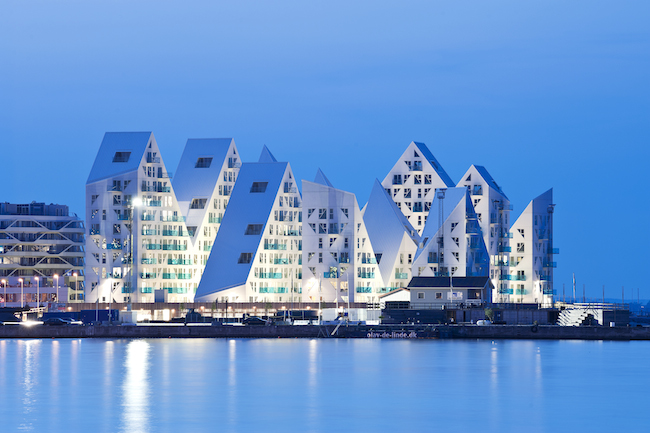
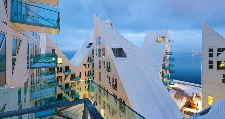
The Iceberg. Photo: Mikkel Frost. One of the best-known CEBRA projects that stands at Aarhus’ harbour front – within one of the largest harbour restructuring projects in Europe – with its eleven white tips. Its structure allows all the residents to have well-lit apartments with views out over the water.
What new and unique aspects does this monograph reveal about CEBRA, which is a very well-known figure on the Scandinavian and European architecture scene?
I am not sure that we are actually dropping any bombs, so to speak. We have always communicated and we have been quite active in publishing our work. It was very important for me, personally, that the longest article in the book – the one describing the making of The Iceberg– was finally put down to paper. A lot of people have talked about the process and how it all played out, but we do know exactly what happened – better than anybody. In the Iceberg CEBRA tale, I describe the full story and I leave out no details. It was incredibly satisfying to finally speak up publicly and to set things straight. Apart from that, the new stuff is all our projects – especially the Qasr Al Hosn design in Abu Dhabi, which is actually bound by a non-disclosure agreement. Our client gracefully allowed us to put it in the book. It´s a great commission and a great design, and we are very thankful that we could include it.

Children's home sketch. Watercolour by Mikkel Frost
Could you elaborate more on the process of selecting the material for the book?
It is very simple. We picked out the best projects and ended up with way too many pages. After that, it´s a matter of reduction and then, finally, layout. The writing was done over a year – mostly on planes where I get some peace and quiet to actually think. It seems I only write on planes these days, and I just write what comes to mind. If it doesn’t come, it´s not important…
Experimentarium sketch by Mikel Frost
Could you describe the aesthetics of the book – its design, content, structure, etc.?
Our third book, CEBRA files 03, is based on the same principles and layout matrix as its predecessors. It´s basically a professional portfolio, so there´s a kind of system to it. Projects are presented chronologically and accompanied by shorts texts. Between these, a number of articles and relevant information pages, such as staff tributes, occasionally appear.
The style is colourful, vivid and optimistic. The book is packed with an abundance of drawings, diagrams and photos. There´s a lot to go through, and if you are looking for inspiration, it´s a good buy. It´s a fun book, but it is also very serious. It´s serious fun!
If this book were a journey, how would you describe it?
It would most certainly be an Interrail journey through Europe. It´s very informal and a bit bumpy, but you get to see a lot of interesting things in a short period of time. You can stop anywhere you want, and then pick up your travels again at your own convenience. It´s for young and open-minded people or older people who are still curious.
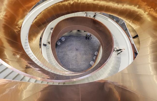
The Experimentarium. Photo: Mikkel Frost. A science centre in Copenhagen that was completed in January 2017 – with an exceptional, shiny copper double-helix staircase in the main hall. It’s design was strongly driven by local traditions, including climatic, ecological, and cultural conditions, as well as the needs of the users – according to the mission of the architects.
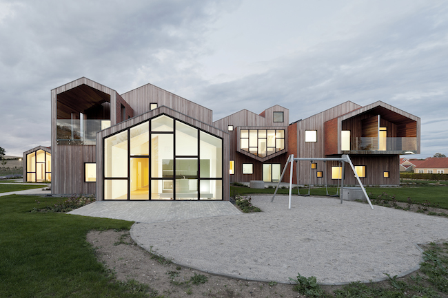
Children’s Home. Photo: Mikkel Frost. A new type of 24-hour care centre for marginalised children and teenagers in Kerteminde, Denmark. The tile- and wood-clad building plays with familiar elements and shapes to create a homely environment in a modern building that focuses on the residents’ special needs.