


To go down the rabbit holes of concrete poetry
Notes on Concrete Poetry
To speak of “concrete poetry” is to not fully know what one is speaking about. That is, even the concretists – the poets within the movement – cannot agree on the precise definition of what this “concrete poetry” is. There have been attempts. Most famously by Mary Ellen Solt in her 1968 anthology of concrete poetry: “the term ‘concrete poetry’ is now being used to refer to a variety of innovations and experiments following World War II which are revolutionizing the art of the poem on a global scale and enlarging its possibilities for expression and communication.” From this definition, we can be sure of two things: for something to be called “concrete”, there had to be innovations and experiments and they had to happen after WWII. Other than that, it sounds like – if you know, you know. We don’t yet know, though, and so all that is left for us to do is to go down the various rabbit holes of concrete poetry and see what this innovative postwar genre really is.
To put the movement into context, pattern – or shaped – poetry is a tradition originating in ancient Greece. Simmias of Rhodes, active from 300–250 B.C., amongst other things wrote epigrams – witty and relatively short insightful verses. Was he a concretist? No – two thousand years too early for that. Yet his work shared an important quality with visual concrete poetry: it communicated its meaning not only through the text but also through its arrangement on the page.
The shaped poem "Wings" by Simmias of Rhodes, reproduced in Ad alas amoris divini a Simmia Rhodio compacta by Fortunio Liceti (1640) in the Austrian National Library
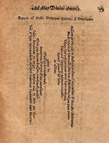
Simmias’ poem “Wings” speaks of the grotesque statue of Eros. The wings on the page belong to the statue. What we see is what is being talked about. The visual is a part of the meaning, which is something that will become important amongst concretists.
“Easter Wings”, a 1633 poem by Welsh-born poet and priest George Herbert, illustrates the revival of interest in ancient Greek poetry during the Renaissance. The poem resembles the one by Simmias of Rhodes – Herbert borrowed the shape and the vertical alignment of the verse.
George Herbert's "Easter Wings" in the 1633 edition of The Temple
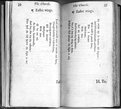
Yet here the subject is different: the atonement of Jesus Christ. The wings belong to a redeemed soul. Herbert – not yet a concretist either – similarly explores how the seen is linked to the read. We see the wings, we read about the Christian redemption, we think of angels, the resurrection, the possibilities of being saved and taken to another place (preferably, Heaven). Excellent! This visual material helps us decipher the meaning of the poem and makes life easier. Herbert’s work is referential in relation to the work of Simmias. That is, Herbert is inventing something on the basis of what he has already seen.
“Il Pleut” (It’s Raining) - a poem from Apollinaire’s Calligrammes
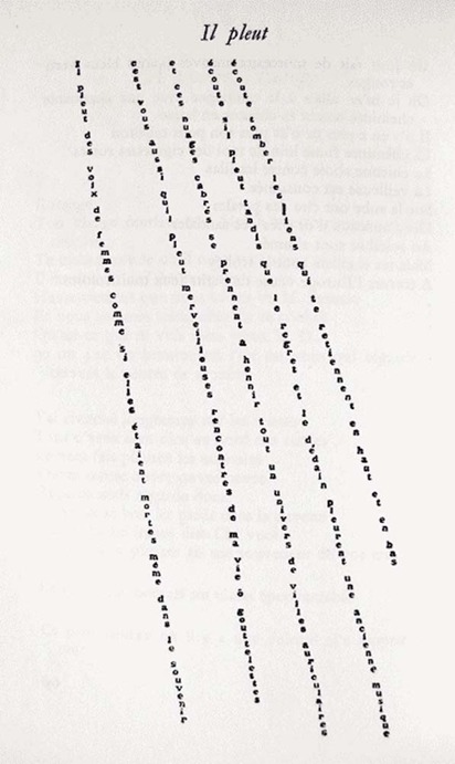
Fast forward to 1916: French writer Guillaume Apollinaire is also inventing something on the basis of what he has already seen. This time, however, it’s not someone else’s poem but the rain. In “Il Pleut” (“It’s Raining”), the diagonally slanting letters of the poem create a visual resemblance of the falling rain. Apollinaire is playing with visual, verbal, and auditory modes of expression. He’s not yet a concretist either (we’re getting there, I promise); he describes his creation as follows in a letter to the writer André Billy:
The Calligrammes are an idealisation of free verse poetry and typographical precision in an era when typography is reaching a brilliant end to its career, at the dawn of the new means of reproduction that are the cinema and the phonograph.
Apollinaire is onto something here. He’s emphasizing that it’s time to reinvent what poetry is about and make poetry catch up with the world. After all, films and the gramophone are changing the way people are interacting with the written world. What people see and what people hear becomes more frequent than what people read, hence the appeal to the visual and the auditory. Does this mean that verse needs to become more visual and sonic? Less focused on iambic pentameter and metaphors?
The concretists have the answers.
Ian Hamilton Finlay, “Ho/Horizon/On,” from The Blue and the Brown Poems (New York: Atlantic Richfield Company & Jargon Press, 1968) Getty Research Institute, Los Angeles (2016.PR.36) (courtesy the Estate of Ian Hamilton Finlay)
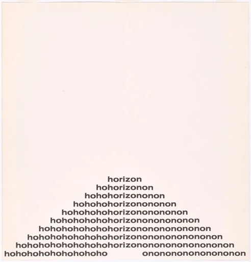
The work of Scottish concrete poet Ian Hamilton Finlay may appear simplistic at first glance. The word “horizon” is broken into three syllables – ho/riz/on – and reiterated in a pattern that isolates the “ho” and the “on.” The representation of the work is graphic – it is a pyramid with “horizon” on top. Yet the complexity of the work lies in our sonic comprehension of it. The “ho-ho-ho” sound makes its way into our consciousness, creating an impression of a sarcastic laugh or a comic exclamation of surprise. The pyramid looks symmetrical not only because of the shape but also because “ho” seems to be a close mirror image of “on.” If flipped, the “on-on-on” becomes a “no-no-no,” and so an expression of resistance or denial.
The main focus here – much as in Apollinaire’s calligrammes – is the shape. But unlike the calligrammes, or the earlier pattern poetry, shape does not necessarily imply content.
From Mary Ellen Solt’s Concrete Poetry: A World View (1968, Indiana University Press)
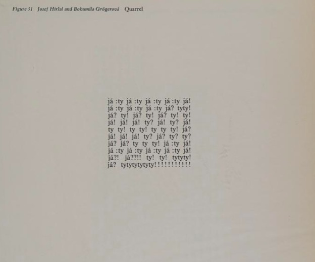
The freedom of the shape does not mean that it’s unrelated to the content. “Quarrel”, by Czech couple Bohumila Grögerová and Josef Hiršal, is a rapid fire of “ja” (“me”) and “ty” (“you”). It’s an all-too-known and common pattern of blame, guilt, and anger between two people. The square shape can be associated with enclosure, borders, containment. At the same time, the emotional charge of the poem offers a release, a way out for worries and concerns. The punctuation – colons, exclamation marks, question marks – suggests the tone of each “me” and “you”: calm assertion, surprise, or indignation. Here, the written becomes vocal through the graphic. It is our words and thoughts when we quarrel with someone, but condensed on one page in front of us.
Augusto de Campos. Amor
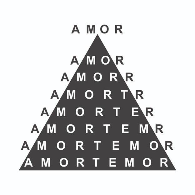
Here, in the work of Brazilian writer Augusto de Campos, the word “amor” (“love”) is reiterated within a black triangle, the letters “t” and “e” added gradually. The words “morte” (“death”) and “temor” (“fear”) become evident. Love, death, and fear, interconnected.
The work of de Campos and his poetic teammates from Noigandres – a group of three Brazilian poets – inspired Japanese poet Kitasono Katué (you’ll hear more about him later) to create concrete works too. This is one of the examples of concretism taking over the world.
Mary Ellen Solt & John Dearstyne (designer and printer), from Flowers in Concrete (Bloomington: Fine Arts Department, Indiana University, 1966) Getty Research Institute, Los Angeles (94-B19512), gift of Susan Solt (courtesy the Estate of Mary Ellen Solt)
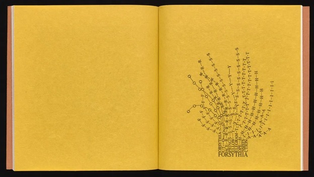
In another part of the planet, the color of the page becomes a tool for concretists to play with as well. American poet Mary Ellen Solt used the background of a poem to remind the reader of the subject. In “Forsythia”, the background is yellow, like the flower. The words “Forysthia Out Race Springs Telegram Hope Insists Action” are arranged in a way that resembles the flowering bush. Here we see a return to the tradition of shape poetry’s resemblance to its subject. The new element is color.
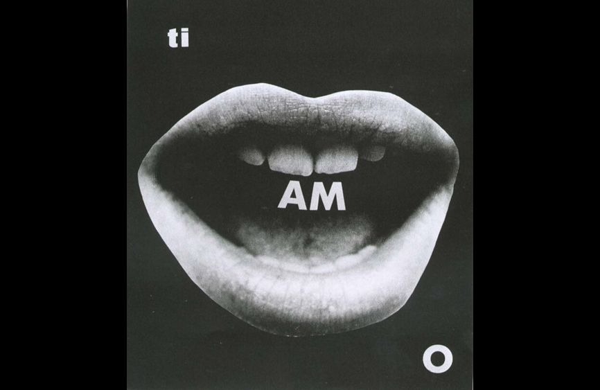
Mirella Bentivoglio. “Ti Amo” (“I Love You”), 1971
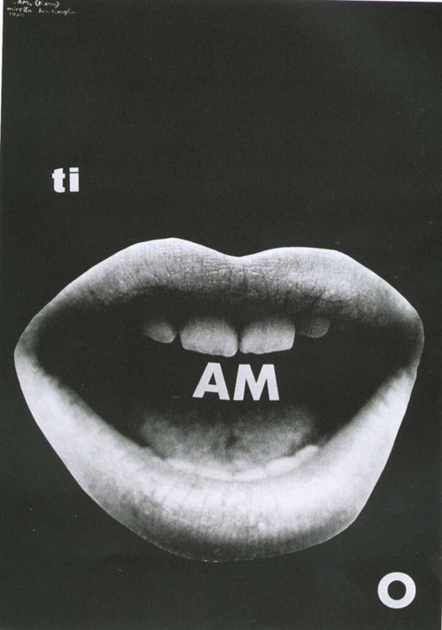
“Ti Amo” (“I Love You”) (1971), a work by Italian poet Mirella Bentivoglio, is an image of an open mouth in which the syllable “am” is inside the mouth. “Am” is a sound someone makes when eating, engulfing something. “Am,” and your lover is gone, eaten – a playful representation of passion and desire. Photography is a tool a poet can use. It is a space where words can interact with visual symbols. Or, sometimes, the photograph itself is a concrete poem.
From Mary Ellen Solt’s Concrete Poetry: A World View (1968, Indiana University Press)
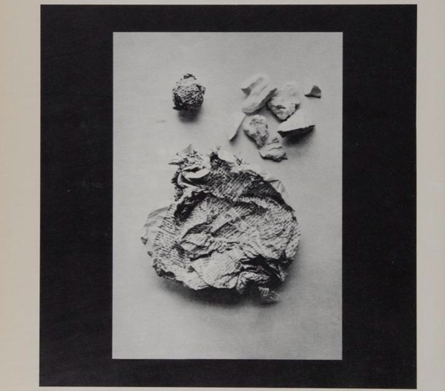
Kitasono Katue’s “Plastic poems” (1966) is an image. In it, objects in still lives reveal a rhythm. “The camera can create a lovely poem even from trifling objects… This is the birth of new poetry.” How or why is this a poem? Because the creator himself stated that it is and his colleagues supported him. This is a rather simplistic view. Katue’s work is indeed included in Mary Ellen Solt’s 1968 anthology of concrete poetry. But his goal was not to make it to the anthology but to make the viewer think of new modes of expression with the advent of photography.
Now we shall pause because this is a particularly challenging moment. Concrete poetry is the only form of literature that establishes a clear connection with the visual arts. The tradition of text art – with people like Jenny Holtzer, Barbara Kruger, Lawrence Weiner, Joseph Kosuth – is founded on working with words in an image. And yet these people did not identify as poets but as visual artists. Precisely because their focus was the resulting image or statement that the artwork makes, not the poetry that the piece may create. So how can we tell if something is a piece of concrete poetry or a piece of visual art (collage, photography)? Is "Popcreto" by Brazilian writer Augusto de Campos a poem or a collage?
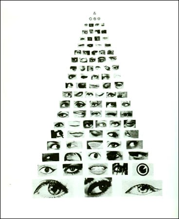
The answer: this Tower of Babel of eyes is a concrete poem. Why? Because de Campos (the author) said so and his professional community (other poets) agreed. What an unsatisfying answer. But what can one do with all this abundance of media? Confusion here is natural and exciting. When is something a piece of art involving text, and when is something a concrete poem? Hmm… It’s time to put your hand to your chin and mysteriously look into the distance...unless you are a literature pro or a master art theorist (if so, speak now or forever hold your peace). Jokes aside, my understanding is that these forms and media constantly intermingle, borrowing from each other and letting each other borrow.
The main distinctive feature of concretists is the desire to experiment, to use what we’ve previously taken for granted in order to create something new. Many of the works we’ve seen so far seem anachronistic. These days, graphic design often employs the tools of visual communication that concretists thought of as innovative. Are advertisements concrete poems? I would not say so, although they sometimes indeed use the language of concretists.
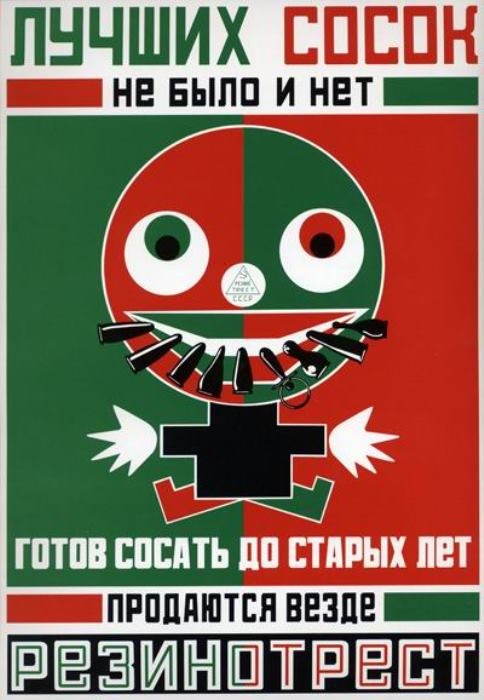
This 1923 work by Russian writer Vladimir Mayakovsky advertises Rezinotrest baby dummies/pacifiers. “There are no better dummies. Suck them ‘til old age.” (“Лучших сосок не было и нет, готов сосать до старых лет.”) – so goes the rhyming slogan. Although the elements of a poem are present there – rhythm and rhyme, as well as the elements of concretism – innovative use of color and typefaces, this is not a concrete poem. This is an advertisement and the purpose of it is to make the customer want a product (I’m not sure whether concrete poems are good at selling anything, but that’s not their purpose in the anthologies they are published in). You get my point: to be called something, you need to be it and have the sole purpose of being so (what a moment of existential contemplation!). Concrete poems are poems that look different from something one immediately thinks of when they hear the word “poems.” But they are still poems!
To be a present-day concretist is to know the rules of the game – use something other poets would not immediately use for making poems – and to play that game. Latvian artist Reinis Lodziņš is making concrete work with interactive typefaces. His text-art practice centers around exploring the environment of digital typography systems and their unique properties and seeing how deconstructing them can conjure poem-like vibrations. This piece is a typeface which, working with an out-of-bounds character placement, transforms blocks of text into certain-sized cosmoi.
Image: courtesy of Reinis Lodziņš
The computational arts allow for a present-day rendering of concrete. The 1968 definition of Mary Ellen Solt still works: postwar (check), innovative (check).
Do we now have a feeling for what “concrete poetry” is? I still don’t. The array is much larger than what can be put down on the page. Some of them require performance. Some of them don’t have words. Some of them have patterns. Some of them move. Some of them are still. The freedom of the genre is both baffling and mesmerizing. And yet, at the same time, there is a sense when something is a concrete poem. Do you get where I’m going with this? We somehow know that it could not have been anything else, and so it is just that – a concrete poem.
