


Cinema finally caught up with me
Moscow-based artist Ekaterina Rozhkova speaks about her recent solo show The White School and explains why “the artistic implementation must be level with the beauty of the artistic idea”.
In May 2021 the city of Kaluga, famous for being the hometown of Konstantin Tsiolkovsky, the forefather of the Soviet space industry, hosted the ninth contemporary art festival Tsiolkovsky Fest; it was held at the city’s main venue, the Innovation Cultural Center. The festival included exhibitions, performances, film screenings, performance premieres, concerts, and poetry readings. Its educational programme featured lectures by renowned art critics Kirill Alekseev, Anna Mapolis, Irina Kulik, and Armen Apresyan, to name a few. But one festival event stands apart.
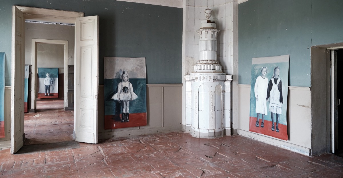
Ekaterina Rozhkova opened her solo exhibition The White School at the main house of the 18th-century estate at Polotnyanyi Zavod (Textile Factory), some 35 kilometres from Kaluga. Her artworks will be on view there all through the summer. The place resonates in the mind of anyone familiar with Russian culture because of its connection with Alexander Pushkin. The Russian poet was often a guest at the estate, which is where his wife Natalia Goncharova grew up. Her namesake and relation, renowned avant-garde artist, painter and costume designer Natalia Goncharova, also had family ties with this locale. Shchepochkin’s house was built by Grigory Shchepochkin, the partner of Afanasy Goncharov, after the two friends divided their capital. But the edifice was overshadowed by its famous neighbour. Perhaps for this reason it survived all the dramatic ordeals of a Russian nobleman’s estate with fewer losses. The house, although it requires serious restoration, is well preserved, unlike the main building of Polotnyanyi Zavod, which was burned down during the war years when the Germans occupied the territory, and then rebuilt in the 1970s-1990s. The current state of these neighbouring architectural sites demonstrates the popular readiness to settle for a poor copy, or even surrogate, instead of the real thing.
But not for Ekaterina Rozhkova. She values the real, the natural, and the human, and despises the fake world of plastic replicas. Her academic art background roots her in true age-old artistic values rather than momentary fads. She first studied at the art school affiliated with the Surikov Institute, then went on to study set design at the Russian State University of Cinematography (VGIK). She is a multifaceted artist who works in various techniques, such as drawing, silkscreen printing and printed graphics, but prefers traditional materials. She is serious about the craft element of artistic practice and attentive to which contemporary artists she favours. She has solo exhibitions under her belt (at the State Museum of Oriental Art and the Shchusev Museum of Architecture in Moscow), has been shown in galleries in Tokyo and London, and has participated in international biennials and triennials of graphic art in Ljubljana, Tallinn, Kaliningrad and New York. Her works can be found in museums and private collections both in Russia and internationally.
We met with Ekaterina to find out how her previous experience influenced her perception of the historical context of this amazing space, and what it felt like to walk around with the estate key in her pocket for a few months. Topics also touched upon include her working under a true sensei, whether it is possible to reconcile East and West, and how metaphysics can be conquered with the help of an ordinary pencil.
Ekaterina Rozhkova. Photo: Денис Крянин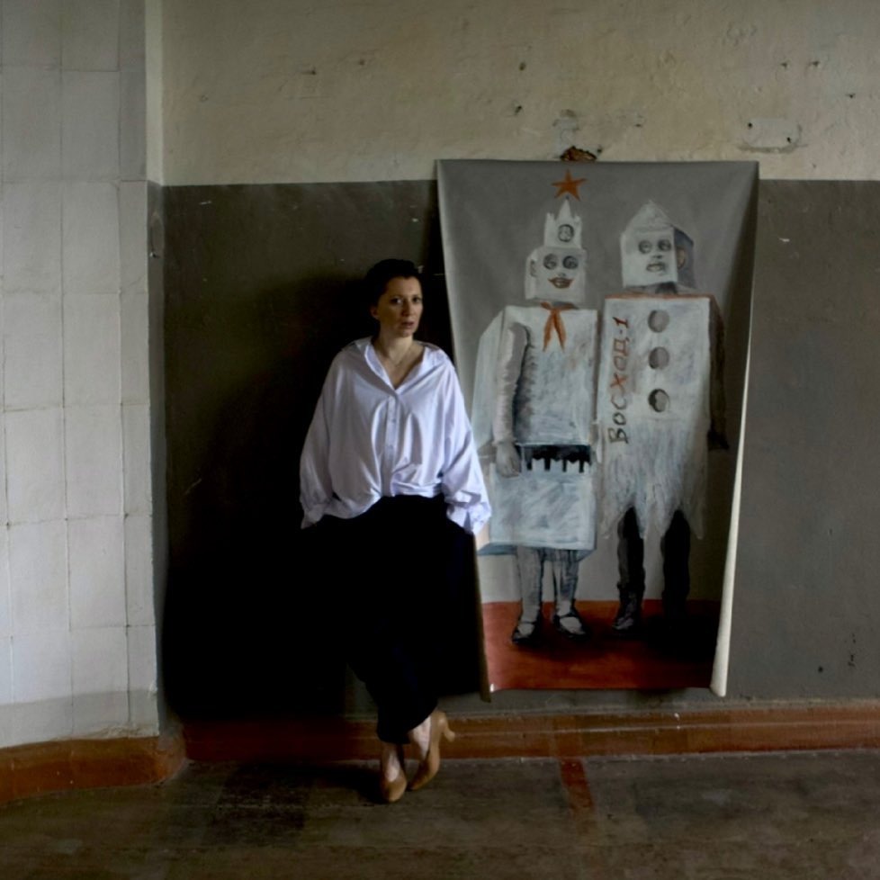
Katya, how did you happen to have this exhibition in such a removed spot, one that is not even in the regional centre?
It was all made possible thanks to Anna Senatova. She was the one who revealed this place to me. I had participated in the previous Tsiolkovsky Fest as a curator with my exhibition project entitled Personal Cosmos. It was a very intimate, private show dedicated to personal belongings – such as dresses which we keep close to the body – inherited from our mothers, grandmothers, or someone close to our heart. Nine female artists were involved in the project; it was my debut as a curator and I found it truly pleasurable to not have to paint anything this time but only direct, produce, and be involved in the montage. This project is very special to me and we would like to have it tour around Russia. It will almost certainly be in Tula and in Vyborg, at the Alvar Aalto Library. I collected a huge amount of material, and technically it was a nightmare because we were in the midst of the pandemic. People often questioned me about my intended audience because there is a notion that provincial exhibition-goers should be presented with simpler, more comprehensible narratives – they should be granted some leniency. In reality, we saw people even crying at the exhibition – they were undergoing some sort of catharsis – so we stopped constraining ourselves and stopped being scared of possible audience misunderstanding.
So, for this second iteration there is no leniency towards the audience. Although when I started this new project, my friends and relatives kept asking who on earth would go there, and I answered that I didn’t care in the least. I had the feeling that it was impossible not to enter this house once I was given the key and had opened the door – I walked around with the key to Shchepochkin’s house in my pocket for several months. And whoever comes will come. I must say that the opening was quite crowded, and people still keep coming from all directions.
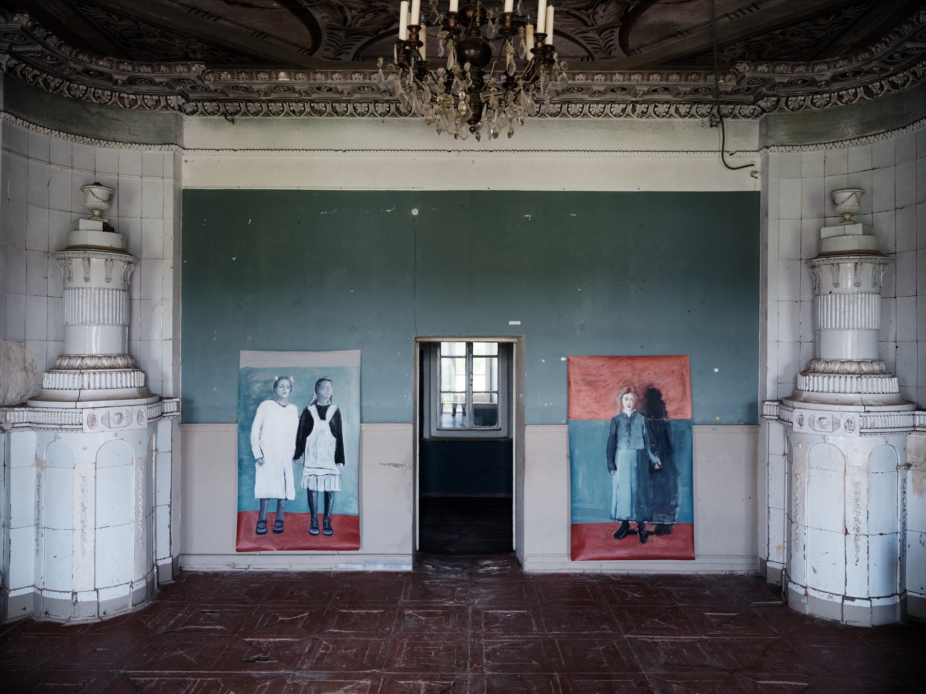
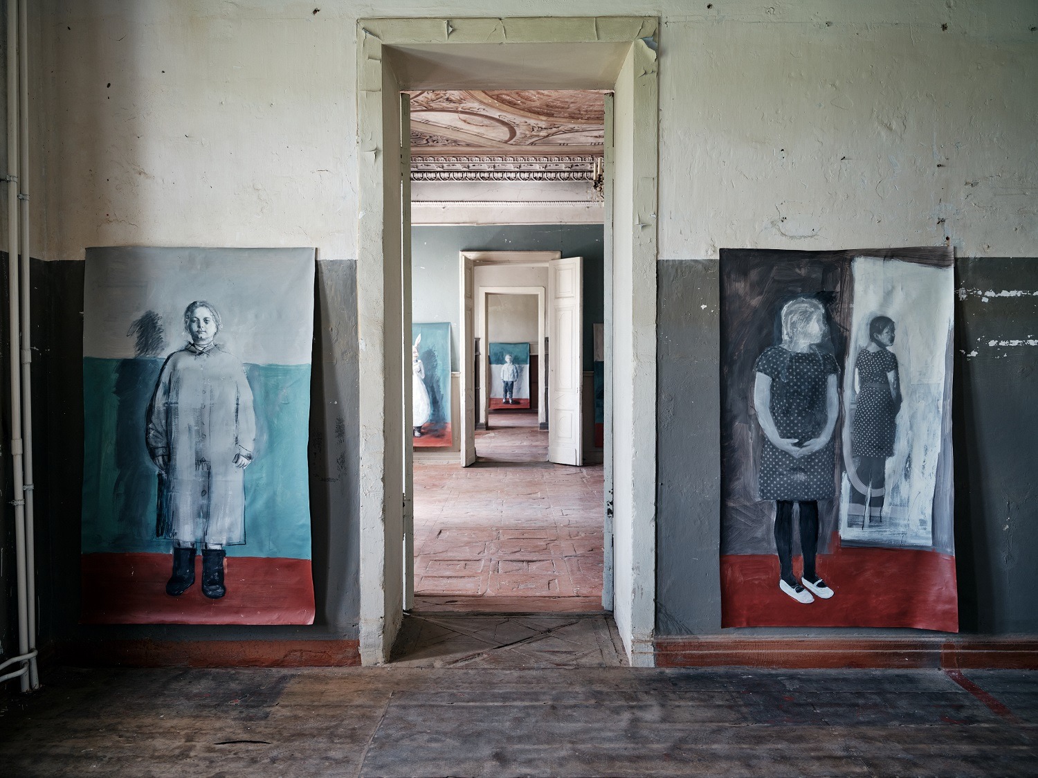
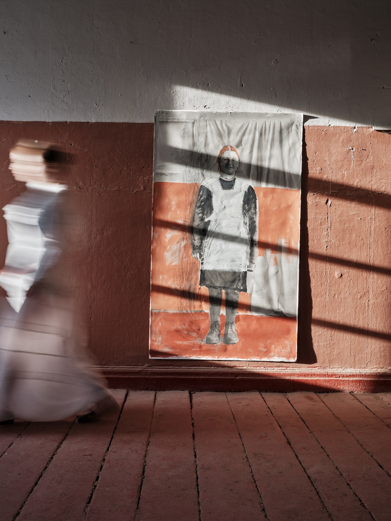
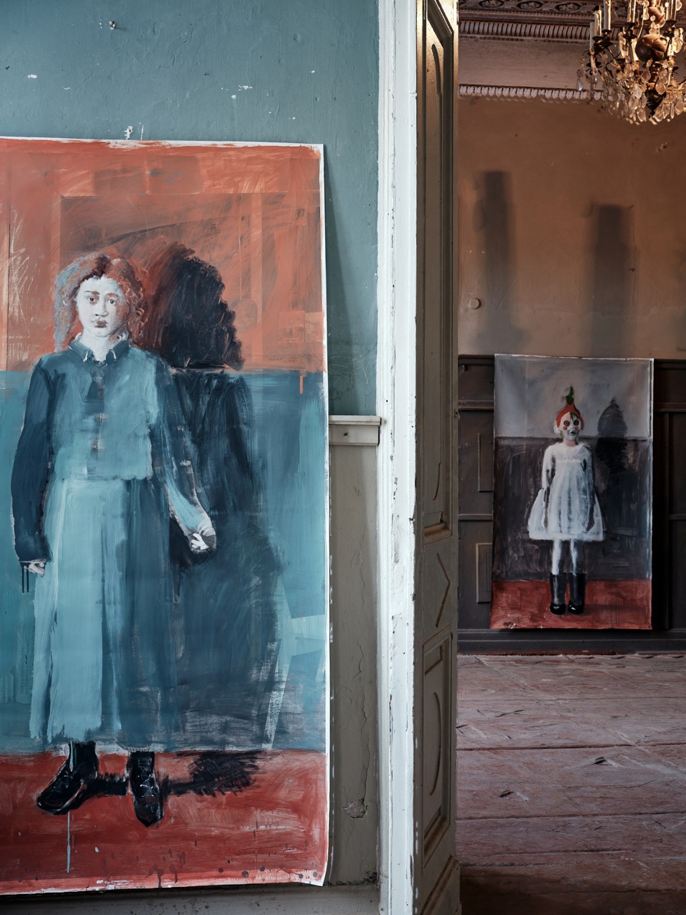
The history of the house is very rich, but you’ve chosen to focus on children – thirty canvases of full-length figures, and the culmination – an entire youth choir represented on the second floor. Why children?
I had various sensory interactions with the rich past of this house. It seemed that the past had soaked into its walls. Every time I went there, I imagined Pirogov operating in one of the rooms on a camping table. He was here on their honeymoon with his young wife, who assisted him. I imagined the staggering rise of the canvas business. I imagined an Old Believer setting up a prayer house and founding the very first school for children. I imagined a lot of things. But most often I thought about the school. This comes as no surprise because all throughout the 20th century it was used as a school building. The local school closed in 2007, when the house became part of the museum complex. There were other things I lived through while working on the project. I imagined the war years, when the Germans had a stable here and left bombs behind when they left – but the locals found out about them in time and rescued the house. After the war, the school returned and the pupils kept themselves warm by huddling around tiled fireplaces. The magnificent ballroom was turned into a gym and the children tried to hit the stucco with a ball.
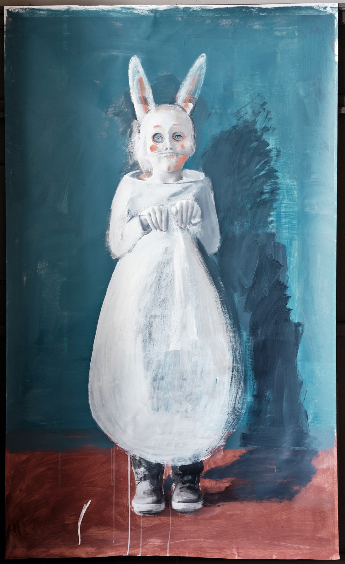
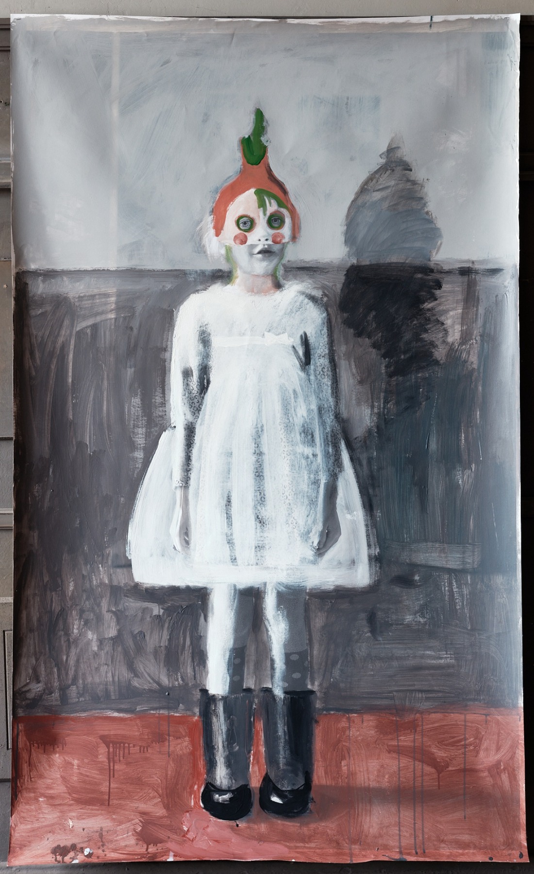
Your decision to re-populate the former school building with images of children seems logical, yet not as benign or mellow as it may seem. “It takes just a little imagination to envisage the children coming to life and scattering from their canvases throughout the rooms, staircases and corridors,” I read in one of the many print reviews of your exhibition, and immediately imagined a phantasmagorical crowd clearly not from a sweet fairy tale, but rather from a noir movie or some kind of thriller. All these Bunnies, Onions, strangely dressed teenagers, and choir singers with open mouths. The soundtrack accompanying the exhibition, by Sergey Komarov, has all these sounds – rustles, noises and songs… One is tempted to recall Ilya Kabakov, with his communal questions. What kind of film are you making here?
Well, Kabakov is not the only reference here. Kira Muratova used the effect of cacophony in some of her films by having different characters repeat the same phrase over and over. These phrases overlap. I agree that the film we’re seeing here is frightening. I am not a great fan of horror or thrillers, but I can hardly imagine anything more terrifying than the modern history of Russia – the entire 20th century, at least. It is permeated with pain. There is hardly anything that doesn’t hurt – scars and wounds can be seen everywhere you go. Schools, as such, are also quite scary. I do not entertain romantic notions of the school. Rather, I see it as an institution of coercion and non-freedom, like any social institution. And humiliation. Certainly, there are nostalgic moments associated with teachers, friends, new knowledge...youth, being a child. But at the same time, it produces the most painful and frightening experiences for those coming of age within its walls. Personally, I have no desire whatsoever to go back to those golden school years. I went through it all again with my two daughters. Sure, in a different time and a different format. But everything remains the same: the power in the hands of the teachers, this tiny slice of authority and the desire for it...all these things.
You want to know what kind of film I’ve got here? I believe that some motifs are from Doctor Zhivago. I’ve made an attempt to do something epic [smiles]. This novel was always at my bedside, I must admit. I love it and often return to it in my thoughts.
I have to say that one of the most striking characters for me in the novel was Tanya, the daughter of Yuri and Lara, who was abandoned by her mother in the midst of war and lived as an orphan.
I fully agree with you. I also have a special girl among my protagonists. However, it’s a slightly different kind of story and the erosion of memory is explained by her Down syndrome. She has such a strange look, and she’s in another world. But she’s dressed up! She doesn't remember anything, she doesn’t know anything, and she is unlikely to ever know. Some people reacted to this character in a weird way – I’ve had issues because of her. This narrative is very sensitive for the local community because the building stopped being a school quite recently. I can’t stop feeling that I’ve trespassed, stepped over the line of someone’s house and the owners are constantly reminding me that I do not belong and have no right to be here. A lot of the former pupils and ex-teachers still live in the settlement of Polotnyany Zavod. They have always called the school white because the building is white, so the exhibition’s name came naturally. One of the former teachers was angry with me – she said I was defaming their sacred place because all my children were very ugly and strange, many of them were mentally ill, and one girl even had Down syndrome. I tried to explain to her that times had changed – it is not something to be afraid or ashamed of; it’s not a crime or a conviction – it is a very important social topic. But in this woman’s mind, of course, the school could not be associated with anything like that.
Inclusion, for me, is not a mainstream agenda or trend. I have personal experience in this matter, and though I did not intend to hurt anybody’s feelings, many responded to this issue very sensitively. They find it unattractive. But I’m sure there is beauty in it too. We can’t be sure we fully understand the reactions of people who exist outside the frame or beyond a life considered as normal. We don’t know what’s built up inside, on their “internal hard disk”, so to speak, that they can’t share. And suddenly you notice a glimpse, some hint, at the existence of secret knowledge. For me, that’s exactly how it is.
What about the technique used in this project? The way these portraits were made really appeals to many.
I cut out pieces of canvas and attached them to the walls directly, without any stretchers. It was not easy – we had to figure out how to do this without nails to avoid damaging the walls because of the planned restoration. Glue or adhesive tape were no good either because they fell off together with the paint – the paintings are quite heavy. At some point we decided to try a simple stapler. This turned out to be the most harmless solution – it only penetrated the Soviet-era plaster, which is thick enough that we didn’t get to the paint layer. The walls under the plaster are painted, and we didn’t damage anything. The canvases are not fixed at the bottom. I wanted them loose because it reminds me of peeling and flaking paint – it drapes and frays in the same way.
To cut a long story short, I think these canvases are just another layer of this house. Temporal, as are many others. I’ve been told it’s messy, that they need to be nailed down. And I really like this temporary home for them. I emphasize that. On the canvas are my charcoal sketches. The figures are life-size.
Did you draw from nature or use additional images, like archival materials and so on?
I drew both from nature and from photographs. I worked together with photographer Ivan Boiko, who is my close collaborator and true friend. It was not always possible to draw children from life because that takes time. We went to different locations – schools in Moscow and in the provinces, art colleges. As for the inner content and expressiveness, some faces are good and some are not so good. I also used old family photos, and not just from my family archive. Some images from the forties and sixties worked well. Afterwards, I painted these life-size figures, turning them into someone else. An intricate kind of layering.
What kind of paint did you use? It looks as if it belongs to these walls...
It’s quite funny and simple. It was the first time I used them. I wanted to match the existing colours as if I were to paint the walls. Actually, most of these colours are recognizable because in Soviet times they often painted walls like that. I went to the market where you buy construction materials and chose the colour scheme according to RAL. It is the so-called interior paint you use inside a house. I selected the perfect palette – a couple of red leads (ochres), blues, the famous Soviet bright blue, the greens they used to paint fences. I had six colors, six tones. I decided I wouldn’t go beyond them. So I used these cans of interior paint, a water-based matte basically the same as acrylic.
I had some flat wall brushes – I’ve used them before – so it was a familiar technique. I tried to generalize, to paint figures without much detailing, sometimes accentuating only some faces. All this reminded me of making extras for a movie or a theatre production, so I think it is pointless to discuss my canvases as portraits, although I did pay attention to the faces, as I’ve already mentioned. What was most important for me was to place the person in this space. In this regard it was the first time that I faced such an unusual task – to find a solution for the whole space and not focus on one particular portrait, which can take two to three months to create. On some of the portraits I even decided to erase the features because it helps to stress this memory loss we are talking about here...but my drawing is still there.
What kind of paint did you use? It looks as if it belongs to these walls...
When I was working on this project, I felt completely at home – after all, I studied at VGIK as a set designer, though I didn’t end up working much in the film industry. At the time I graduated from VGIK, the only work available in Russia was either advertising or music videos. I worked in that field for a while, but you’re implementing someone else’s ideas. I wanted to be independent, to work on my own projects and not depend on anyone else, to do what I needed to do. So I left. And then here, all of a sudden, I felt that my cinematic past had finally caught up with me. I treated this show like a story I have to tell – a set, a film project. I created the extras. And the main characters? They could probably still show up. And they will certainly be beautiful.
And beauty comes naturally to you. Hardly any mention of your work can avoid using such terms as “beauty”, “real beauty” or “innate beauty”.
To be honest, I am not afraid or ashamed of the word “beauty”. I am not talking about decorative prettiness, overabundance, or anything like that. But visual perception is key for me. In other words, it is crucially important that the beauty of the idea matches the beauty of its artistic implementation. And this is possible: works by artists like Christian Boltansky or Chiharu Shiota prove this position. Nowadays, the word “beauty” has almost become vulgar. Everything contemporary is supposed to be ugly, but why? Absolutely not. And as for The Great Beauty, it’s all in the past. Sorrentino, for example, explained that to us very well. [Smiles.]
A meditative approach, an appeal for the invisible, the true essence of things as opposed to the mundane – these qualities of your art have been mentioned and praised many times. How do you connect with metaphysics?
I believe this question should be addressed to those who write about my art – that’s the place to reflect on these things. To be honest, the desire to leap from physics to metaphysics is always there, but it does not happen as often as one might wish. Meanwhile, as we talk, my dog has jumped from the garden through the open window and made himself comfortable in an armchair. A fair example of overcoming a physical barrier. I had a series of works entitled Plates. Originally this series appeared from my non-stop interaction with a tin plate that we had used in the house for years. I remember that, as a child, I often took it in my hands and examined its scratches and marks. I imagined how they appeared, who made them, with what fork, and everyone who had eaten from that plate as they sat at the table.
Plate 1. 2001. Hardboard, pencil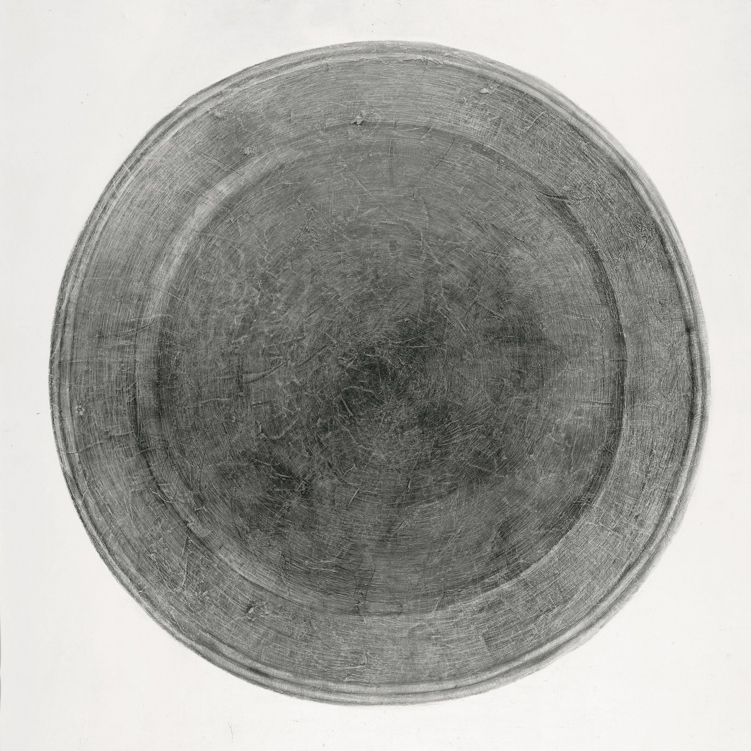
In other words, you were storytelling – it’s a literary work as much as anything.
I agree, literature often drives my imagination. I’m not sure if you can consider this a shortfall… For me, it’s always inspiring. Getting back to the plate that I described, I later started drawing it but the image was much larger in size. You may ask why? There was a project called East-West organized in the small Manezh Exhibition Hall by Kino gallery, a very active participant in the Moscow art scene at that time. I participated in both sections. For the East section, I painted plates. I made a lot of plates – it was a whole wall and some large-scale objects. Scaling sometimes produces a spectacular effect: you take a small object, zoom in, change the scale, and thereby change the meaning of the thing and its nature. It also allows you to become visible because there is so much art around. So I used this technique – I enlarged this small plate to a metre and a half. I remember that I really enjoyed the drawing process – it was so meditative and uplifting. I used only a pencil and the techniques of hatching, shading and sketching… It was pure pleasure … I love hatching, and in this work I had to cover such a big surface that I could go on and on and on. Later, all kinds of thoughts arose about the perfect plates in our life, metaphysics and so on, but they all began from hatching and scratching with needles and other little tricks… Hatching and shading take you into a meditative state, and the shape itself, the circle, is perfect. It is an absolute, like a point – a beginning and end at the same time. There’s a lot to write about; it’s a very productive area to work on.
Plate 1. 2001. Hardboard, pencil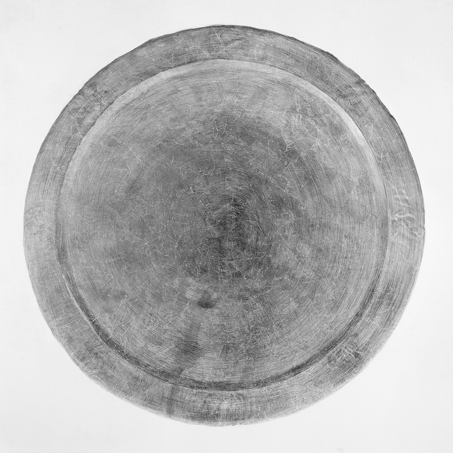
Its ripe for various ruminations, if you have in mind some theoretical ideas with which to counter empirical facts.
Sure, but it makes the whole thing even more exciting. For me, these plates embodied the true East as I knew it – the slow-paced Old East, very different from what it is now. It took me a long time to narrow down my fascination with the East to certain objects. And the process absorbed me completely; it was sufficient and I simply loved it. I remember the phrase we loved to say at school. We used to call it “stuffery” – the obsession with certain stuff, things, objects. I’m a “stuffer”. [Laughs.] At the East-West exhibition, I represented the West as gigantic mechanisms.
Bush VI. 2006. Cardboard, silk-screen printing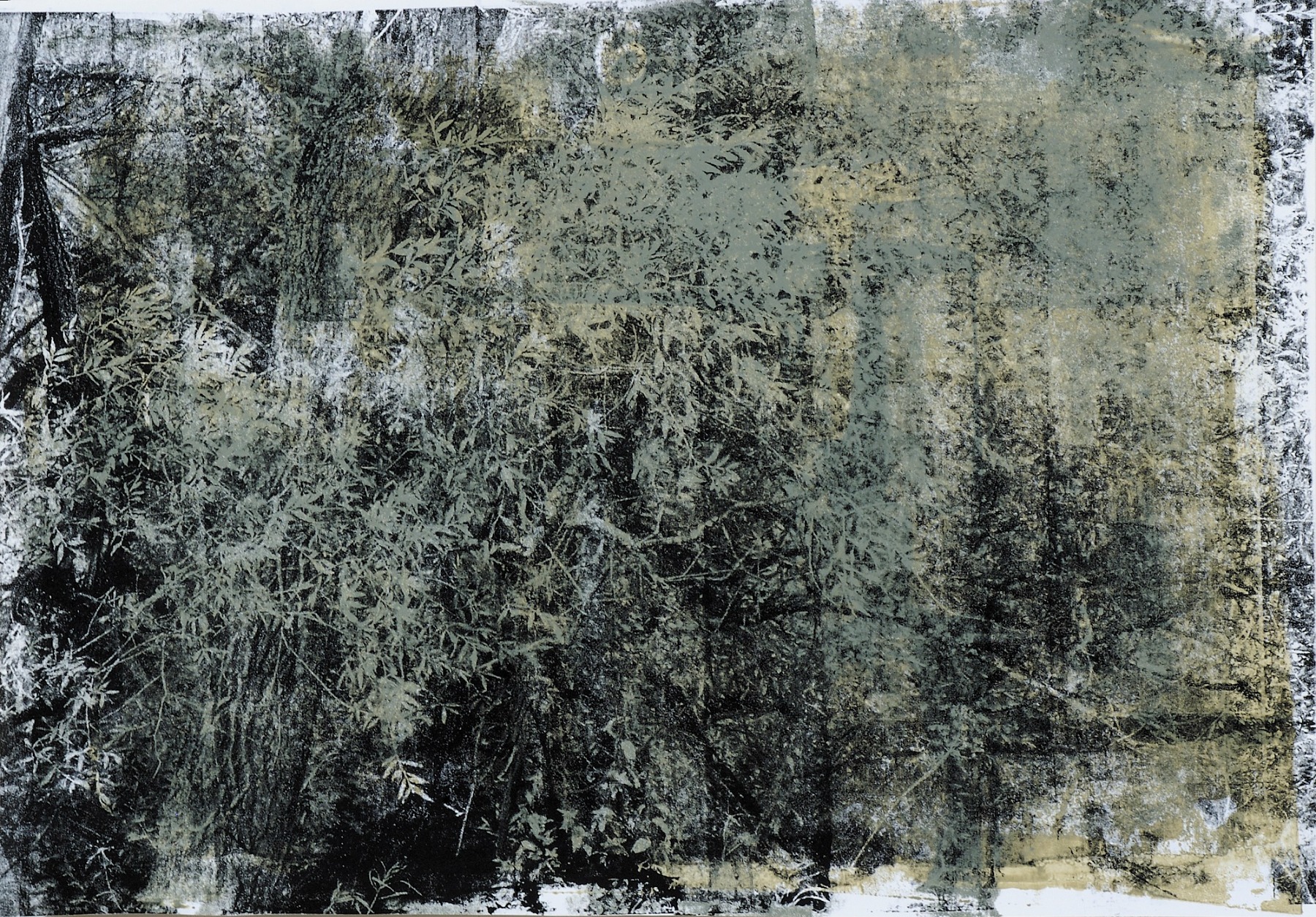
How do you balance between the East and the West? I know that as a child you lived in China for several years, later on you went on an exchange programme at a university in Japan, and then you worked at the famous Franz Masereel Centrum in Antwerp.
It was a wonderful experience and it made me who I am as an artist. It allowed me to see the world in its diversity and learn to appreciate it for that. I became connected to the East, in one way or another, for life. Another thing is that the concepts of the East and the West are changing now, unfortunately. The wise East, as it has always been in my perception, seems to be turning dumber. I love China. I came to China with my father who was a diplomat and I studied at the Embassy school until the fourth grade. Almost five years. These impressions of my childhood are priceless. I remember all the smells; I even remember what the Chinese smell like – yes, they have their own smell. It’s all gone. I think the West has done something to the East, that something is now lost forever. When I went to Japan, I was already an adult. I had a terribly romantic idea about Japan before I happened to go there by chance. I just got lucky. It was in the mid-nineties, when Russia was finally becoming part of the wider world. Cultural exchanges were very popular in those days. Japan was part of it too. My friends suggested I write an essay and apply for a programme. Unexpectedly, I got an invitation to go there, and so I spent a year and a half studying traditional Japanese painting – grinding paints, gluing gold and silver to surfaces. I had a sensei – he was a respected master but rather conventional, not a refined artist. I met him once a month at his house in Kamakura, a sort of local Peredelkino or Repino [an artistic settlement]. The rest of the time I spent my large scholarship on travelling around the country. As for new skills, I didn’t know how to apply them to my work. I didn’t understand what I could get out of it to make it my own.
Bush II. 2001. Canvas, pencil, tempera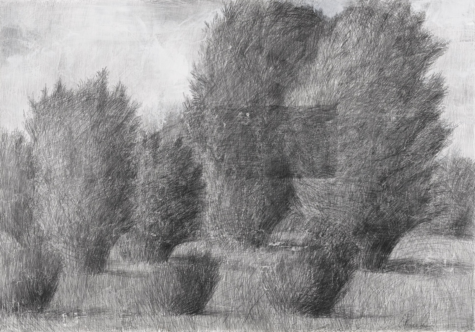
What about Japanese calligraphy, which has often been cited as one of the sources of your art?
I don’t think I can borrow anything from Japanese calligraphy. It is such a self-contained technique. Sometimes I feel like taking a sheet of paper and simply channelling my energy through the ink and the brush – just spreading it around the paper, because I like the speed and unpredictable flight of the brush. It is easy to understand why: when you have to be accurate and meticulous in your main works, when you spend hours working through minute details, you sometimes have an itch to run around, to release energy. I don’t show this work to anyone. Sometimes a designer friend might see these by chance in my house; they’ve suggested that it fits well in a modern interior because it’s so alive and fast. There’s a rhythm to it. But it’s about absolutely nothing.
Why is it “nothing”? Maybe it is very true and sincere. Are there any echoes of Dadaism or Surrealism in it?
Maybe, who knows? But so far, I feel that I cannot speak this language. As if I’m holding back something. For instance, Cy Twombly’s curved lines can speak – he expressed what he wanted to. I envy artists like that, but it’s unlikely I can become so free. I won’t manage; I’ll always feel like I’m missing something. I would need some kind of continuation.
In Belgium I learned many things that were truly necessary. For two years running I participated in a competition and won it twice. Each year I spent a month working in a print studio near Antwerp. I studied silkscreen printing. It was wonderful to escape the mundane and plunge yourself into work. Everyone there was a workaholic. You are on your feet all day working, and then at six PM they switch off the electricity, just to make everyone leave the workshop. And there you are, standing in paint or emulsion, trying to find your way out of the darkness. It’s not a residency where you just hang out. It was all about work.
Christening shirt. Silk-screen printing on metal. 2010 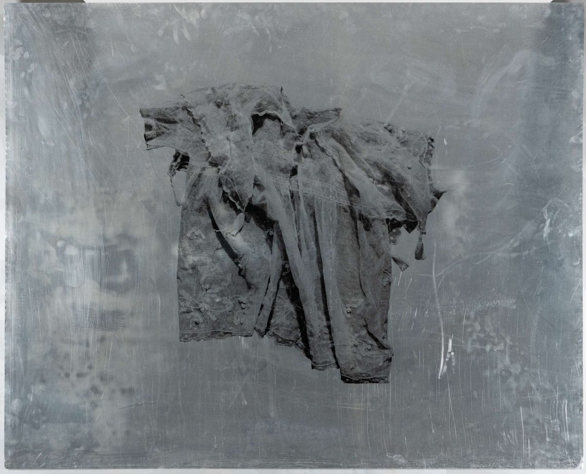
Where in Moscow do you do your printing?
I’m doing other types of printed graphics now. I am working on a big project with larger dimensions – 100 х 70 cm. My idea is to have a limited print run. I took a lot of photographs of my exhibition at the Shchepochkin house. These photographs, if printed properly, can build a new story, a new narrative and a new drama due to the colour scheme and the objects that I’m adding to the images…The differences between live material and objects blur…I find it amazing. I use the Piranesi Lab run by Alexei Veselovsky most often, and would very much like to complete this project.
It sounds like some sort of an epilogue. But you could present it as an exhibition project.
Some of the pieces are exhibition level. But I have to think it over – what kind of pretext to suggest, how and where to show it.
From series "White School". 2021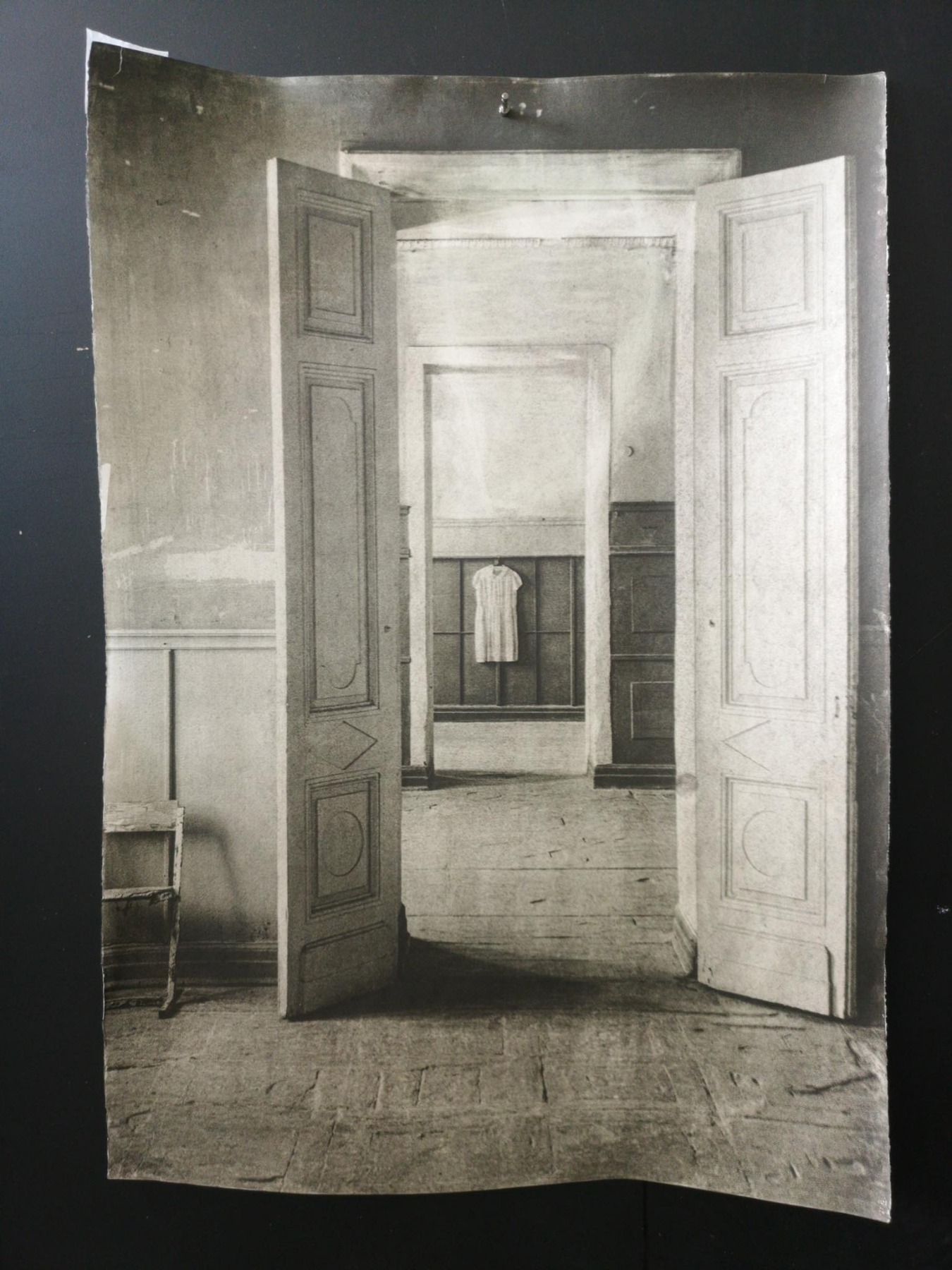
Nevertheless, graphite pencil is the main tool you use. You made a number of large, complex series in simple graphite pencil, and not on paper but on canvas. Where does this practice come from?
I’m hardly the one who discovered this technique. I know quite a number of artists who work in pencil on canvas. I’ve always enjoyed pencil drawing. Most of all, I cherish pencil as a finishing technique and not just strictly using it for preliminary sketching. But in order to sustain the pressure applied to the pencil or any other manipulations, it is necessary to have a very solid surface – a hardboard, canvas or plywood. Paper does not work for that purpose. I only use paper for spontaneous sketching. But only canvas can physically sustain such pressure being applied to the surface.
What do you do to prolong the lifespan of your drawings? Do you fix them?
Sure, I fix the drawings at different stages. Sometimes I need to fix a certain part of the drawing, to work over it. Graphite can smear and crumble, and the particles disperse everywhere, so I need to spray it first and then varnish. It lasts for a long time. It also depends on the type of primer. Italian primer is good; Russian primer goes yellowish and this should be taken into account when you add colour. The primer can be altered depending on what you want to achieve. It takes a long time to prime the surface; then I have to grind and polish it and it comes out like gesso. I need a hard pencil for strength, for the line, and I can work on this surface with a hard pencil – a 10H pencil comes out looking like a 5B.
A paradoxical mechanism. 2005. Hardboard, graphite pencil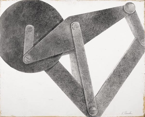
I find it interesting when drawing in the classical sense is perceived as a conceptual framework for other artistic media. This kind of drawing allows the artist to act without the distraction of transforming an impulse, a gesture, into technique. What is your ratio of impulse to technique? In what way do they coexist?
You’ve touched upon a very sensitive issue for me. I would love to feel free, be more flexible and relaxed in what I’m doing. I always feel responsible when working on a large canvas; I know I need to complete it, have it finalized. And I appreciate this feeling. But at the same time, I enjoy the line, the impulse it starts from. I know how valuable it is when I manage to get it when I see it in others. And I would like to take it to a new level, to combine these two. To keep that momentum alive in the big work. In big works I usually don’t let in these impulses from my scribbles that I don’t show anyone. Maybe it’s because of art school or my own insecurities, but something prevents me from freeing myself. All my impulses stay in folders. I’m a perfectionist. If I take up a project, I need to have it completed from A to Z. From left to right, up and down to every corner. I feel a bit tired. Even the series The White School, when I had little time and so much to do, gave me a liberating feeling. That’s also why I think this exhibition is so important for me. It opened something in me, untied my hands a bit.
All these lovely objects, family reminiscences, dresses that carry family stories, and children from the past... but I’d like to ask you about the present. What is your take on today’s agenda? Does your inner muse have any response to it, and if so, what is it? Can escapism save you from the intense problems of today? What kind of problems seem the most acute for you?
In my view, escapism today is precisely a search for reality, not an escape from it. Reality is strange, theoretical, surreal. If you are looking for support somewhere, you have to have solid ground under your feet. You are looking for living things that have this real essence. My children somehow dropped a new idea into my lap. They were building something out of LEGO, and these ugly pieces kept catching my eye, or I would step on them and it hurt. So I started drawing a series about children’s ugly toys. I wanted the lives of grass, anthills, mushrooms and plastic unnatural LEGO elements to collide.
I care about children with disabilities – where they grow up, how they live. They are no longer out of sight, as in the incident in which all these so-called “invalids” were taken away overnight to an island. That’s nothing new, but I’m not into mainstream fashion. These problems really worry me. Political subjects don’t interest me, and I certainly won’t draw anything about that. That’s in the realm of the poster for me. I’m different. I like to dig into something, and even if it’s ugly, I’ll still find its beauty and make it full of meaning.
Translated by Elena Rubinova ^ Ariadna Arendt