


The Treachery of Images
Text and photos by Elita Ansone
About Vija Celmins’ exhibition at the Fondation Beyeler in Basel
‘This is the most comprehensive presentation of Vija Celmins’ work in Europe in the last twenty years’, is how on 15 June the Fondation Beyeler in Basel announced its latest ambitious project – a solo exhibition by Vija Celmins, on show until 21 September. The exhibition spans more than six decades of Celmins’ career, from her earliest works in the 1960s to her most recent works from the last decade. The exhibition has been curated by Theodora Vischer and James Lingwood. A 200-page catalogue has also been produced, including images of all the works in the exhibition – oil paintings, charcoal and graphite drawings, aquatint, mezzotint and drypoint prints, as well as bronze, steel, wood and mixed media sculptures – ninety-one works in total. The catalogue includes a text by James Lingwood and short essays by ten contributors, the narratives of which span from reflections on Celmins’ life to musings upon a single work by the artist. Alongside reproductions of her works, the catalogue also includes Celmins’ own writings about her art. Her written words are more like poetry, aptly illustrating the fact that art can never be fully described through words, but rather emerges from a subjective state.
Exhibition view at the Fondation Bayeler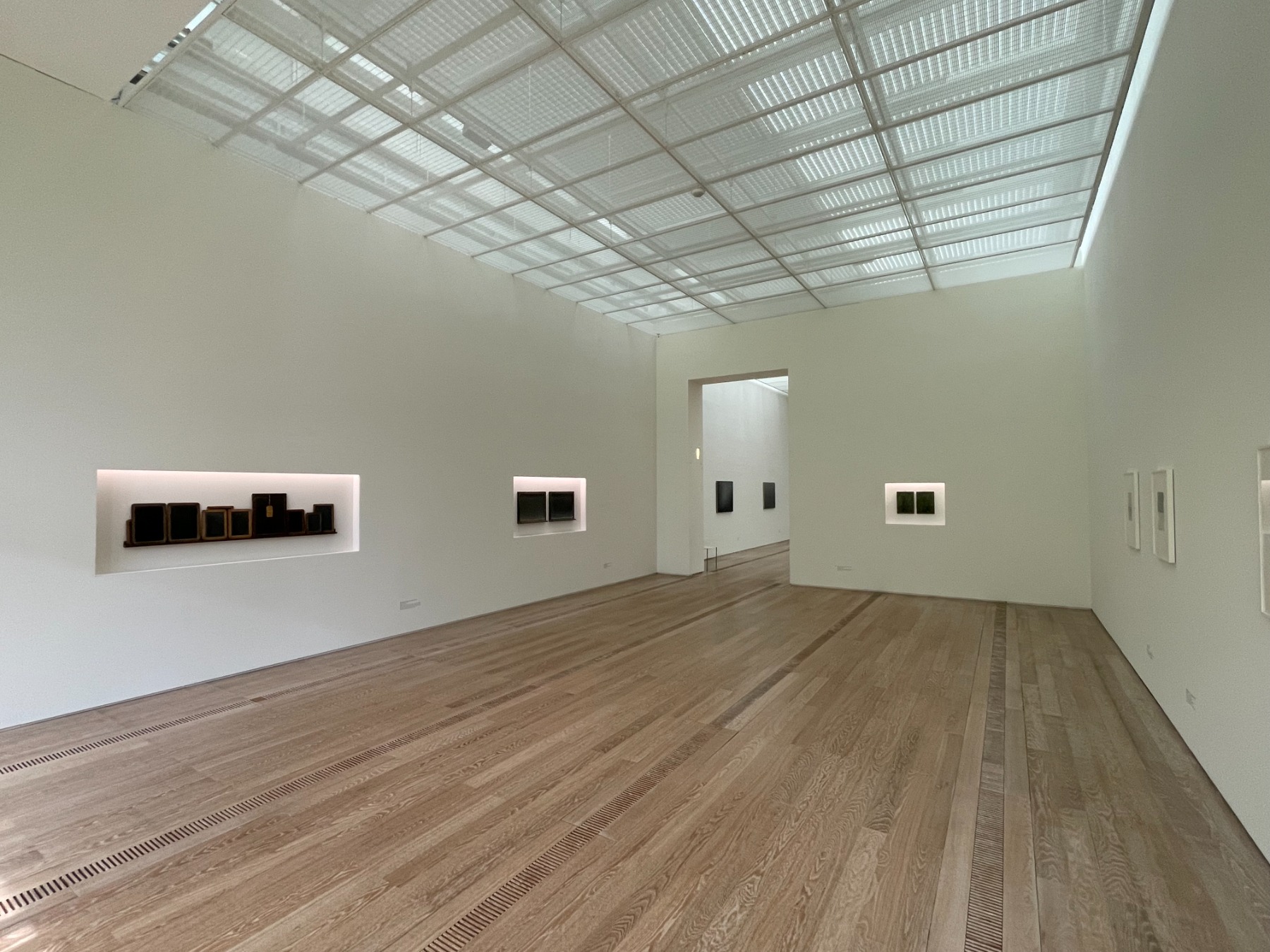
The last page of the catalogue features a portrait of Celmins wearing a paint-splattered apron – she looks directly into the camera through binoculars. The eighty-six-year-old artist definitely has a funny bone, as this photograph reveals. A film made specially for the exhibition gives an idea of the artist’s character and how much she likes – or doesn’t like – to talk about her art; the latter prevails, as viewers learn that it is nearly impossible to extract explanations of Celmins’ art from the artist herself. Instead, a somewhat humorous biographical documentary has been made, one in which the filmmakers follow around a subject who somehow manages to keep wriggling out of engaging in a ‘real’ conversation about her work. Yet the film truly is wonderful, and even a bit moving for us Latvians, as Celmins is persuaded to sing a particularly meaningful Latvian folk song at one point, roughly translated so:
The night is dark,
The grass is green,
As I let my horse out to pasture.
After which Celmins wipes away a tear.
Barrier. 1985–1986. Oil and wax on linen. Anderson Collection at Stanford University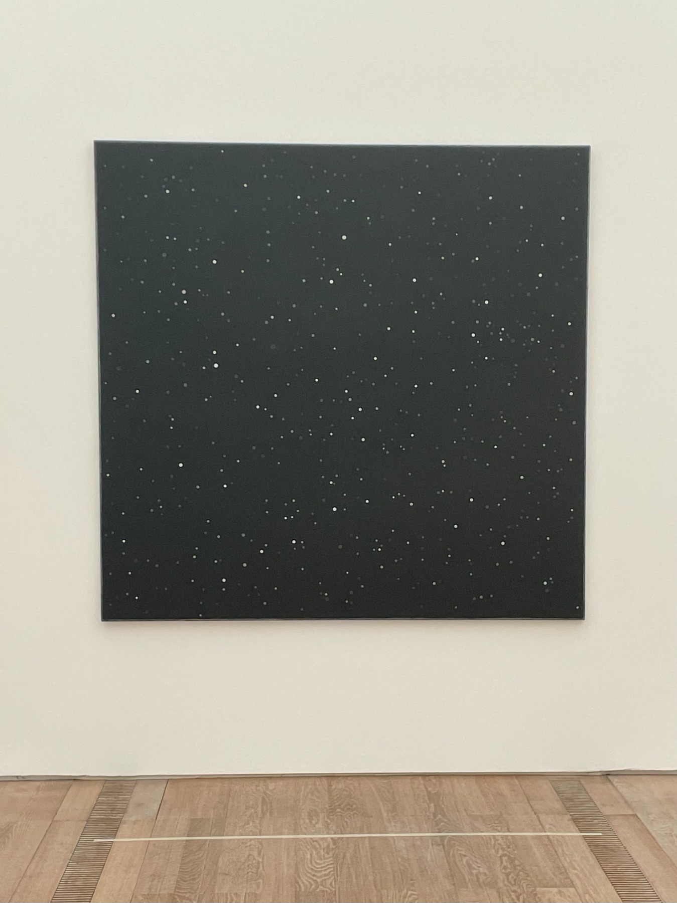
How has Vija Celmins won her solid standing in the Western art world, one with so many imposing and larger-than-life names? Willem de Kooning, Mark Rothko, Clifford Still, Andy Warhol, Roy Lichtenstein, Jackson Pollock, Frank Stella, Barnett Newman… this was the generation of American art that came before Celmins. Hundreds of celebrity-level artists created great works in physically impressive proportions, each one introducing an unprecedented nuance to the art world. ‘This is my conversation with other artists,’ Celmins said when asked about her work on the hot morning of 13 June at the press conference for her solo show, which was held on the Beyeler Foundation’s outdoor terrace under a canopy of leafy gnarled trees.
Vija Celmins and James Lingwood at the press conference held on the Beyeler Foundation’s outdoor terrace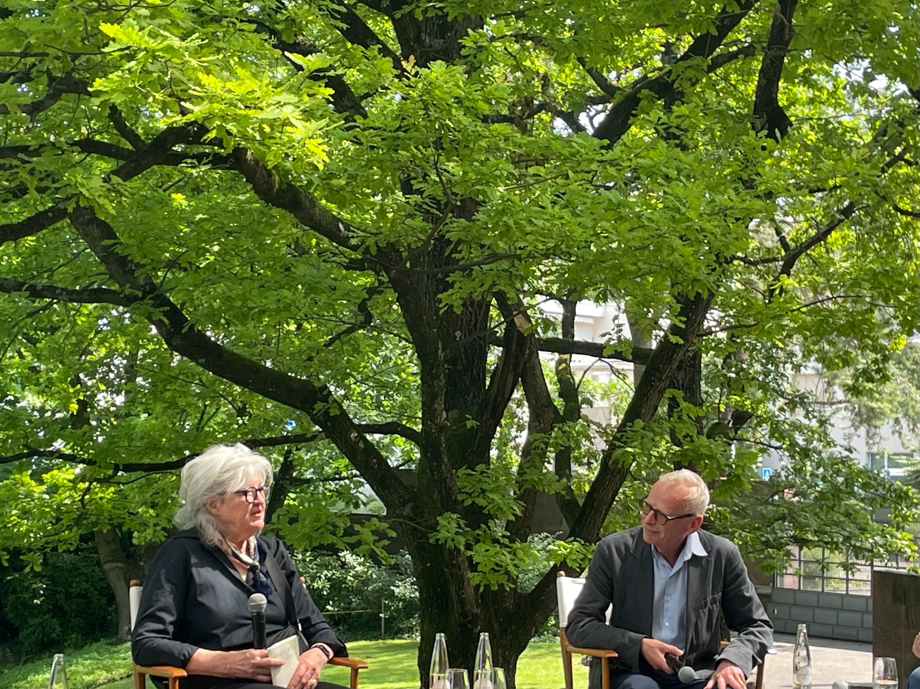
On the one hand, she is fully inside the American art scene, but on the other, she seemingly resists what is considered ‘American’ – for instance, in a parameter as simple as the size of her art. She has never been interested in working on pretentiously large pieces; her works are modest in size.
Envelope. 1964. Oil on canvas. Private collection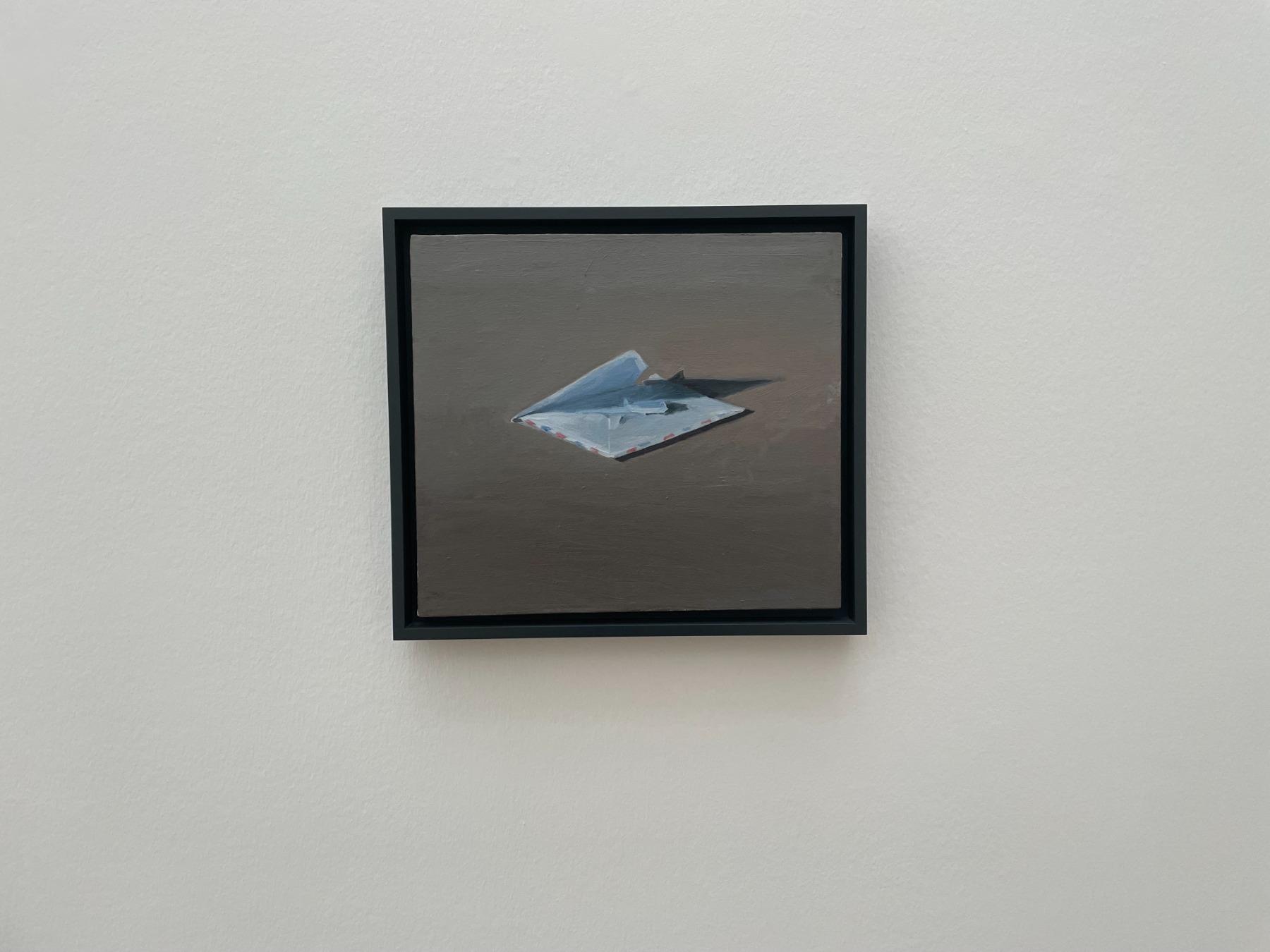
In 1957, while she was still a student, she first saw the work of Giorgio Morandi and was overcome with fascination – ‘how something so small can be so powerful.’ She then realised that it was not the size of the work that held its power. Celmins’ still lifes of the 1960s may have been decidedly influenced by Morandi’s art, but simplicity, concentration and introspection have remained in her works throughout her life.
Porsche. 1966–1967. Oil on canvas. Collection of the Glenstone Museum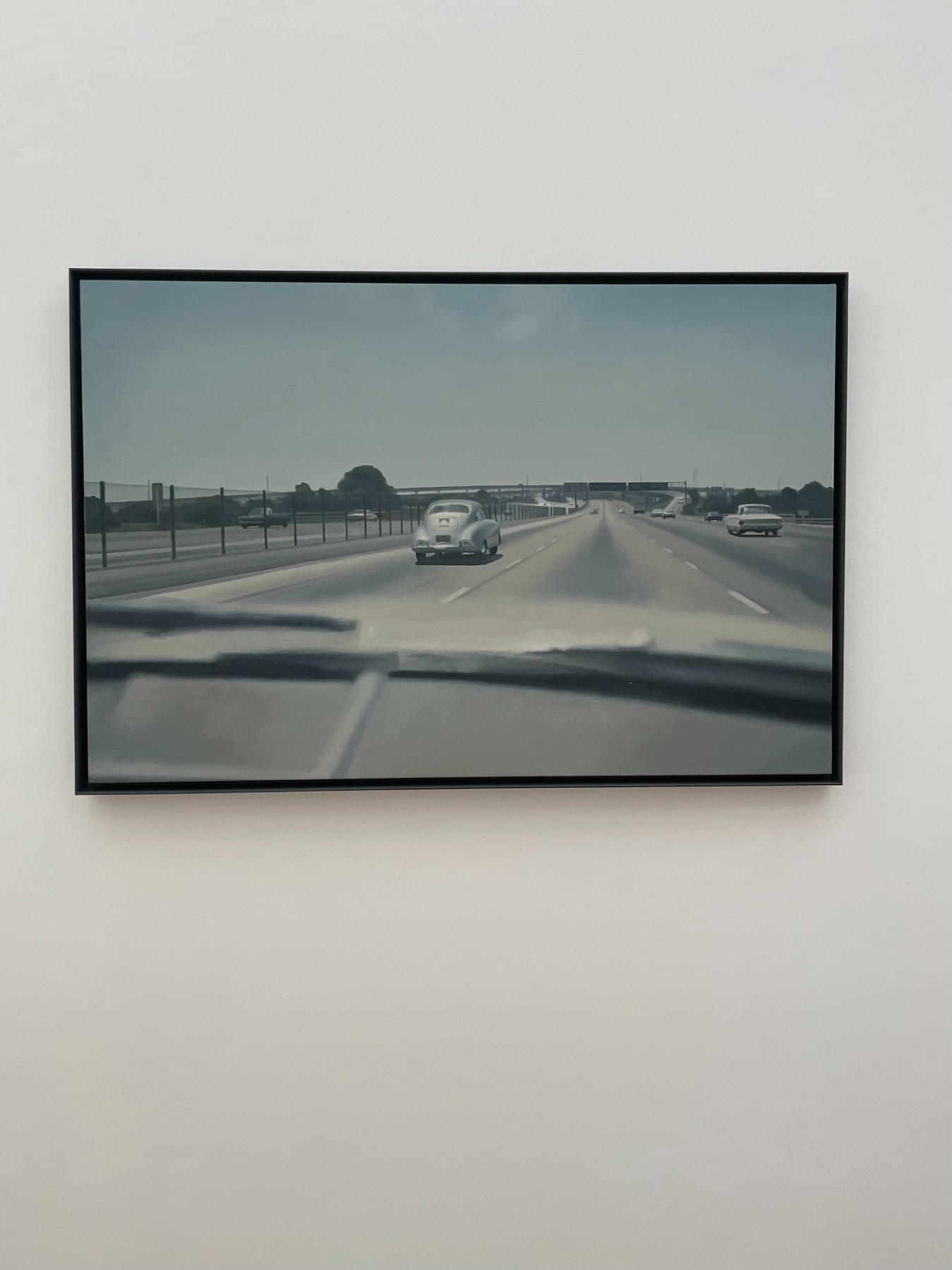
Celmins developed her art alongside the art movements that flourished in American art after WWII. She embraced the innovations introduced by the new movements, simultaneously denying them a position of dominance in her art. Abstract Expressionism, Pop Art, All-over Painting, Colour Field, Photorealism, Minimalism, Conceptualism – bits and pieces of all these can be found in her work. Non-American Surrealism should also be noted. However, it cannot be said that she belongs entirely to any one of these movements. Celmins in particular does not like to be ‘credited’ with Photorealism, which is mentioned in most encyclopaedic descriptions of her work.
Snowfall. #2. 2022–2024. Oil and alkyd on linen. Matthew Marks Gallery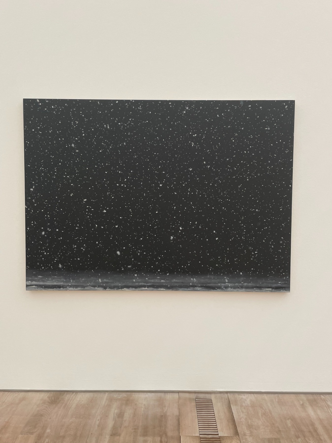
In the 1950s, when Celmins was studying at the John Heron Art Institute in Indianapolis, Abstract Expressionism seemed the only possible form of expression. ‘We all wanted to be like de Kooning,’ she once told me in conversation. She didn’t stick with abstract expressionism, yet there are techniques in her work that come directly from that art movement. In the late 1960s she started to use the All-over method, in which the whole surface of a work is evenly covered – without any focal point or compositional hierarchy; the eye is free to wander over the entire work, the composition basically staying the same from top to bottom and from one side to the other. In a sense, her seas, deserts and stars can also be seen as abstractions. However, in complete contrast to Jackson Pollock, who literally splashed his paint, Celmins has chosen to be super-precise in her work. Colour-field painting also involves covering a canvas or paper surface from edge to edge with paint, yet Celmins distanced herself from using colour and its associated emotional impact. She has always been firm in her denouncement of evoking an emotional response in the viewer, unlike, for instance, Rothko. Celmins’ work is neither emotional nor depressing.
Flying Fortress. 1966. OIl on canvas. The Museum of Modern Art collection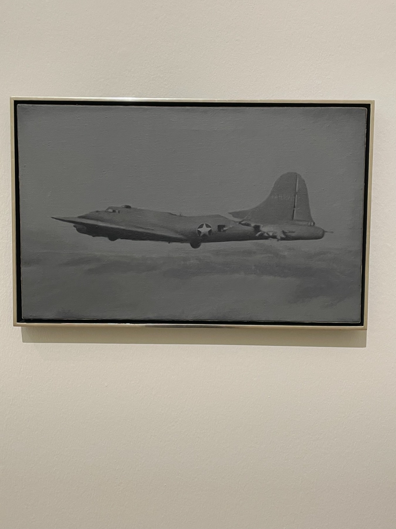
In the 1960s Celmins turned to images found in magazines and books. Of course, here one has to reference the Pop Art technique of using images found in mass media, as well as the acceptance of the victory of the masses and ‘low culture’ in the modern world. However, there is something biographical in Celmins’ choice of images. She says that sometimes when she looks at books or magazines, a reaction takes place in her and old events resurface. Photographs of WWII aircraft conjure up her childhood fear of a sky roaring with war planes. The first atomic weapons tests, the social unrest of the 1960s, violence and conflict, forest fires, burning houses, American highways, and lastly, the first images from the moon – these were all over the media, and so they became the images that Celmins would use in her work.
House #2. 1965. An oil-painted wood and cardboard sculpture. Private collection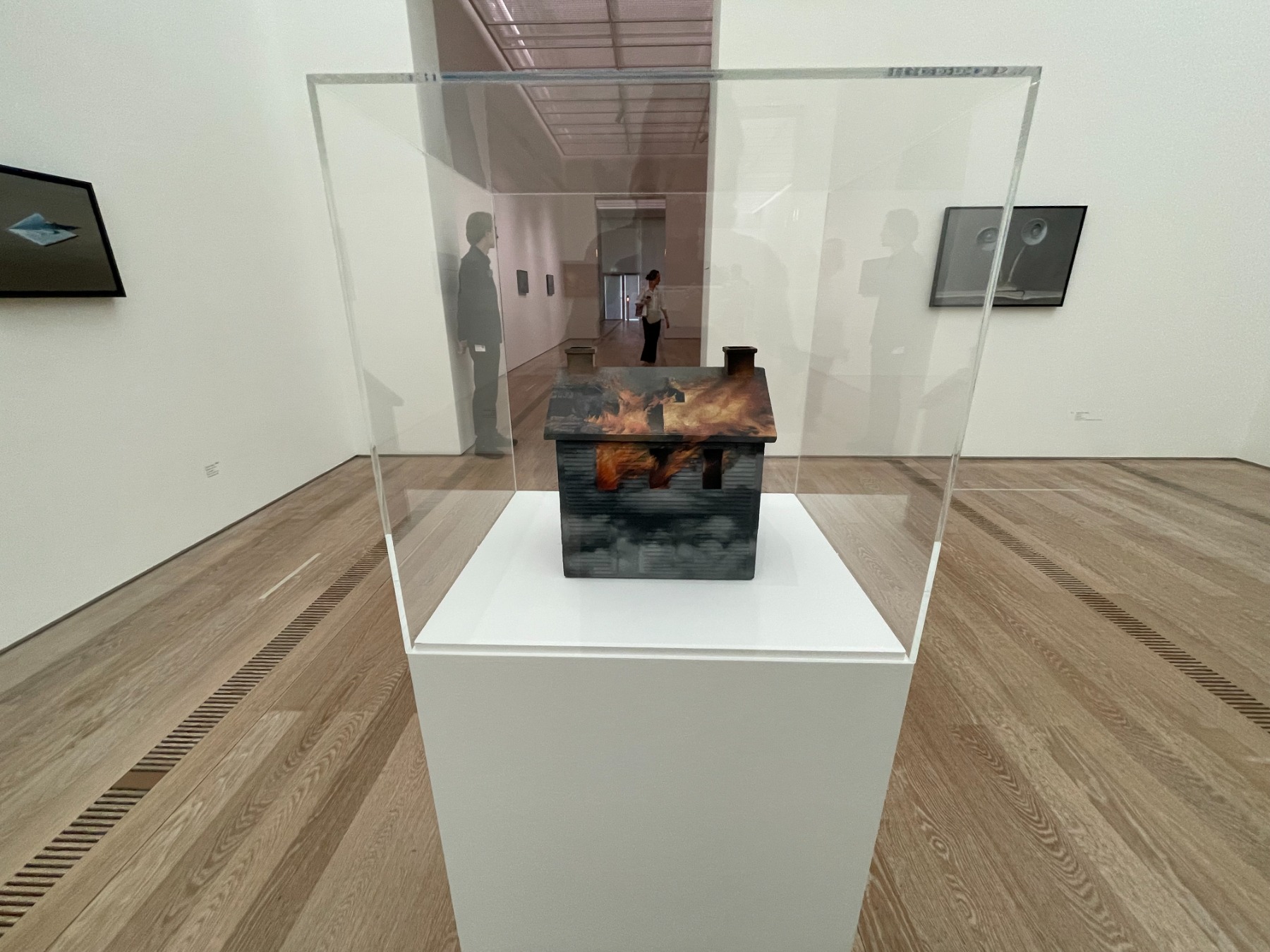
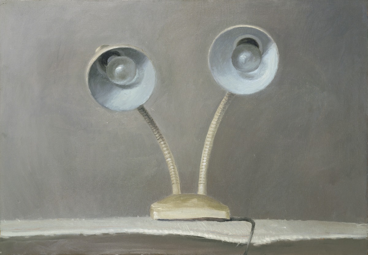
Yet Celmins depicted the intrusion of the news into people’s everyday lives from a distance, as if through a mediated medium – a photograph or a television screen. The images she produced were black and white, yet she did choose to paint flames in a glowing orange, thereby creating a disturbing heightening of the event depicted. Celmins’ still lifes from the 1960s, in which she painted or drew everyday objects from her Venice Beach studio in Los Angeles, were completely different – an electric cook-top, a heater, a table lamp. Like Morandi, these paintings were executed in gradations of grey tones. But although Celmins’ objects are depicted realistically, they seem almost surreal in the sense that they look frighteningly alive. The shades of the lamps are turned upward to face the viewer like two eyes; the heated filaments of the space heater emit an eerie orange incandescence from the object’s ‘mouth’. Celmins’ pop art of everyday things is also related to Magritte’s philosophical irony of how we perceive the world.
Pncil. 1966. Wood, oil on canvas, graphite. National Gallery of Art, Washington, D.C.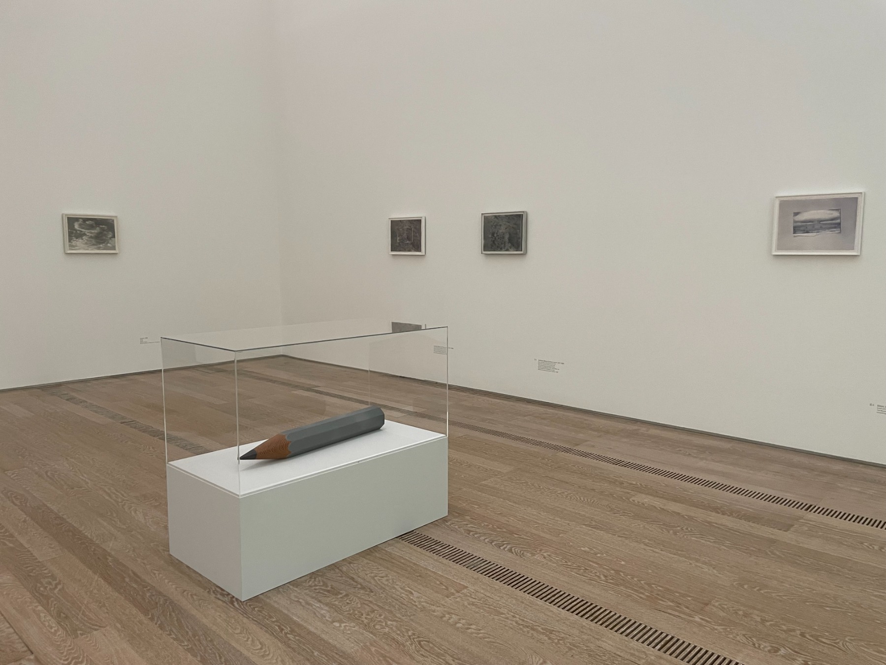
Celmins’ hyperbolised sculptures – a comb, an eraser, a pencil (the latter is also on view in this exhibition) – were also inspired by Magritte’s Personal Values (1952) painting. Magritte’s influence in Celmins’ art later developed into a kind of paradoxical conceptualism, which can now be applied to her entire oeuvre. In particular, she has always tried to bring down to ground level those who tend to wax romantic about her stars, oceans and everything else that she depicts in her works. What you are seeing, Celmins always reminds us, is a flat paper or canvas surface covered in graphite, charcoal, oil, or some other substance. What you are seeing are neither stars, nor oceans, nor anything else. Here, of course, one cannot not reference Magritte’s painting titled The Treachery of Images (aka This is not a Pipe).
To Fix the Image in Memory XIII. 1977–1982. One found object and one made object: powder pigment and binder on bronze. the Fondation Cartier pour l’art contemporain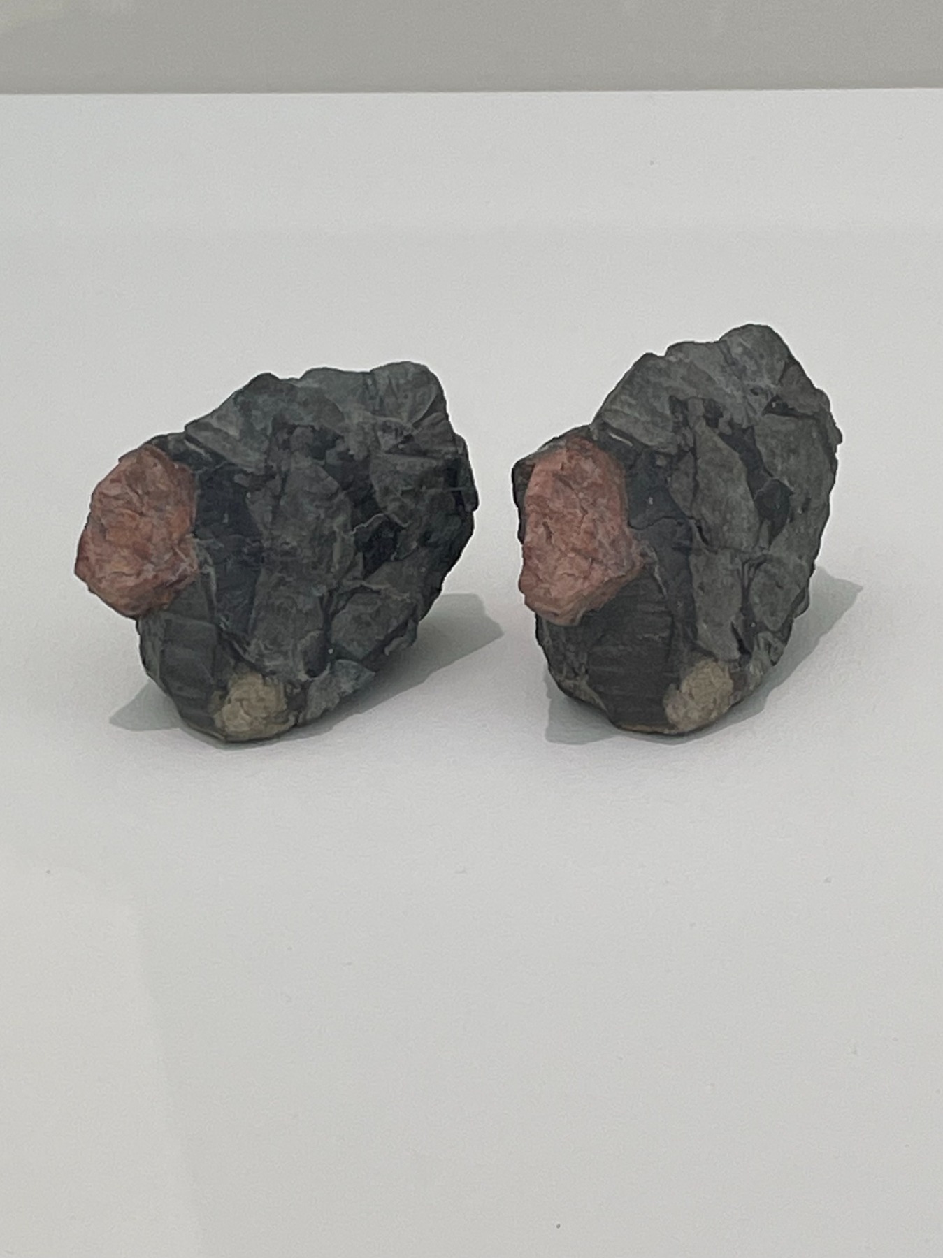
Celmins has also cleverly played out tricks of the imagination in her rock sculptures, which are well represented in the Basel exhibition. These are pairs of rocks: one real, the other a copy cast in bronze and painted to resemble the real rock as closely as possible. The first collection of Celmins’ rocks was created after a relationship break-up. For five years she worked on the piece To Fix the Image in Memory (1977–1982). The creation of this work was also a kind of meditation. Before that, in 1975, she, like John Cage, Allen Ginsberg and others, learned the basics of meditation under the guidance of the Tibetan Buddhist monk Chögyam Trungpa Rinpoche.
Blackboard Tableau #1 (2007-2010), San Francisco Museum of Modern Art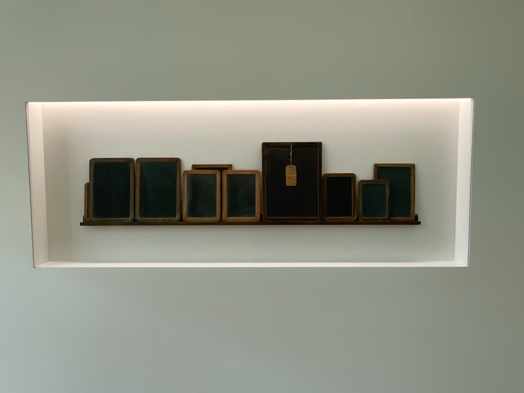
Blackboard Tableau #14. 2011–2015. Collection of the Glenstone Museum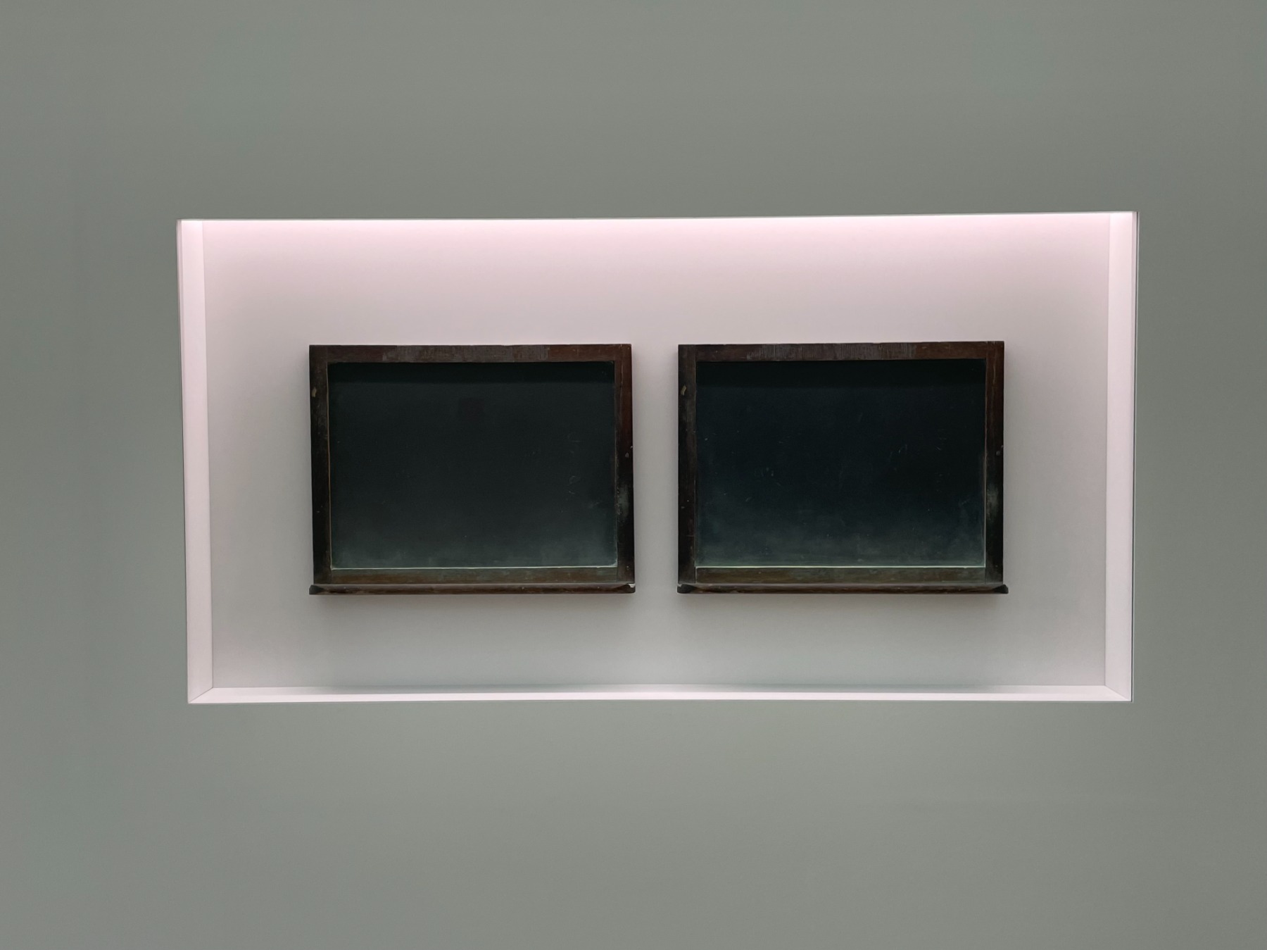
Celmins also made sculpture pairs from antique writing slates or blackboards, once used by schoolchildren, that she found in flea markets; these tableaux can be seen in several versions in the exhibition. The charm of old things, their shabby textures and the temptation to ‘transfer’ them once again into paintings is also one of Celmins’ whims.
Plate. 2013–2023. Oil on canvas. Private collection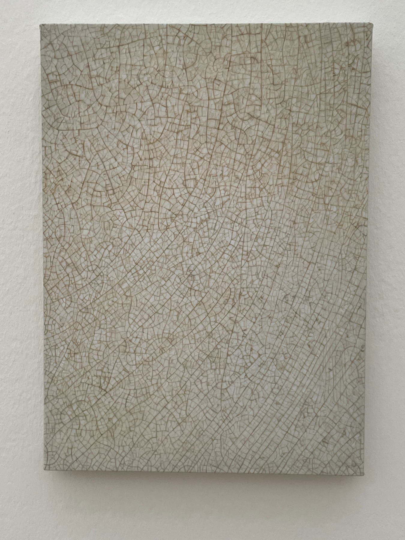
The exhibition features paintings depicting the worn and battered cover of an old Japanese book, as well as the delicate crackling seen on the surfaces of an old porcelain plate and vase, respectively. Celmins approaches these works as painterly tasks, using a series of gradations of colour that, to the superficial viewer, can be misleadingly monochrome. However, Celmins’ ‘ode’ to the painting Japanese Book (2007–2010), which is done in shades of blue-grey tones, is best described by the orchestra of colours that play out her painterly symphony: Ultramarine Light / Old Holland Blue / Titanium Opaque White / Yellow Ochre Deep / Cap Yellow Extra Deep / Raw Umber Light / Burnt Umber / Mussini Blush Grey I / Brownish Grey I / Brownish Grey II / Old Holland Grey / Ivory Black / Cobalt Violet Deep / Cerulean Blue Light.
Untitled (Night sky #13.). 1996. Charcoal on paper. Museum of Modern Art in New York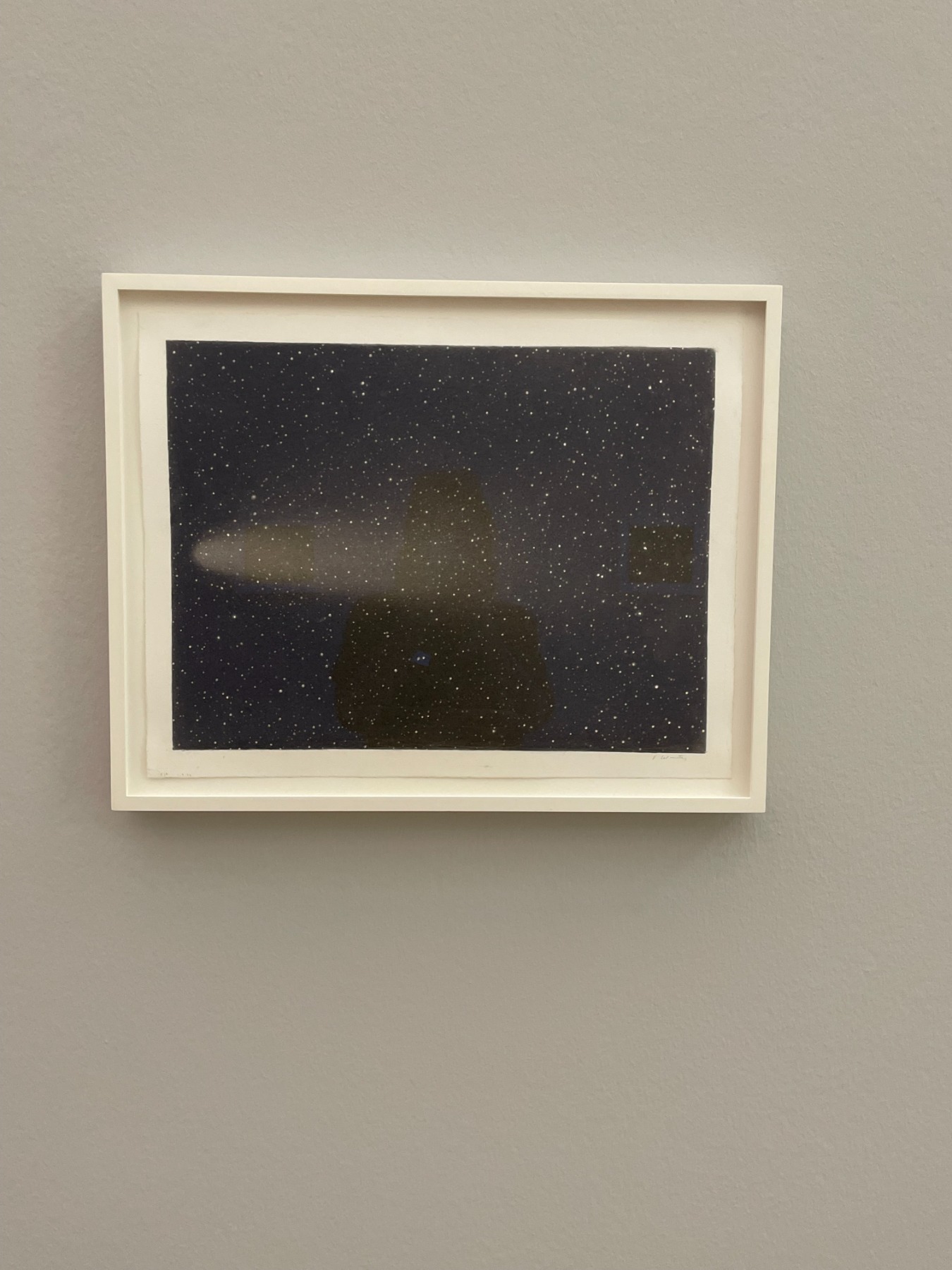
Celmins’ works create a calm, quiet, even transcendent atmosphere. ‘My works are silent,’ is how she puts it. Perhaps the mode of silence and a calmed mind that Celmins’ art exudes are linked to meditation. She once lived in California, after all, where Zen Buddhism has been trending since the 1950s. In the late 1960s she began to depict the ocean, the desert, and stars. Her water surfaces are calm – you won’t find the romance of a roaring Turner-esque seascape here. Once, when Celmins was showing me her work, she pointed out that one of her ocean pieces was ‘too wavy’; then she singled out a star-scape piece of hers – with a comet – as having ‘too much activity’. As for her works featuring the ocean’s surface, she once thought that this was something she could do for the rest of her life. In fact, this is exactly what she’s been doing all her life; it’s just that she happened to stumble upon other fascinating phenomena which also became sources of inspiration. For instance, the natural world of California and its deserts – as well as the sky above them.
Untitled (Desert-Galaxy) (1974). ARTIST ROOMS Tate and National Galleries of Scotland
© Vija Celmins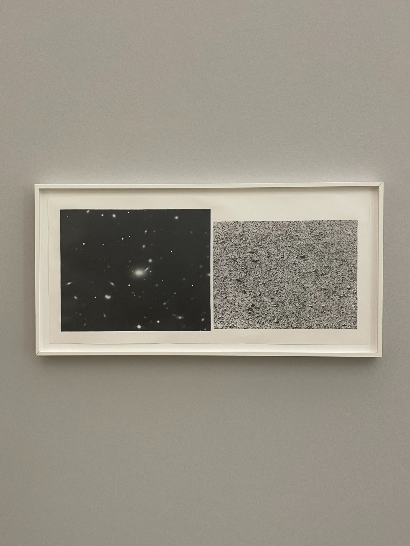
In her catalogue, Celmins writes about the desert: ‘It was a place that made you feel as if your body had no weight. At first I thought there was nothing there. Then I began to see things. I was always having to adjust my eyes back and forth – both far and close, which is how I think about my own work sometimes. It lies somewhere between distance and intimacy. That early discovery about that different kind of space – where you don’t really know how far or near something is – had a subtle influence on my work, especially in the work of the late 1060s and 1970s.’
Vija Celmins’ works are like places without bounds – no time, no space. The super-realistic paintings and drawings are also decidedly abstract, akin to psychological landscapes that say more about the inner experience than any external environment. ‘I have several loves. The love of the surface – to see how close I can get to it without disappearing into it totally.’ So says Vija Celmins about her art.
Ladder. 2021–22. Cast stainless steel, alkyd paint. Collection of the Glenstone Museum 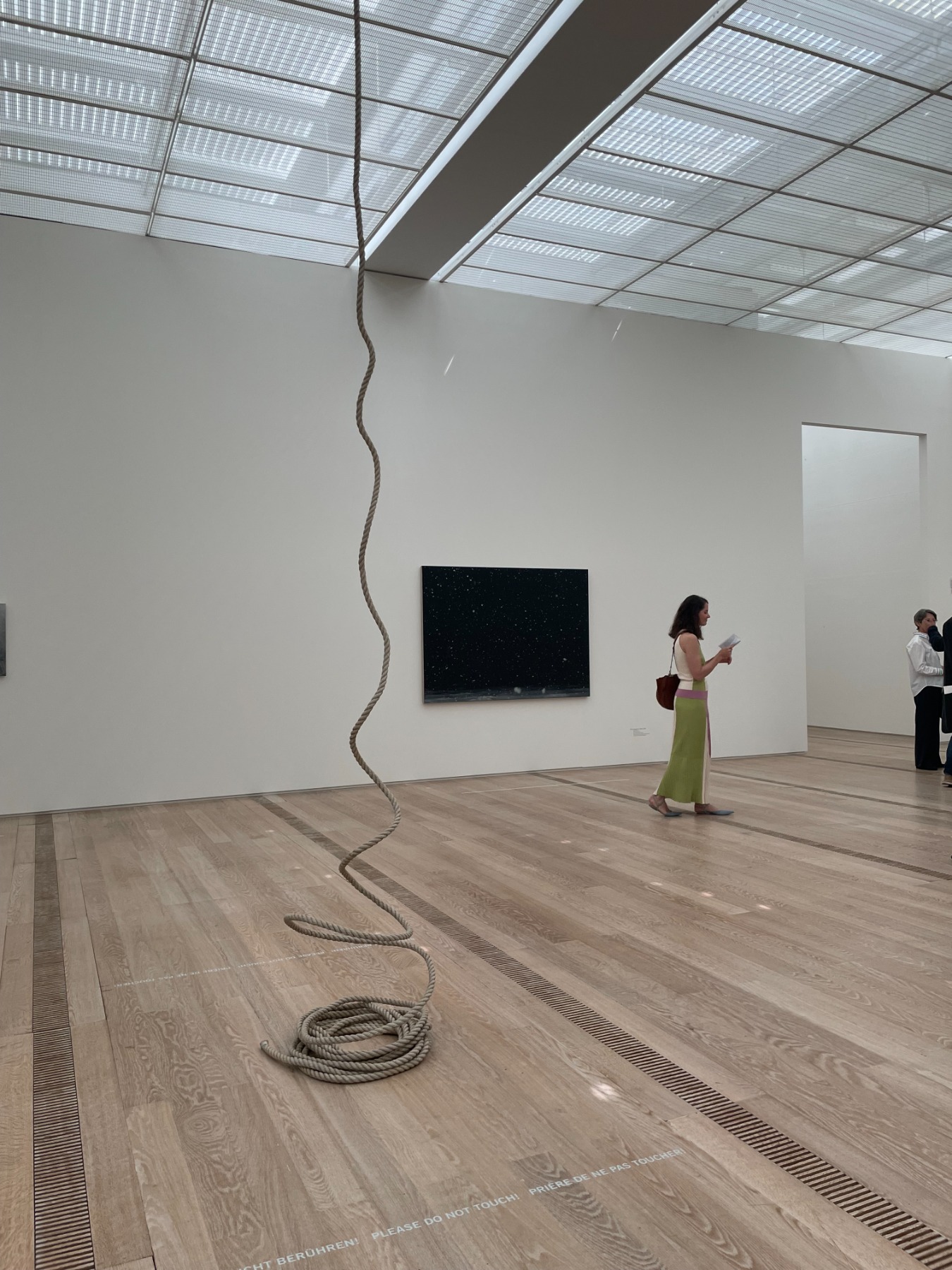
Title image: Vija Celmins, Lamp #1, 1964. Oil on canvas, 62,2x88,9 cm
© Vija Celmins, Courtesy Matthew Marks Gallery / Photo: Aaron Wax