Homecoming: Romas Viesulas, a retrospective on native soil
Author: Romas Tauras Viesulas, son of the artist Romas Viesulas (1918–1986)
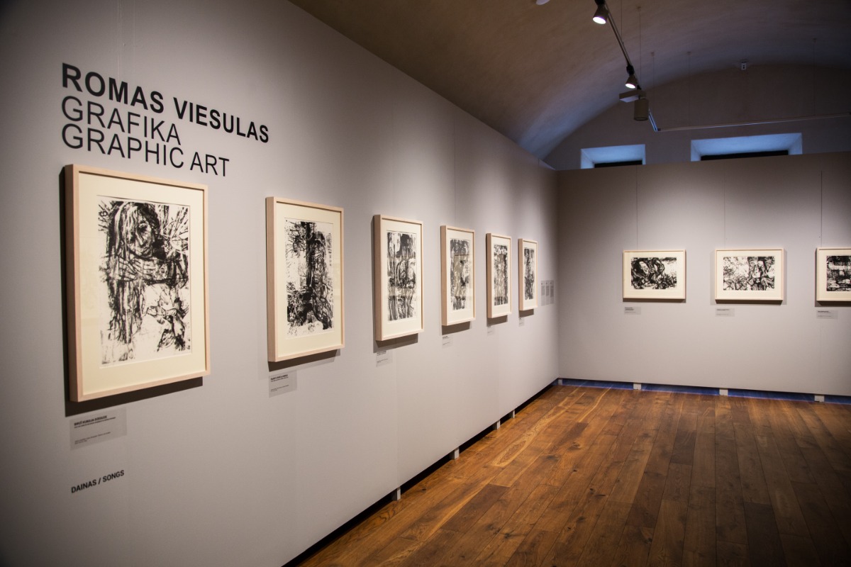
Graphic Art
Retrospective Exhibit of Romas Viesulas
Daugavpils Mark Rothko Art Centre, Daugavpils, Latvia
07.02.-14.06.2020.
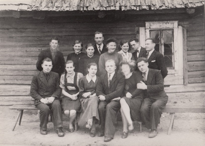
I first came to Latvia in 1990, and came to Daugavpils in search of my extended family. My father was born very close to the city of Daugavpils, in the village of Eglaine, and his older brother and younger sister were still living there at the time, in the very house where he was born. Everything looked very different then.
Romas Viesulas, seated first on left, on the occasion of his older brother Vitauts’ wedding to Veronica, center
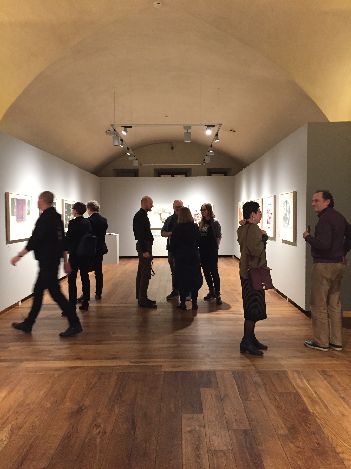
The military barracks that is now Daugavpils Mark Rothko Art Centre were effectively an abandoned ruin. I find there's something quite poetic about the idea that a military installation, a fortification that was created by the Tsars as an outpost for defending Empire, should be repurposed into a cultural institution. Something that was originally a symbol of violence and domination has become instead a gathering place for people celebrating beauty, creativity and art. It's absolutely an honor to be able to exhibit Romas Viesulas graphic work in this fine institution, which seemed so unlikely only a few decades back. It’s easy to forget that this seemed impossible not long ago.
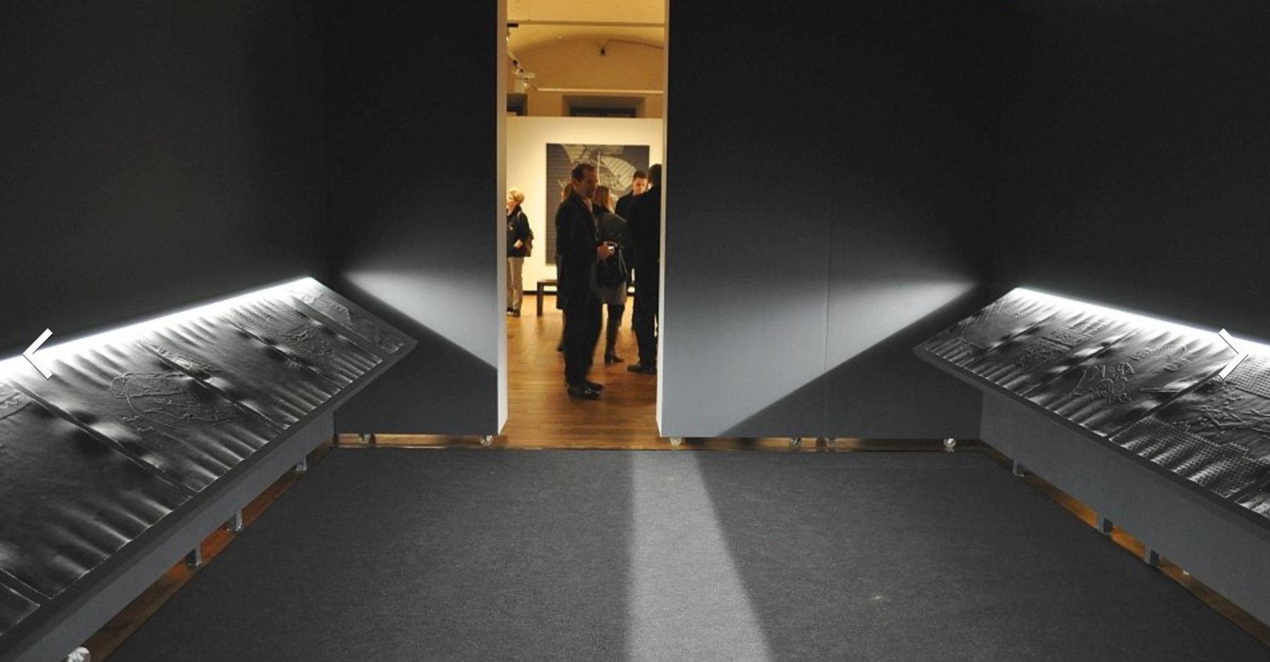
Rothko Center, installation view, Overpass and Notes on Image, left to right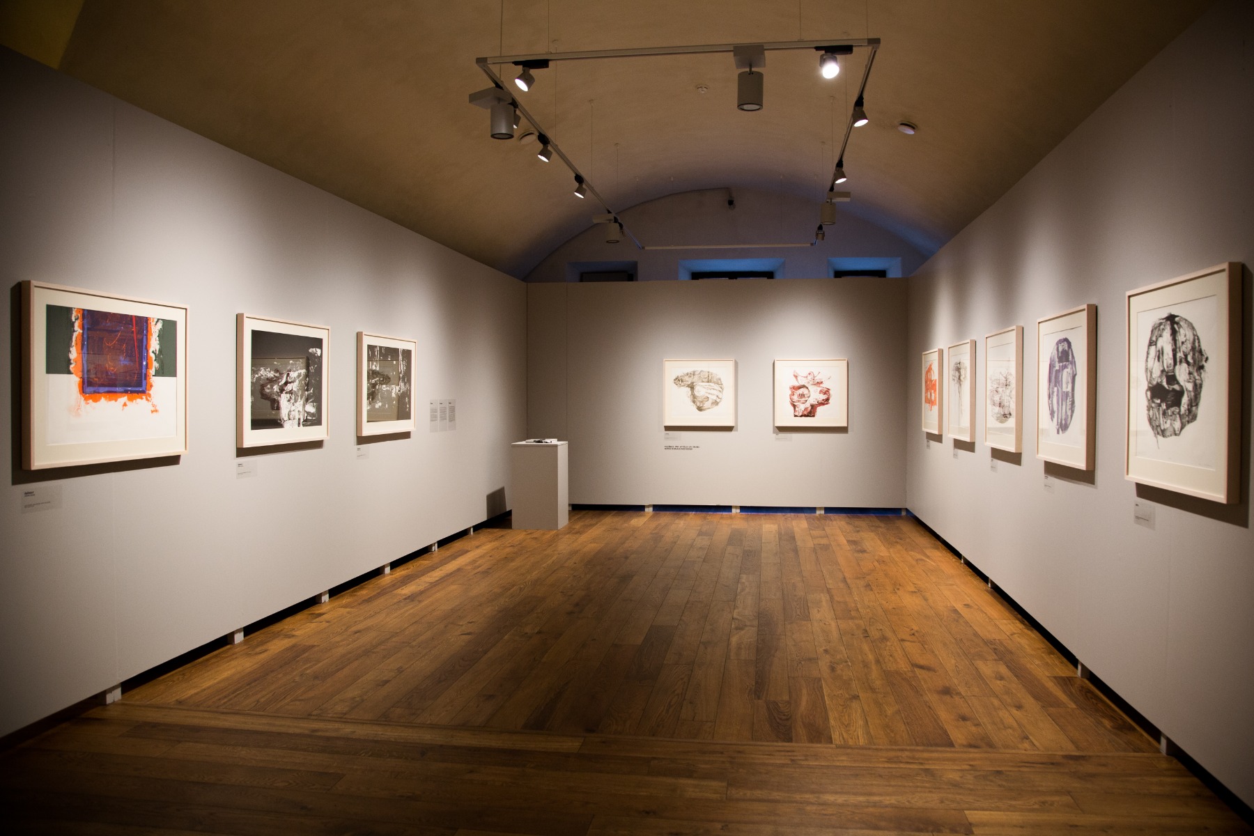
In this article I hope to give you an idea of how his artistic vision evolved over the course of his career. It would be clear very early on as a viewer walks through the exhibit that he worked in several different media. Overwhelmingly, however, I'd say his signature medium was lithography. This is a form of printmaking that's done on stone. It's an imprint taken from a stone – which is where the word lithography comes from - ‘litho’ for stone, ‘graph’ for writing. Early work that we see in the first few galleries are all lithography. In the following galleries you'll see that he introduces innovations of technique, medium and material, like prints without ink - where there is an embossing or relief and the paper becomes almost sculpted by the plate that is printed on - or prints on fabric. Traditionally, printmaking involves works on paper, but fabric enabled him to work on a scale much greater than a typical printing press would allow. He began as a printmaker in a very traditional style, but as his career evolved, he introduced radical innovations both technically and in terms of scale, which makes his work quite varied. The very largest of his works spans 4mx1.5m and was an image that it would be impossible to print on paper. It was printed by hand on fabric.
DAINOS
1958 - FIRST GUGGENHEIM FELLOWSHIP
From the cycle Dainos, lithograph
The lithographs in the cycle Dainos were created by passing an inked stone through a machine, an old-fashioned printing press, the sort that you might see for printing a book for example. This series was the first that he received significant recognition for as a newly arrived artist in the United States. They are images taken from Lithuanian folk songs, hence the title Dainos, meaning ‘songs’ in Lithuanian. They are figurative works, with subjects that are readily recognizable - a young boy, a beekeeper, various animals represented. All of them are figuratively depicted, and although already in these early works there is a very gestural expression, all of them still recognizable as objects or individuals from everyday life.
TORO
1960 - FIRST TAMARIND ARTIST IN RESIDENCE, GUGGENHEIM FELLOWSHIP
The same is true for Toro, where we move from something directly representational to something that's already one step more abstracted, though still featuring recognizably figurative elements such as human features, faces and bulls. He also moves from monochrome to quite a vibrant color register.
This was a pivotal series for Viesulas and a major professional milestone. It really was a breakthrough. This work today is in the permanent collection of the Museum of Modern Art in New York, which is perhaps the most famous museum of 20th century art in the world. If the Louvre in Paris is the temple for Old Master art, the MoMA is like the temple for 20th century art. Toro is in the permanent collection of MoMA, and other portfolios also feature in other major American museums such as the Metropolitan, the Philadelphia Museum of Art, the Art Institute of Chicago, LACMA and others.
Romas Viesulas, right, with Tamarind director Clinton Adams, working on Toro 1960
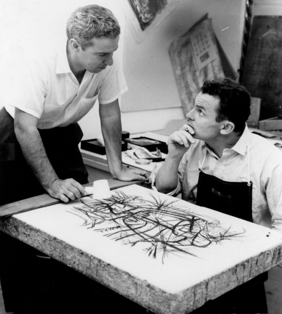
Toro was created at The Tamarind lithography Workshop, which was founded in California in 1960 as an institution dedicated to the promotion of this printmaking technique. He was the first to be invited as artist in residence to help the institute meet its mission statement, which was to import techniques in lithography printing from Europe where it had a very long history of being used for artistic purposes, whereas in America there wasn't much of a tradition of using these techniques beyond commercial reproduction.
This work is important in a number of respects. First of all, it marks a major development in American printmaking. Tamarind wasn't exactly introducing lithography to the American public but nonetheless, it significantly helped to raise lithography’s profile and indeed was purchased by MoMA and other important institutions when it was issued.
Secondly, it was a watershed for him as an artist. From this moment on, Viesulas’ career really took off. He went on to win a number of awards and prizes thereafter, including three Guggenheim fellowships, a Tiffany fellowship and others from a number of different establishments.
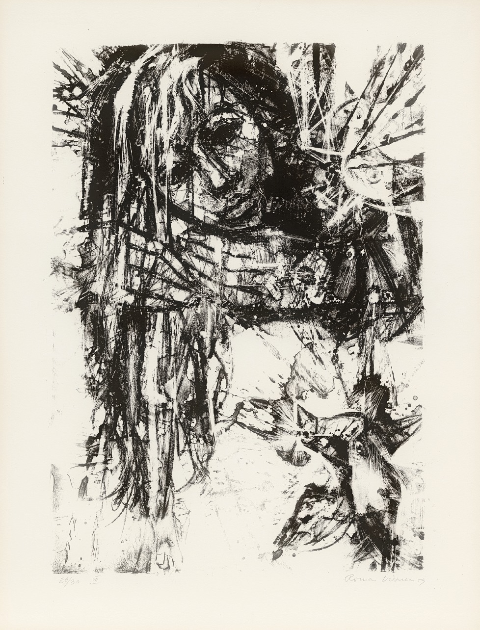
With Trumpets of Shadow, lithograph from the cycle Toro
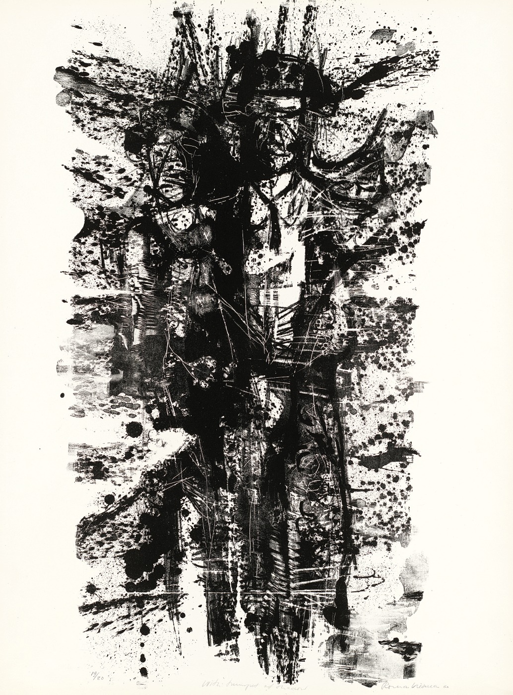
The bullfight is a recurring theme in Western art. Picasso depicted bulls and bullfights, Hemingway famously wrote about bullfights. This series is about the bullfight, but not from the heroic perspective of the toreador or bullfighter, but from the perspective of the bull. In the end, the bull gets slaughtered as part of the ritual of the bullfight. As an observer, you know from the beginning that it's a fight that the bull can never win. There's a recurring theme in my father's work throughout his career of paying tribute to individuals or peoples that were perhaps heroic but were not recognized for their heroism in the history books. Those who were somehow obscured or forgotten, which can give much of his work a melancholy aspect. He was a champion of the unsung. A lot of his work deals with painful and traumatic episodes in history. I believe that much of that sentiment emerged from his experience of exile. He left his country, his native soil, very close to Daugavpils, and he never returned.
However, he kept the idea of home close. He studied in Germany immediately after the war, then in Paris, France before eventually emigrating to America to become known as an American artist, and one of the foremost graphic artists of his generation. However, he never forgot that initial loss, the separation from his family, the language, the memories of early life. Themes of loss and longing, themes of the unsung or the unrecognized keep resurfacing throughout this series and indeed all of his work.
This series Toro was dedicated in a frontispiece ‘to unknown bulls facing unknown swords’, in a way to draw attention to all of the stories in history that we don't hear about or read about in the official accounts. History of course is written by the victor, while the vanquished often go unrecognized. They may not have a chance to write their own histories. In a way he was recounting his own story, but telling it in a way that it has universal resonance.
In this striving for the universal and the absolute, he shared a sensibility with the Abstract Expressionists like Rothko, De Kooning, Pollock, who came a generation earlier, and whom my father revered. In their art they strove to express themselves in universal ideals or in themes that relate to humanity, rather than specifically being from a particular country or particular tribe.
HEW
1963 - TIFFANY FELLOWSHIP
Romas Tauras Viesulas in a public talk - walking tour of the exhibition in Daugavpils Mark Rothko Art Centre on February 8, 2020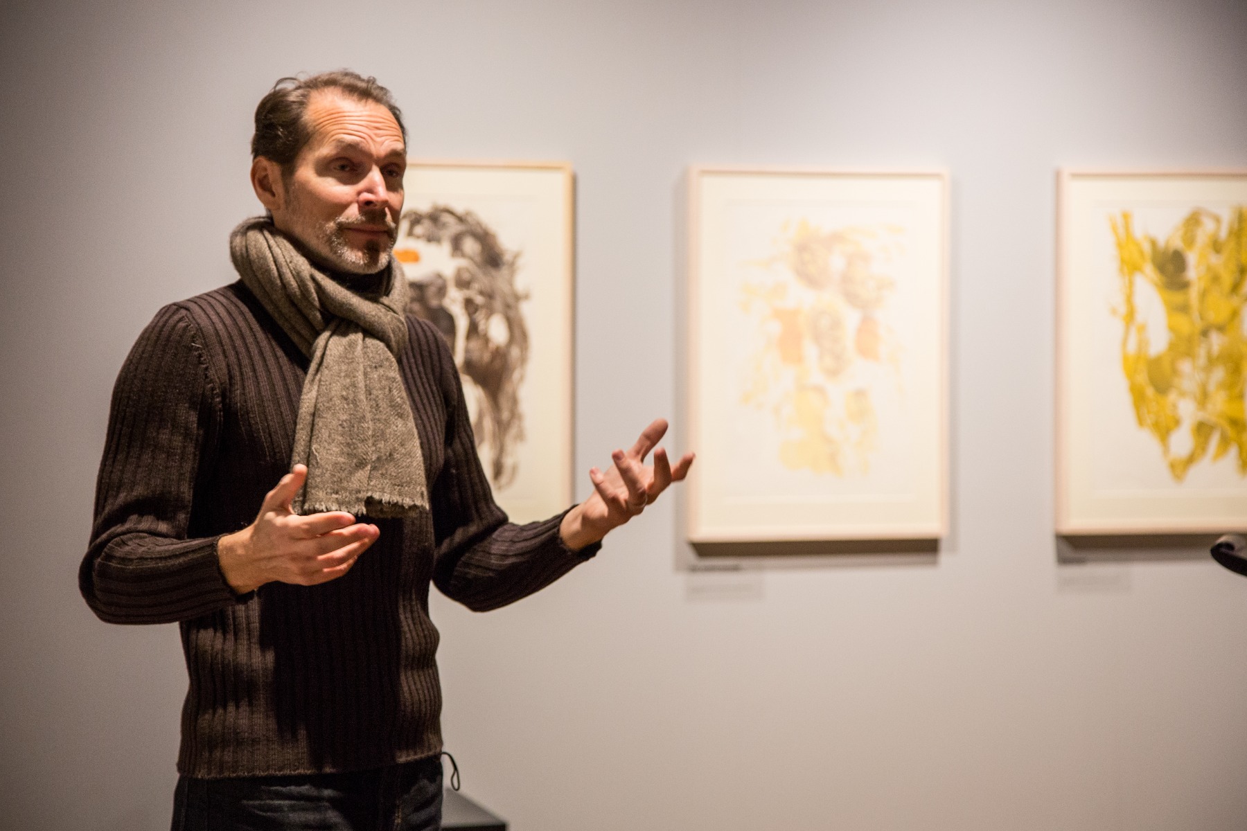
The series Hew refers to just such a tragic episode from history. It was inspired by travels Viesulas undertook to Mexico. He was thrilled to learn about the visual traditions of Mexico and the Yucatan Peninsula. Muralists like José Clemente Orozco had an early and formative influence on American art after the war, and Viesulas was very fond of the Mexican-inspired work of Josef and Anni Albers. You see at once that the color register is quite different from anything that came previously. He starts to introduce colors of the Mexican landscape that had made a very deep impression on him.
Emplumada, from the cycle Hew, color lithograph
Perhaps even deeper was the impression made on him becoming even more familiar with the history of the indigenous peoples. Colonized by Spain and subsequent conquistadores, indigenous peoples and their culture were practically wiped out. We're talking about the Maya, the Aztecs, the Incas. Comparing this cycle to earlier work, you can see that we're one step further along in abstraction. These are not recognizably faces or forms or animals or distinct anything really. However, they conjure up carcasses and headdresses and alien, imposing landscapes.
The title of the series gives a clue, and I feel he's expressing sheer emotion, violence and rupture. Hew is a title that comes from a line in Shakespeare’s play Henry VI, ‘Hew them to pieces, hack their bones asunder’, a terribly violent phrase, referring succinctly to the annihilation – the physical annihilation - of an entire culture. While we know from what he wrote about the portfolio and the titles of the individual prints that in this case the culture in question is the Aztecs, Mexican indigenous culture, there's nothing in the images that tells you literally or specifically that we are talking about Mexico or the Aztecs.
As so often was the case with his approach, he took a real world theme, an episode from history, and abstracted from that something that he wanted to communicate as a universal truth about the human condition, and about the often terrible things that we do to one another in the name of ideology, country, religion or commerce. He did live an experience of colonization and violence personally, and reflected on it throughout his artistic career as an exile, but he sought to express it through his vision of the world around us in some sort of universal form.
TRAMONTO
1971 - MONUMENTAL WORK ON FABRIC
Gallery view, opening of the exhibit ‘Graphic Art’ at the Rothko Center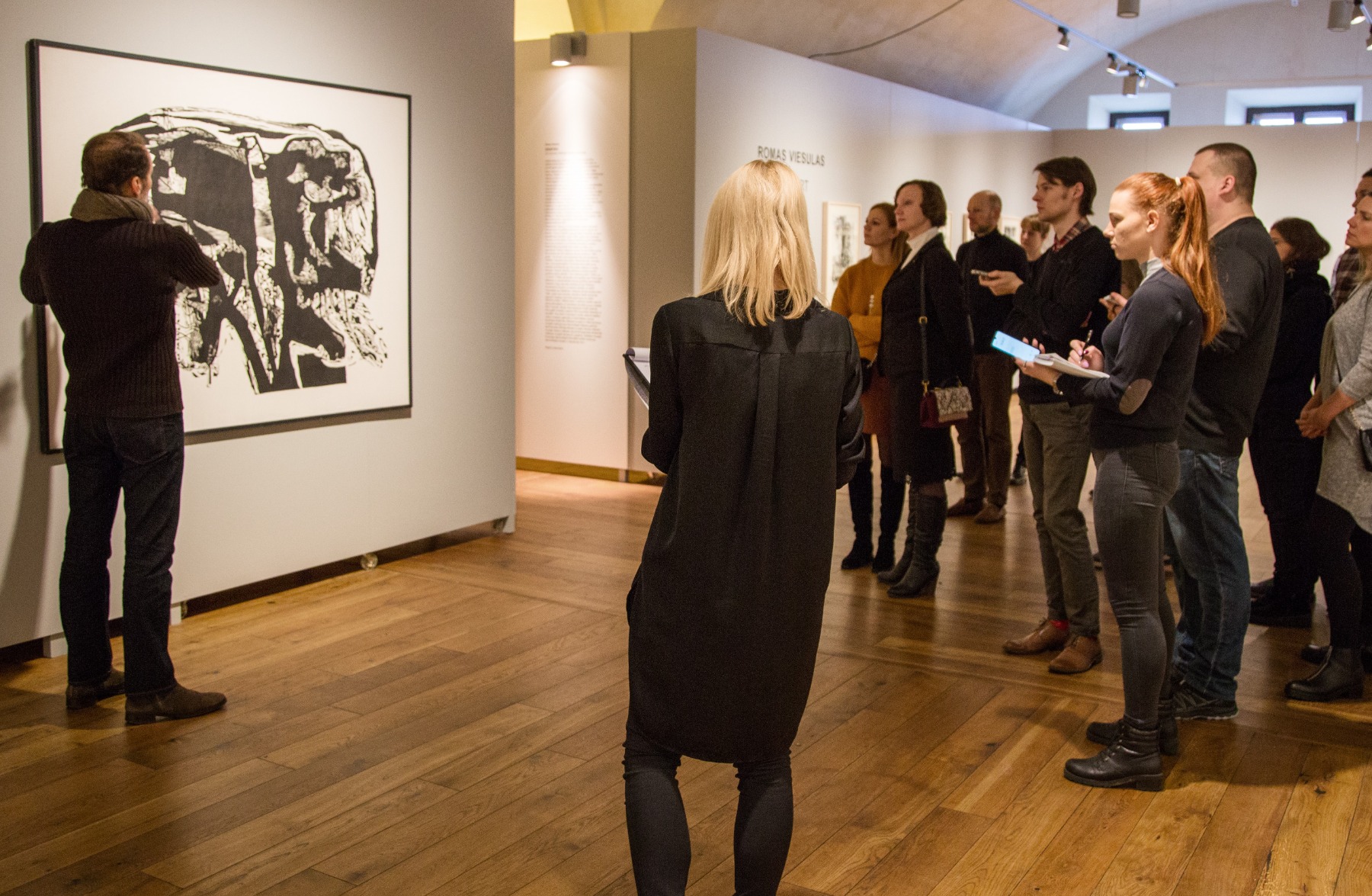
This is an example of one of the larger works on fabric that I mentioned briefly earlier. While Dainos, Toro and Hew are all lithographs, this represents a different technique. Tramonto is a little bit like a woodcut, which may be a familiar technique to many of you. A block of wood is carved, ink is applied to the surface, and then an imprint is taken from the carved block of wood. Here, the principle is the same, but instead of carving into wood, the surface that gets worked up is linoleum. You may be familiar with flooring linoleum. Traditionally, linoleum is a mix of wax and resins on a canvas or fabric base, which enables you to roll it and work the surface quite easily. Viesulas liked to use linoleum because it was very porous, and enabled extremely subtle carving effects, without having to work with or against the natural grain of wood. Linoleum gave him the ability to work in any direction without having to contend with the material structure of wood itself. There are incredibly fine lines in this work as you can see.
Romas Tauras in front of Tramonto, linocut on fabric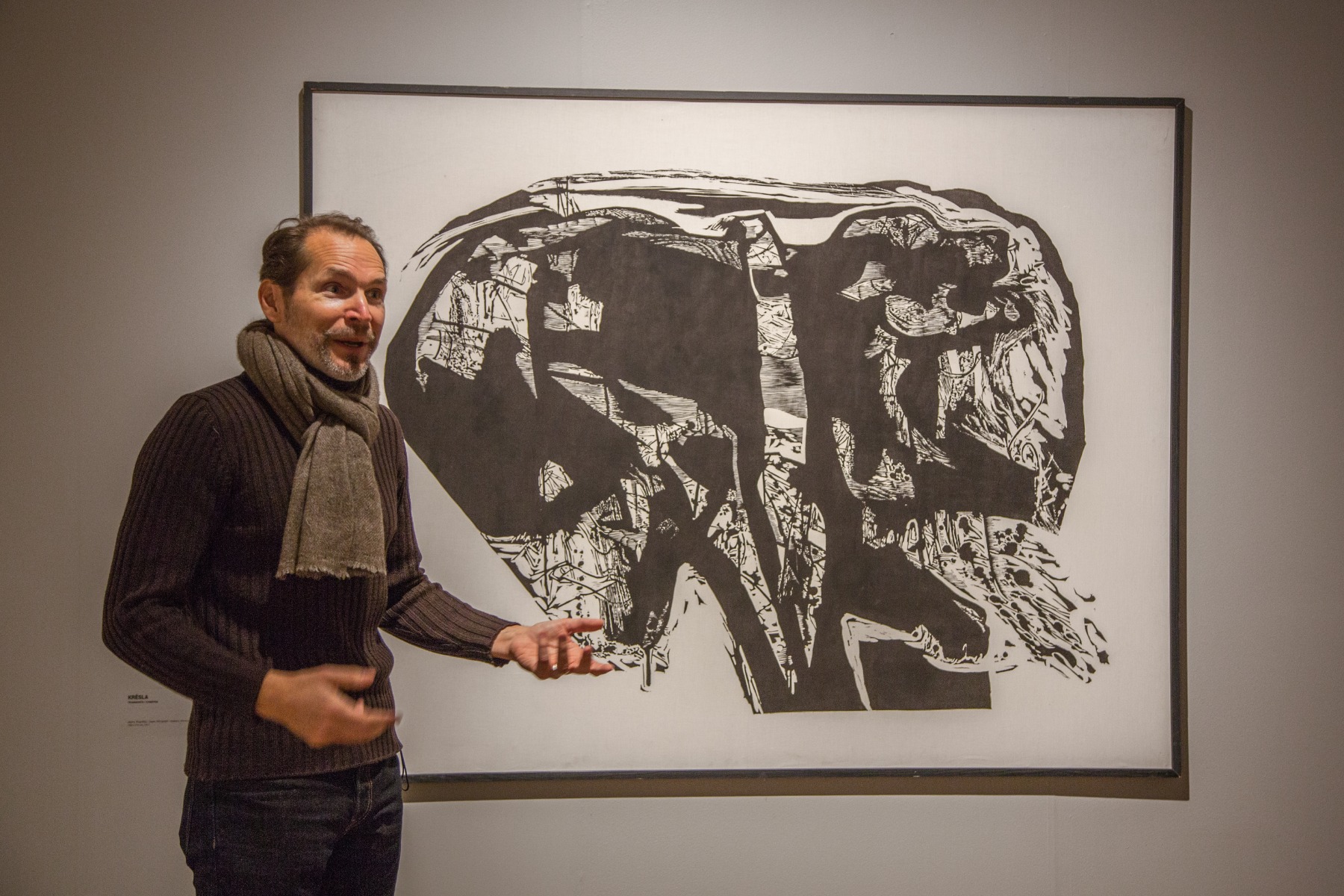
Tramonto is the Italian word for sunset. You might wonder, in what way does this represent a sunset? In fact, when I was growing up, these are the sort of questions we would often ask him. ‘What’s going on here? What is this all about?’ This print is a good example of that kind of puzzlement. My brother, sister and I used to call it ‘Ciuckis’, which is a diminutive in Lithuanian for dog or puppy. In the upper right hand of the dark shape, you can kind of make out what looks like it could be the head of a dog. In fact, I learned later something that perhaps he didn't want to tell us as children. As it happens, one inspiration for this work was the sight of a dog dying in the street. Perhaps it was run over. One moment, a domestic animal is walking around minding its own business. The next moment, its life ends violently in a collision with a car. This may seem like unlikely material for inspiration. Well, it depends on your sensibility. Tramonto is yet another example of Viesulas’ fascination with stories of interruption or foreclosure, cataclysmic events that happen and which are beyond any one individual’s control.
You might call this a memento mori, representing the twilight or final moments of this creature. Knowing this, the picture takes on an altogether different aspect. We'd ask him these questions about many examples of his work, sometimes quite insistently, but he always used to say that it is for you, the viewer, to bring to the artwork what you see, your own feeling and your own interpretation. Even if his titles were sometimes illustrative or suggestive, giving us a little context for a particular image, more often it was his intention for the work, especially as it becomes more abstract, to speak for itself, without explanation.
In the example of Tramonto, one might also see a shape reminiscent of a mushroom cloud. That was certainly an obsession at the time. ‘Mutually assured destruction’, or the annihilation of humanity by nuclear war, might also fit the sunset theme, but it’s purely my speculation. You might equally discern a tree, or a human head or fist.
That’s true of the composition overall, but it’s also true of the details. Growing up with these pictures on our walls, I would often find myself lost in these visual labyrinths, mazes of marks that provided for hours of games, imagining things the way that you might look at the clouds and see a dragon or a horse or house. This is one of the many elements that I personally love about my father's work. I’ve spent my entire life coming back to these images, seemingly so familiar from the days of my childhood, and I continue seeing new things, even when I’m familiar with the story of their making.
OVERPASS
1970 - US PAVILION, 35TH VENICE BIENNIAL
Installation view, Rothko Center, Romas Tauras in front of Overpass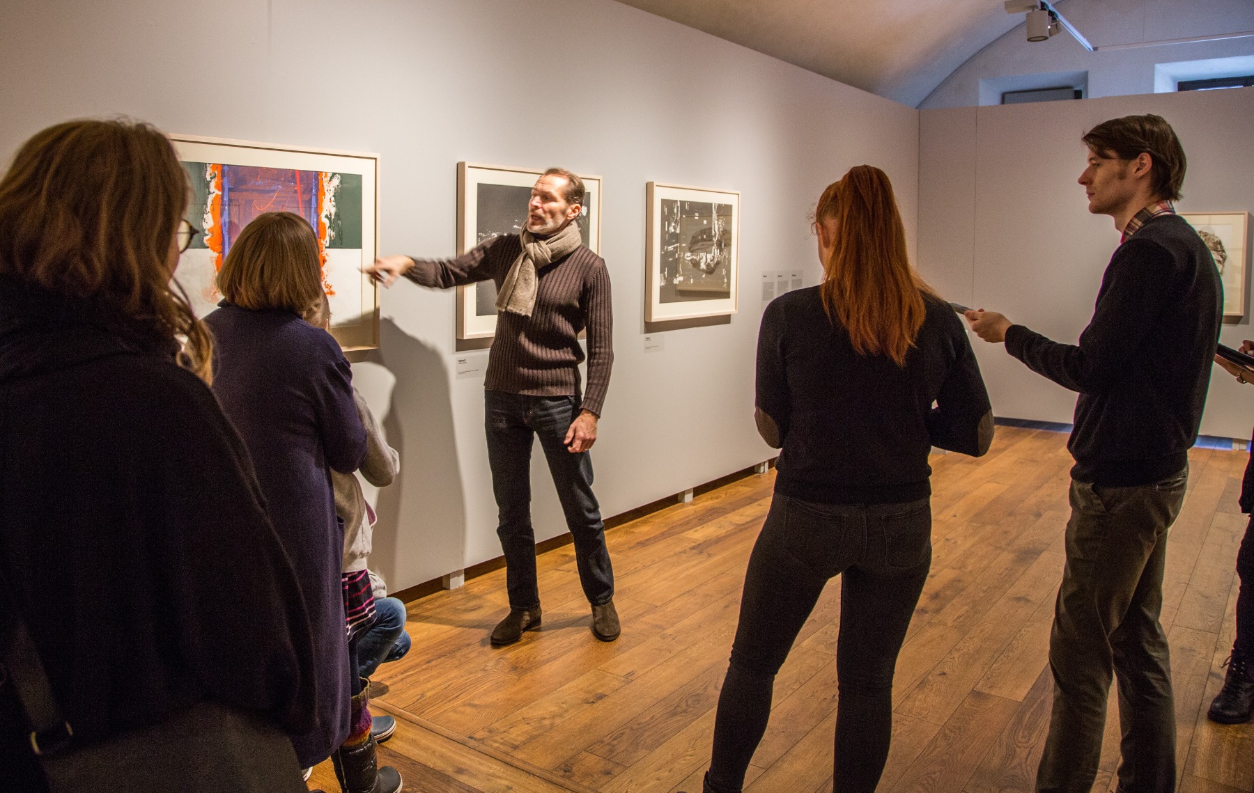
The four prints in this series were created in 1970 for the 35th Venice Biennale. My father represented his adoptive country, the United States, so his work was on show in the American Pavilion where he literally set up shop. His work and his working methods were both on show. There was a printing press literally installed on the premises, and he created the series of lithographs called Overpass.
Overpass, color lithograph
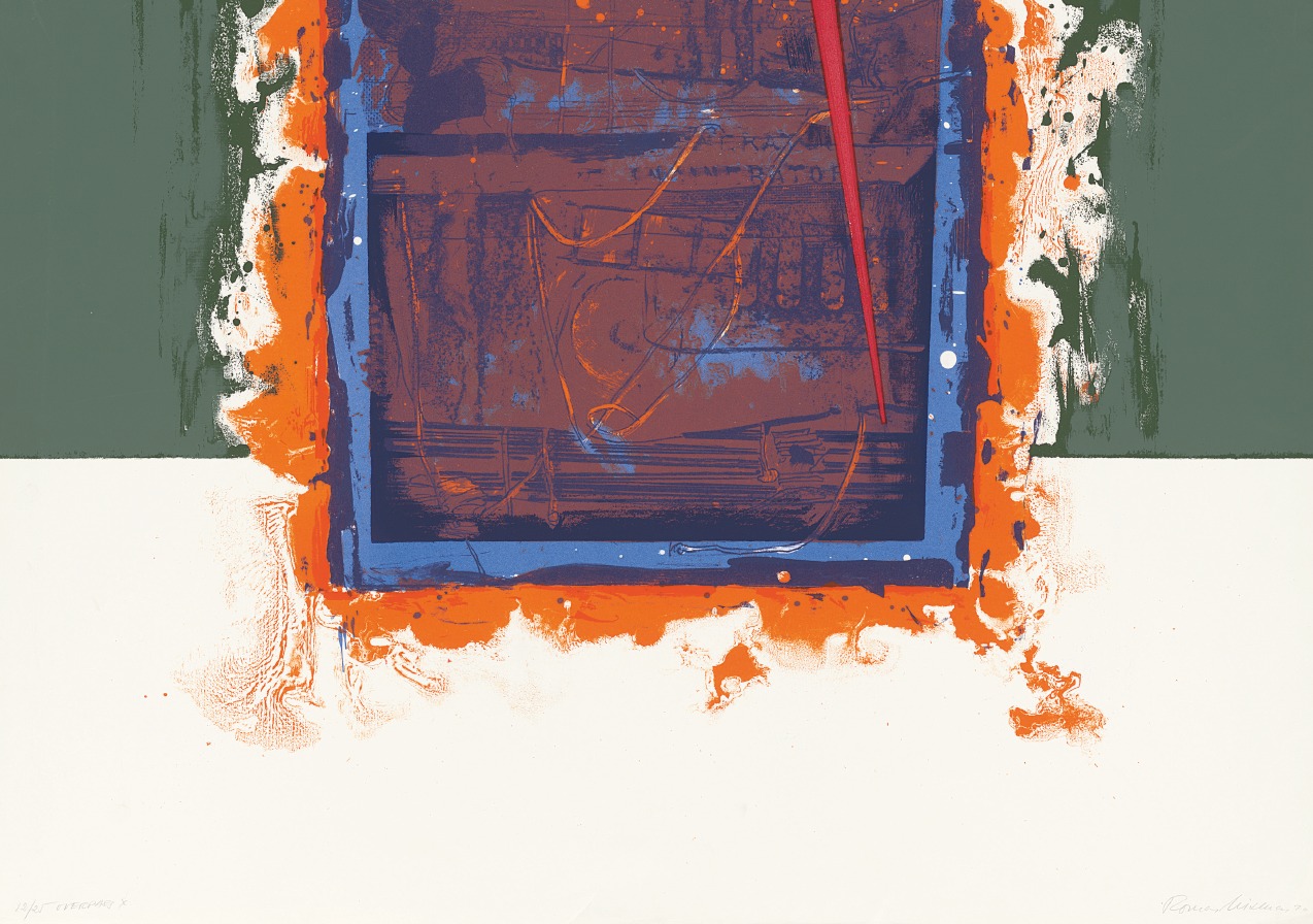
It’s a title that leaves a lot of room for interpretation. To me it conveys the idea of moving from one place to the next, perhaps our trajectory through life, of an argument from A to B. It would also be no surprise to me if my father had drawn direct inspiration from Mark Rothko’s work in creating this series. Look in particular at the first in the series, with the simple geometric forms, the delineation of a kind of horizon line or perhaps a portal or door. And also the use of color. The vibrancy of the palette in this print in particular makes it one of my personal favorites.
Viesulas in the process of creating Overpass in the US Pavilion at the Venice Biennale in 1970
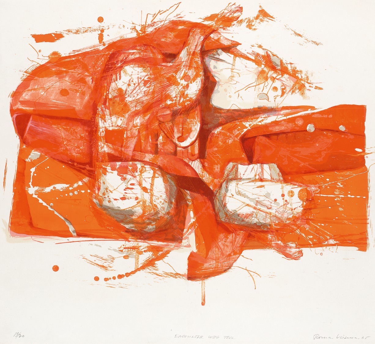
NOTES ON IMAGE AND SOUND
1965 - WHITNEY BIENNIAL
Encounter with Tell, lithograph from the series Notes on Image
This is actually a cycle composed of two parts, both very different looking but conceived as a whole. Notes on Image and Sound is a meditation on visual and musical experience. The color lithographs represent Notes on Image, while the white inkless relief prints the Notes on Sound. Here in a single print cycle we have both traditional lithographic technique on the one hand and then on the other hand, as a mirror image or counterpart, the very innovative technique for its time of carving into linoleum a form that is then printed into humid paper to create something like a two-dimensional sculpture or bas-relief.
Notes on Image has very intriguing titles which may represent mythological creatures or perhaps episodes from the epic poetry of the ancients. They may represent ideas. Some of the images are figurative - you almost feel like you could reach out and hold the objects represented given their almost three-dimensional aspect. There is real depth to the image, but any explicit link to material objects has been obscured, leaving space for your interpretation.
Rothko Center installation view, Romas Tauras and translator Inga Gedžūne in front of Notes on Sound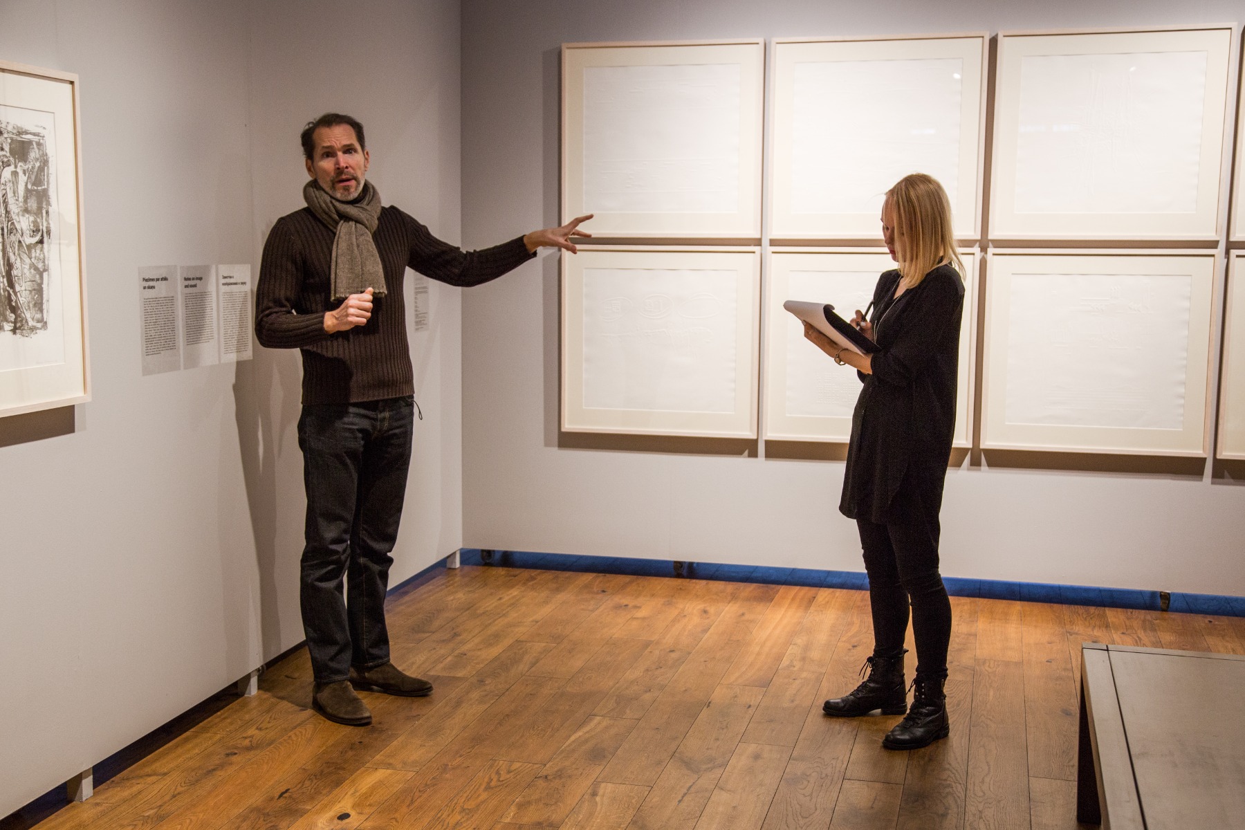
The Notes on Sound seem to hover between two- and three-dimensional representation, insubstantial perhaps like the music that they represent.
These are all collaborations with prominent electronic and experimental musicians of the day. Viesulas was fascinated by the power of music to evoke emotion. I believe he strived for his own work to communicate or elicit emotions in the viewer in the same way that music does. We recognise intuitively that a musical passage is sad when we hear it. Or anxious, or thrilling or joyful - you know instantly what it's ‘telling’ you or how it makes you feel. Happy music might make you feel like dancing. You would never mistake a song of celebration for a funeral march. The collaboration involved working directly with a number composers, speaking to them about their work, listening to their compositions and interpreting their scores - the musical notation – or indeed the music itself, sometimes both, and then creating visual impressions of the musical composition.
Eulogy to D, from the series Notes on Sound, inkless intaglio relief print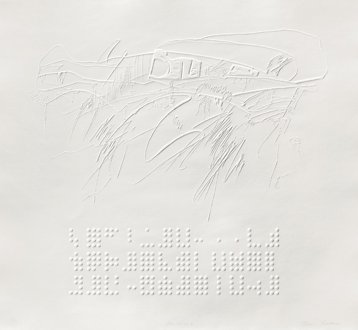
Some of these prints are recognizably representations of a musical score. We can find elements of traditional notation. Elsewhere, it starts to look quite robotic, almost like a digital visualization done with technology. Keep in mind this series was done at a time when computer technology was really just starting to become widespread. These were all electronic musicians, so you can imagine the overlap in these areas of interest, even if some of these ‘scores’ look like complete abstractions. Whether the notation was of machine origin or not, all of these relief prints were from a hand-carved linoleum base, even the most mechanical looking. The more impressionistic look rather like a visual or even a physical expression, a gestural image, of how that particular piece of music acts upon us when listened to.
In the relief prints, too, when you examine them from up close, it’s easy once again to get lost in the details.
DAY OF 23
1971 - MONUMENTAL WORK ON FABRIC
Rothko Center Installation view, Day of 23 and Yonkers I & II from left to right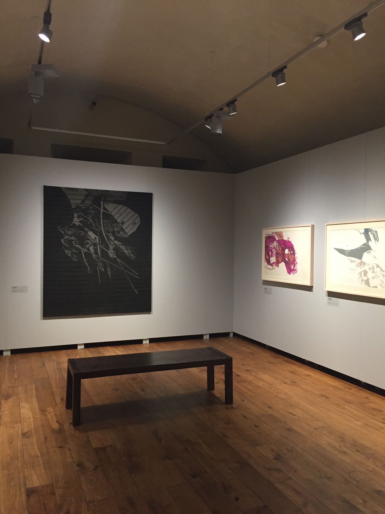
My mother was one of my dad's most steadfast collaborators. Aside from helping him pack and ship works of art for this exhibition or that gallery show, she would sometimes be involved in actually making them. Some of the larger prints like this one she actually helped to print by hand. These are works that are much too large for a conventional printing press. They might be carved from a single piece of linoleum – which is heavy stuff! – so it would be arrayed on the floor like a carpet, then meticulously carved to achieve the reverse image he sought. It’s also difficult, if not impossible, to find paper large enough to cover this sort of area, so he would work with fabric. Fabric would be laid down onto the linoleum base, and given the extremely fine detail, rather than using a roller, which didn’t afford the necessary pressure, he would actually print it using the back of a spoon. Here, he enlisted my mother's help. It's such a vast area that even working jointly, it would take days and days for the two of them to finish a single print.
R30
1979 - AMERICAN ACADEMY IN ROME, FELLOWSHIP
Installation view, R-30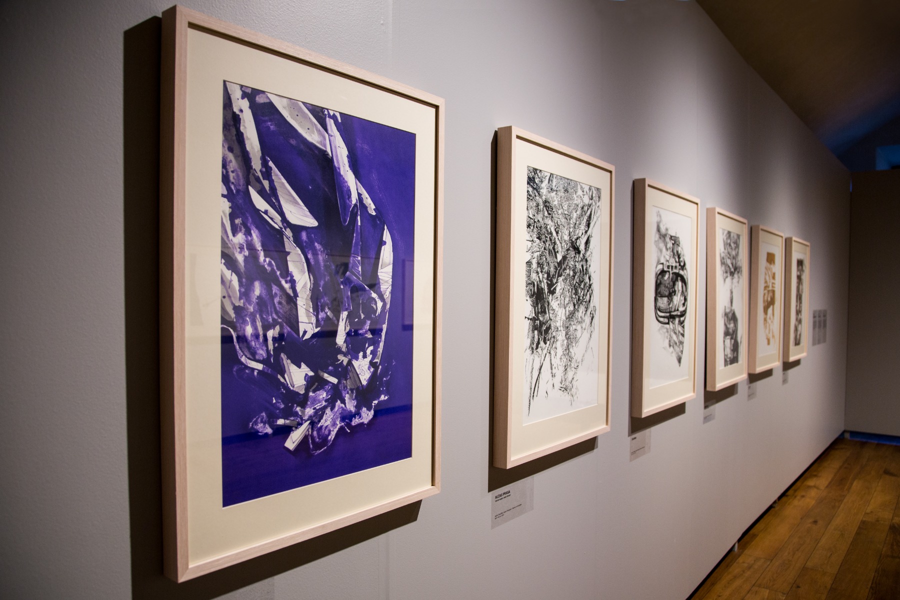
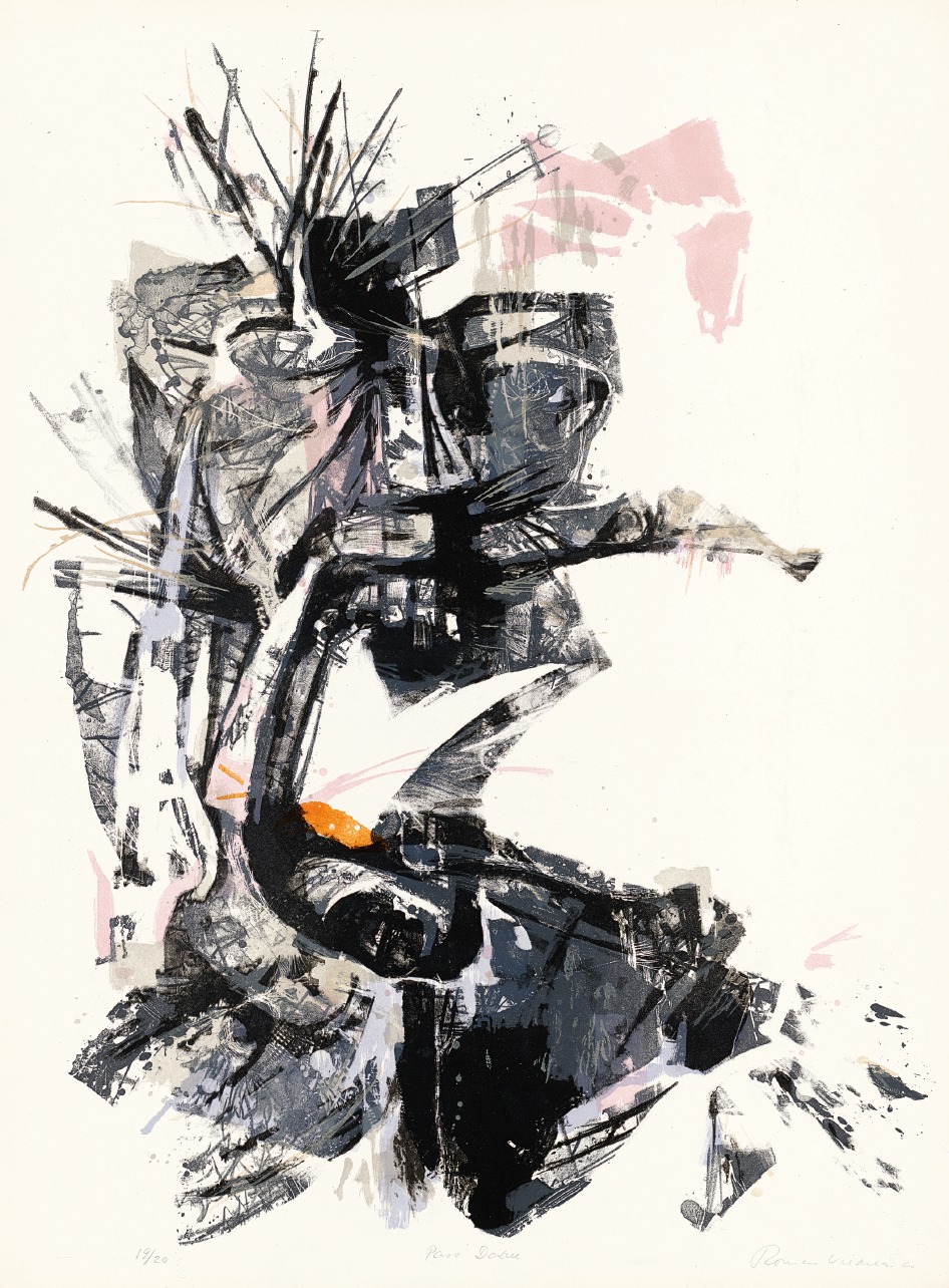
R30 – Useless Things, marked 30 years of Viesulas’ career and is dedicated to the Forgotten, Useless and Lost. Once again we find ourselves in front of a treatment of this familiar theme, the overlooked or neglected or forlorn. It’s worth stating that very often, even the most abstract work would begin with something ‘real’ - an object, a place. The visual starting point may, as in Acqua Daula for example, be a fountain near the studio where he worked in Rome, not far from the place he died in fact.
Romas Tauras in front of the installation of R-30 at the Rothko center, with interpreter Inga Gedžūne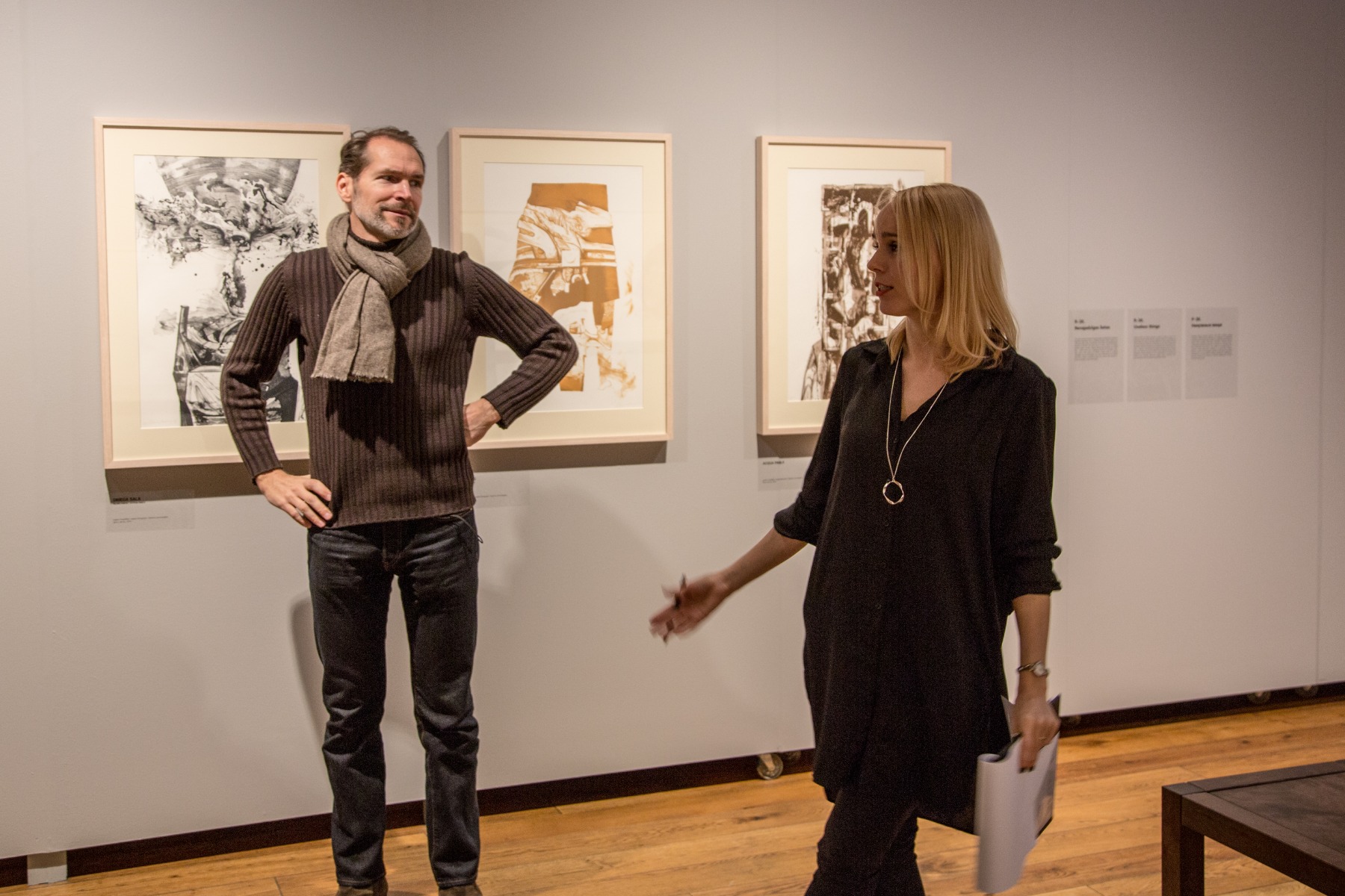
There are frequent references to the material world. He would often take initial Impressions, make drawings and then work from those, and gradually build abstraction upon abstraction until the final image ends up quite far from the original object. Nonetheless, there is still some true link to the original form. He wasn't simply imagining shapes or creating works entirely from his imagination. They're all rooted in the world around us. Sometimes, the images yield an illusionistic impression that, like objects, they are something you feel you could reach out and touch.
Nox, from the print cycle R-30, lithograph
YONKERS
1967
Yonkers I, lithograph
Or events that you could experience, as in this cycle of three prints called Yonkers, after a town in the American state of New York. The inspiration from the series is a personal experience of the artist. Viesulas attended a dinner party of friends living there, where one of the guests received a call to learn that her children died in a house fire. He witnessed the bereaved's reaction when she got this tragic news, which explains some of the figurative elements like the recognizably human features in this cycle, and the seemingly abrupt visual truncation of the final print in the series, which is entirely abstract and devoid of color. The print was completed in 1967, by which point Viesulas was combining color lithography with relief print techniques. ‘We are the other’, the images seem to say, inviting the viewer to share, to identify with, the experience of grief through the eyes of strangers, being in the company of someone who learns that their children have perished in a house fire, the source of almost unimaginable grief. I think of Yonkers as a summons to witness, and to empathy, an elusive quality during a century riven by ideological divides, separating people from origins, from others and from themselves.
IMMINENT
1967
Imminent, hand-dyed relief print as displayed at the Rothko Center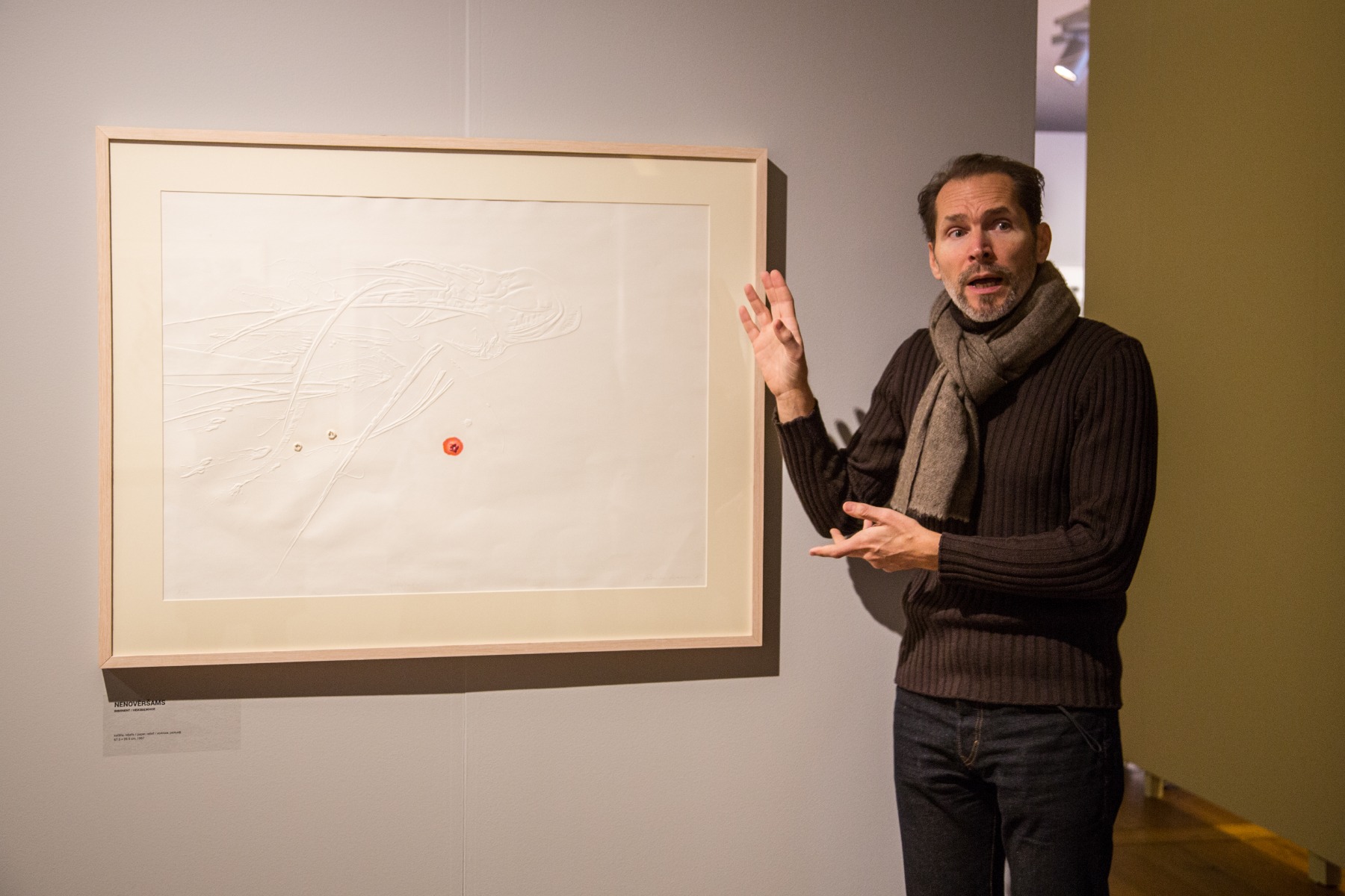
There’s a performative element to Imminent. This was created as a standalone print, and not part of a cycle. It’s relief print where the embossing is augmented by details tearing through the surface of the paper - actual bullet holes. Completed in the closing stages of the Vietnam War, perhaps this was a protest. I don’t recall my father taking any vocal political stance against the war, but a work like this – and his entire oeuvre in fact - conveys amply a sense of the futility, tragedy and meaninglessness of a conflict like the Vietnam War, or any war.
RAUDOS
1972 - THIRD GUGGENHEIM FELLOWSHIP
Raudos, installation view at the Rothko Center
Finally, in the purpose-built chapel-like space of the exhibition at the Rothko Center, is Raudos, a series of inkless intaglio prints on hand-dyed black paper. The installation and lighting is an important part of the work itself, and was conceived as an integral element of the cycle, much like the Austin chapel featuring Rothko’s work in Houston, Texas. Raudos is a Lithuanian word that refers to songs of lamentation. These were the songs that women would traditionally sing at someone's burial, a sort of chant for grieving or mourning. Like Notes on Sound, this work is a collaborative piece which Viesulas developed with the American experimental and electronic composer Alvin Curran. The two of them took ethnographic records, recordings of traditional folk songs of lamentation, the ‘raudos’ of the title, and reworked them.
The result is almost like a remix. What begins as recognizable voices in this soundtrack begin slowly to overlap, then again and again, until what you end up with is a sort of continuous drone. Listening to this one enters an almost meditative state, a trance-like state. These ancient songs, looped and manipulated electronically, somehow move beyond having a purely human quality to something more ethereal. You might consider it almost like a sonic metaphor for Viesulas own artistic vision, where you start with something real from the world around us, a figurative depiction – in this case an actual song with actual words, interpreted by living people - that is then reinterpreted subtly and repeatedly over time until it involves into something completely abstract. In the end, what you hear is barely recognizable as a human voice, if at all, where the very letters the words all meld into one another to become a pure expression of woe.
From the portfolio Raudos, a detail of the print Masta 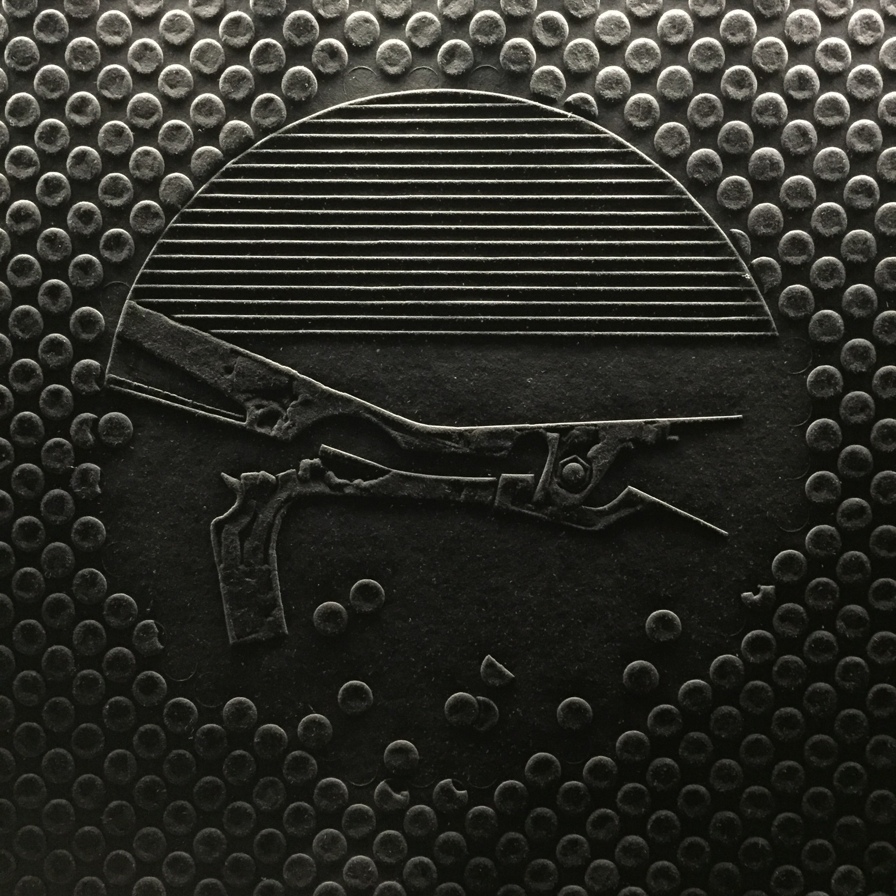
Each individual print in the series takes its title from a Sanskrit word. Why Sanskrit? As two of the most ancient Indo-European living languages, both Latvian and Lithuanian are philologically very close to ancient Sanskrit, which was a language, much like Latin, steeped in sacred and liturgical association. Sanskrit was the holy language of the Indian subcontinent, where the early settlers along the Baltic sea were said to have originated, many, many centuries ago. If you examine words in Latvian and Lithuanian for natural, holy or sacred objects or places – spirits, divinities, sacred properties - they often derive very directly from Sanskrit roots. These Sanskrit titles invite the viewer to meditate on the practice and incantation of sacred rituals around the passing of life. One is invited to ponder the sound of the words themselves, and what they might convey. How is today’s language, today’s ritual related to that of our ancient forbears?
These are again inkless relief prints, intaglio prints carved from linoleum plates, and they’ve been printed on hand-dyed black paper. My father crafted this paper himself, as he couldn’t find commercially available paper that was robust enough to take the sculptural impression of the embossing, but above all, he couldn’t find paper that was black enough. He had studied papermaking in Japan. Creating the paper for Raudos was a very laborious process. And once again, my mother was his accomplice. Individual sheets were dipped by hand into vats of black ink, until the ink completely saturated the paper, but then would need to be dried very carefully to maintain an evenness of tone and a consistently smooth surface, so that it wouldn’t buckle or warp as it dried.
Our neighbors growing up would have laundry lines hanging with pyjamas, socks and underwear. In our yard, we had long lines of black paper hanging in the breeze, like some sort of gothic parade, maybe like the Adams Family or something. It’s striking that even now, almost fifty years later, and after being exhibited a number of times, the tone is true black, with no fading or gradation. This was a hard-earned effect!
Raudos, installation view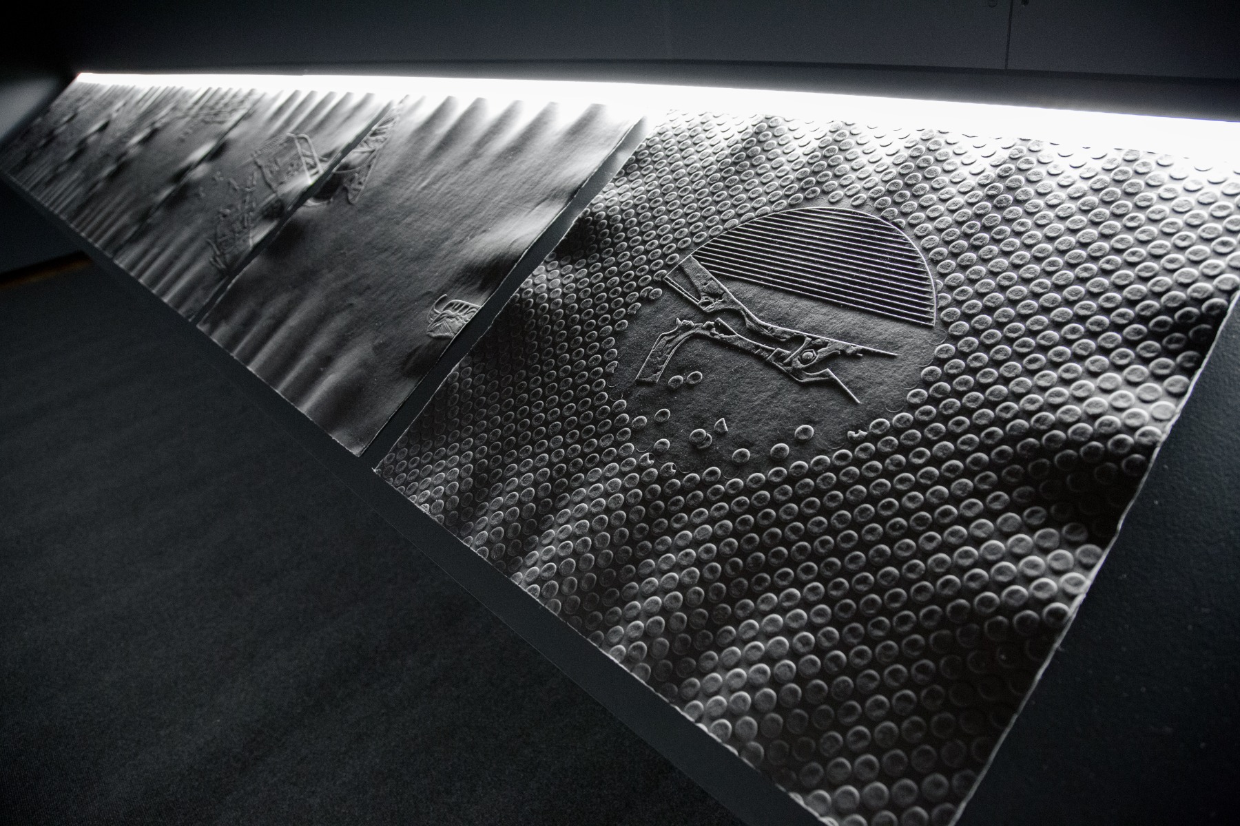
These rune-like monochrome prints feature abstractions of the codified torture instruments from Constitutio Criminalis Theresiana, an 18th century codex of judicial torture employed by the Austro-Hungarian Empire. Removed from their historical context and paired with an incantation that is equal parts folk songs of grieving and abstract electronica, the images themselves are lifted above mere lamentations. They become a testimony to violence deployed in the name of ideology.
You will also notice that there is an odd number of prints in the series. The final print is actually half an image. He actually tore the paper in half with a deckled edge. Once again, the image on the paper is itself truncated, conveying the sense of something being cut short, a minimalist interpretation of an age-old motif of the scythe or sickle as if carried by the reaper. Songs for the dead, songs of lamentation and grief and the symbols or words that humanity holds sacred take us back many centuries to the very roots of civilization. We are invited to reflect on our heritage, not in a narrowly ethnographic or tribal way, but as participants in the story of humanity, as far back as the origins of our language. This act of remembering takes us right into the present day, which is the result of our history of collective endeavor, our rituals and incantations. It demands that we reflect on where we take this inheritance in our actions and words today.
Heartfelt thanks to curator Tatjana Černova and director of the Rothko Center Māris Čačka for organizing and hosting the exhibit. Also to Inga Gedžūne for providing excellent simultaneous translation into Latvian during the exhibition tour I gave at the Rothko Center in February and the translation for this article.
Photos: Romas Tauras Viesulas private archive and Daugavpils Mark Rothko Art Centre