Roughness versus well-thought-out ideas
An interview with Roland Reemaa, one of the RIBOCA2 leading architects
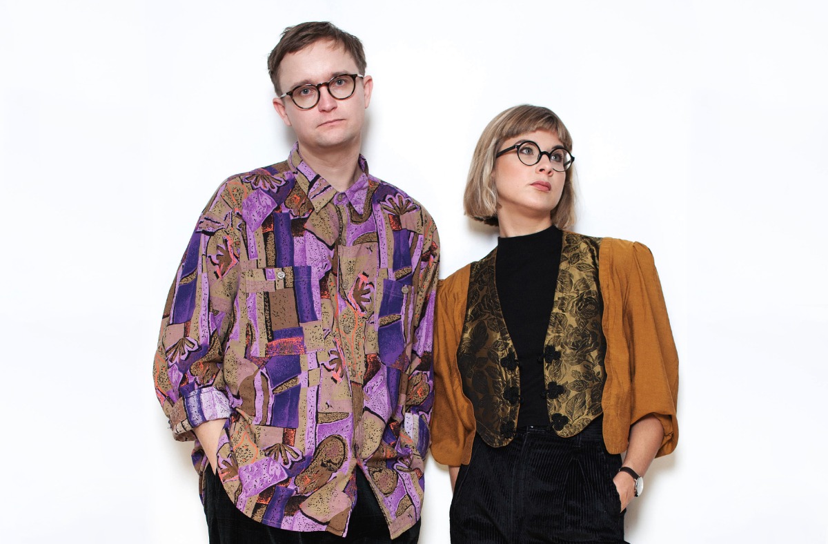
Roland Reemaa is an Estonian new-generation architect and one of the creative forces behind the duo LLRRLLRR (Laura Linsi and Roland Reemaa). Their main areas of interest include the values and potential of vernacular architecture and research-driven art and architecture projects.
When the organizers of the 2nd International Biennial of Contemporary Art in Riga (RIBOCA2) invited LLRRLLRR to submit a proposal specifying the visual and conceptual vision of the upcoming exhibition in Andrejsala, it wasn't surprising that the duo's proposal turned out to be a match with the core mission and curatorial vision of the biennial. They both aimed to create an exhibition with respect for the environment and harmony with the local context.
Inspired by historical explorers' early attempts to map unfamiliar regions and areas, and to illustrate their nature and potential, LLRRLLRR set out to explore the existing material on 200,000 m2 of exhibition grounds of the former industrial area of Andrejsala.
As a result, the works of art as road signs, respectfully integrated into the environment, lead through the three stories of the former building of the Riga Commercial Port as well as through the whole half-abandoned artificial peninsula. The exhibition invites visitors to discover historical layer by historical layer of the once demarcated industrial part of the city that oftentimes has no contour in the mental map of Rigans.
Roland Reemaa teamed up with like-minded Laura Linsi in 2016 and opened an office under the name of LLRRLLRR. In 2018 the architects, together with Tadeáš Říha, took part in the 16th International Architecture Exhibition of the Venice Biennale, creating the Estonian national exposition called Weak Monument. The exhibition was dedicated to both demolished and never-erected monuments, their place in the urban environment, and reflections on monumentalism and its opposition – weakness. Roland, Laura and Tadeas were also the authors and editors of a book, Weak Monument – Architectures Beyond the Plinth. In 2019 Linsi and Reemaa were awarded the Young Architect Prize by the Estonian Association of Architects.
Most of this year was spent thinking about the architecture of the RIBOCA2 exhibition, but also upcoming for the duo is a project in Tallinn for a 90s house in which they are refurbishing it to correspond to its true era, as well as curating the seventh edition of a small, local art biennial in Tallinn called Artishok Biennale, where the exhibition will revolve around the topic of the Copy. Next will follow participation in the Hungarian Pavilion for the 17th International Architecture Exhibition of the Venice Biennale, where the central theme is the legacy of modernist architecture.
When you first stepped into the Andrejsala territory, what was the first general impression of it? And how did it change over time?
When I first came here in January, it was very cold, very dark, the territory was enshrouded in mist from the waters... And it was beautiful. The Port Building seemed like a super-cold big concrete bunker. But now, when I have been here for almost a month, I can see this beautiful natural wilderness in a yellow summer light – and suddenly it is a very warm place. The building has been warming up, and I couldn't imagine that when the place is warmer, it feels more comfortable and also smaller. In January the building felt like it was endless.
RIBOCA2. Photo: LLRRLLRR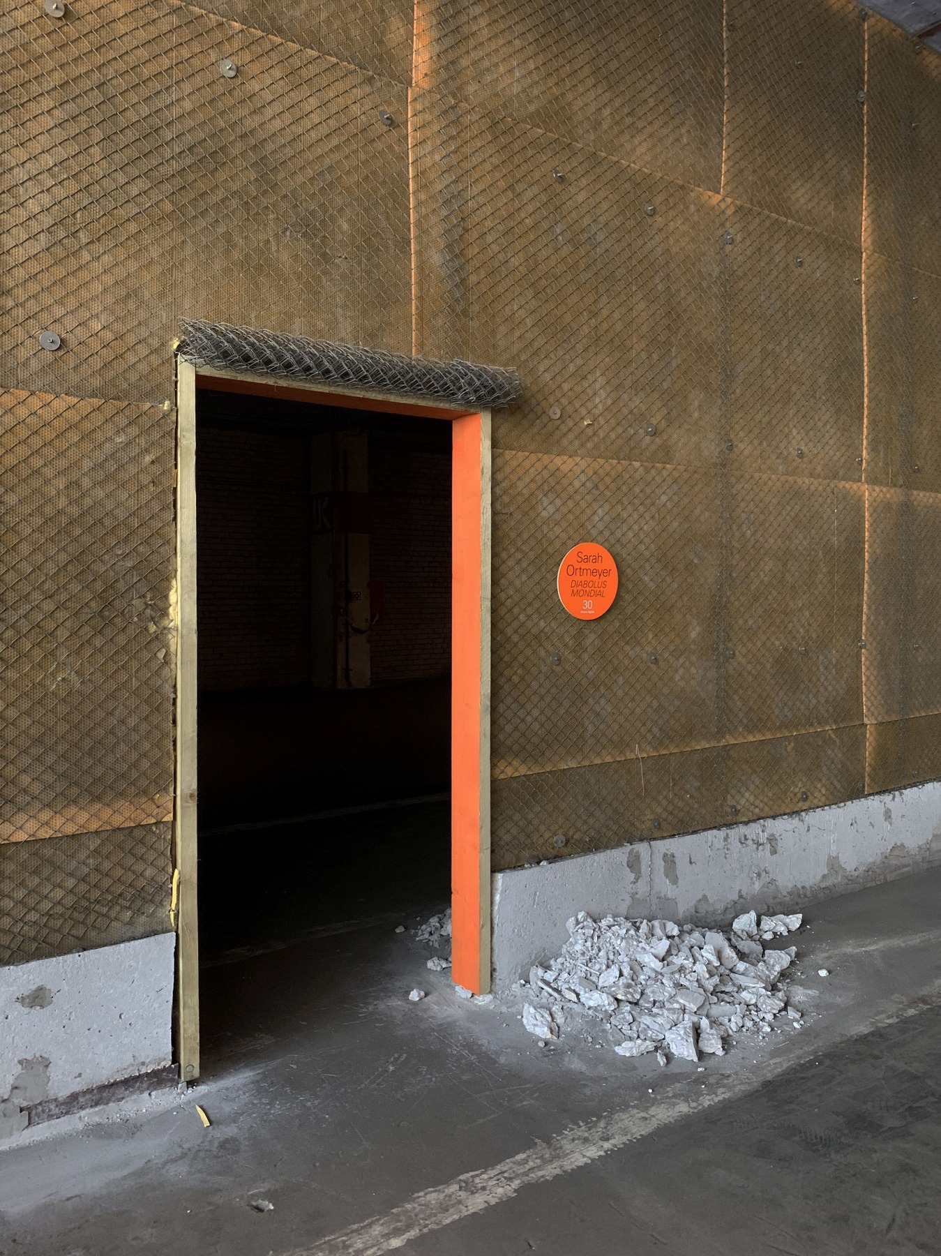
Please introduce the idea behind the design concept of the exhibition.
What we proposed originally was to work as archaeologists. At first, we need to look at what is already there – find materials that we could use and reuse, and find qualities and places that we can present better, for example, by cutting grass or moving some rocks around, or by making some seats or pavement. The whole idea was to reuse as much as possible. For example, when you enter the territory through the main gates, you’ll find new pavement made from existing construction rubble. All these layers of materials – such as bathroom tiles mixed with asphalt and concrete – was placed on top.
A part of RIBOCA2's concept is a question – how can we be sustainable? And that is something I was also asking myself when we did the Estonian Pavilion for the Venice Biennale.
A part of RIBOCA2's concept is a question – how can we be sustainable? And that is something I was also asking myself when we did the Estonian Pavilion for the Venice Biennale. The Biennale is a very massive event and a lot of material goes into it, but what happens to the materials afterward? How can one be not wasteful? It is difficult. What we decided, together with the curator and the producers, was to use timber and other sustainable materials as much as possible – to use materials that we can reuse. That's why we paint as little as possible. If something is painted, it will go to the landfill. Also, we built the walls out of cardboard – it is just a 3mm-thick material, and afterwards we can take it down and give it to art or architecture schools. If we used plasterboard, it would break when dismantled and would just go into the trash.
RIBOCA2. Photo: LLRRLLRR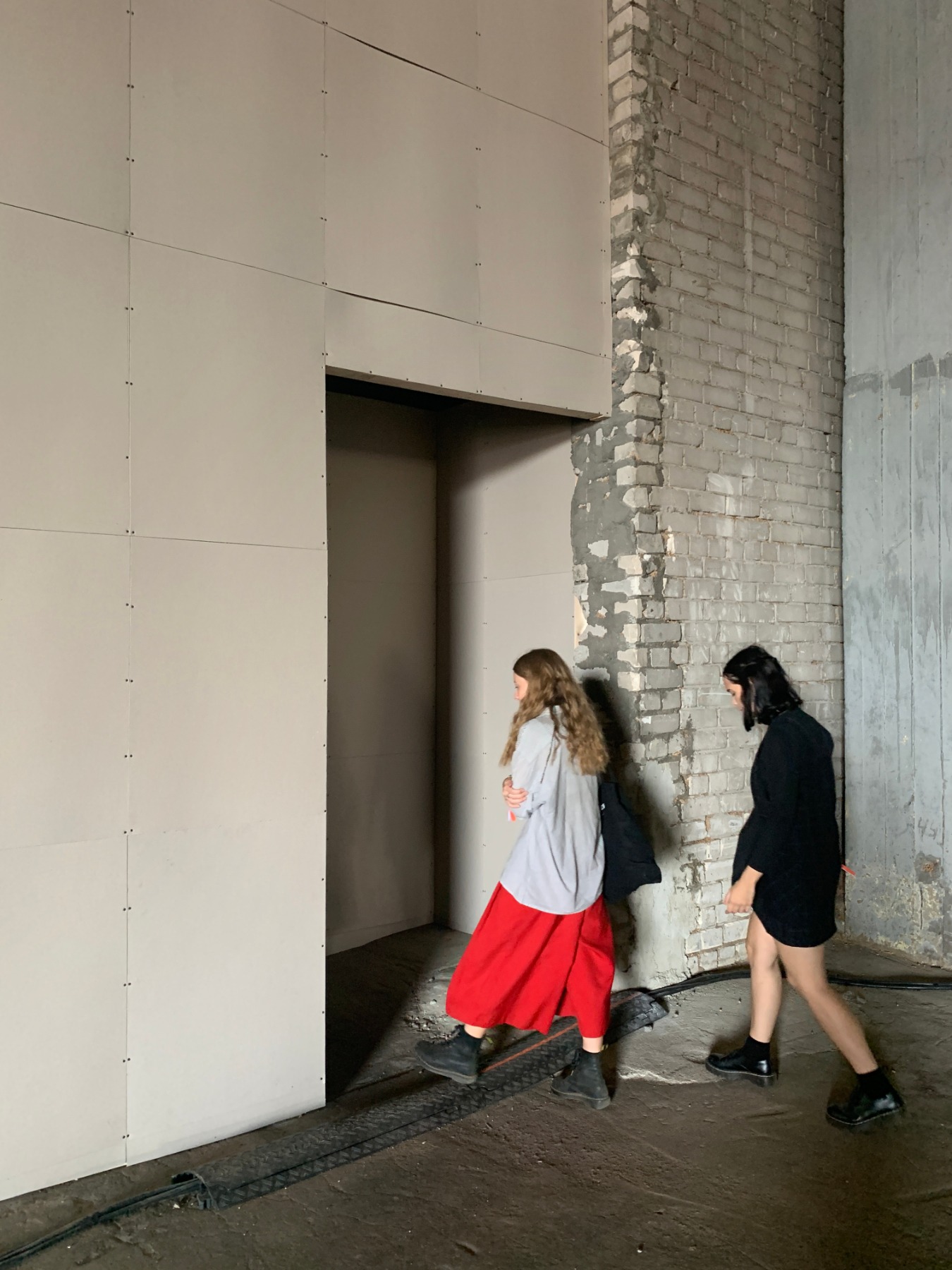
When looking for objects and materials to utilise in the exhibition's architecture, did you come across any surprises – any interesting finds or ‘treasures’ of the site?
I'm a big fan of the different kinds of pavement. The pavement is something I always look at when traveling to different cities. It is so subtle and often not noticed by people, but the pavement is something under your feet that makes you feel safe. The ground is very important.
I'm a big fan of the different kinds of pavement. The pavement is something I always look at when traveling to different cities.
The harbour has cobblestones from the 18th century – really old stones that now has asphalt poured over them, next to concrete slabs from the Soviet era... It is a real mix of histories! You just have to look to the ground and you can read that this territory has been a very active place for ages. This was the thing that fascinated me.
RIBOCA2. Photo: LLRRLLRR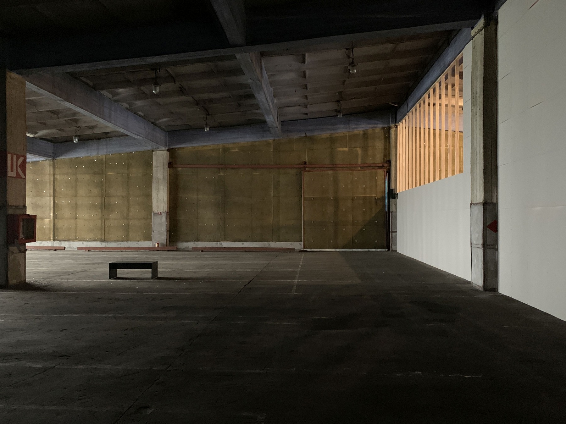
Another thing that surprised me was this nice mix of massive concrete and very thin materials that can be found in the Port Building. Heavy, solid materials next to very lightweight sheet materials. When we were designing and thinking about the walls, we decided to go very thin as well. I am enjoying this contrast. It is very subtle, and I hope people will notice.
Thinking about whether people will notice the changes made to the building... Most of the people coming to the biennial have never been here, they do not know what it looked like before.
That's true. But I think the curator Rebecca Lamarche-Vadel has taken a very bold and brave position. Yes, we’re keeping it quite raw, the building is dusty, the area is muddy, but that is a part of it – we are not building a gallery or museum. It is an exhibition, and this kind of dustiness and muddiness is a part of the experience. People will visit it for five hours and they will have a very clear experience. It is not like we are trying to make a cake out of the mud.
It is an exhibition, and this kind of dustiness and muddiness is a part of the experience.
How would you describe the rhythm of the exhibition set?
The graphic designer, Manuel Bürger (The Laboratory of Manuel Bürger / Collaboratoires MB), had this idea of heat maps. So, sometimes it's hot, sometimes less so; sometimes the tension is higher, sometimes lower, but it all blends from one to another. And I really think that the heat map is the best way to describe the rhythm - it is not highly contrasting, it is more flowing. The outdoors territory is quite big, and even though there are not so many artworks there, they blend into the views. Sometimes you can't even tell – is it a piece of art, is it something that existed here before, or is it something that we have fixed... It is a very constant flow.
RIBOCA2. Photo: LLRRLLRR
The exhibition will be transformed into a feature-length film directed by Dāvis Sīmanis that will be shot during opening hours. How did this aspect affect your work?
The decision to make a film is also a reaction to COVID-19, and it did change the course of developing and planning the exhibition. Some artworks were already in the process of being made, some were adapted, some couldn't make it due to shipping limitations, etc. The original exhibition, before COVID-19, was pretty much all planned and ready to be built when the whole world came to a standstill. So the decision of making a film affected many architectural decisions, as a film set is another type of scenography with its own possibilities of how to narrate and present the artworks, the space, sound, and time in general. The exhibition design became something between a ruin of the earlier design – frozen moments of decisions that were already taken and new opportunities for filming and lighter construction. For example, we could literally build walls out of paper, as many acoustic decisions in the real exhibition have now been solved with headphones. All in all, the core ideas remained the same, and to be honest, the whole production process became much more intriguing and enriching since the mediums are much more mixed.
What fascinates you about working at the intersection of art and architecture?
Laura and I are both educated as architects, but we always have had artist friends and we ourselves have participated within and collaborated with the art world for some time now. I have to say, the fields are very protective of what the borders should be – somehow, architects are not allowed very easily into the art scene, and vice-versa. This is understandable, but it also limits the potential of ideas that could travel across these fields. What I enjoy about art or the ways how artists work is the possibility to work with ideas very precisely and clearly, e.g. to cut out a fragment from history, society or culture and focus on one topic or idea. Architecture is more often heavily subjected to the complexity of all of these layers – physics, real estate, urban planning, restrictions, client wishes and aesthetics, etc. – and thus the ideas often become diluted and compromised. This does not mean that art does not deal with similar complexities, but the decisions and working methods can be much more precise in art.
What I enjoy about art or the ways how artists work is the possibility to work with ideas very precisely and clearly, e.g. to cut out a fragment from history, society or culture and focus on one topic or idea.
How do you build the dialogue between a work of art and a space? Is there any formula that works for you?
It very much depends on the project – there is no formula. We have had beautiful collaborations with artists where they invite us to really complement the exhibits, such as a collaboration with Ingel Vaikla at the Contemporary Art Museum of Estonia (the exhibitionYou Have Become The Space, curated by Laura Toots, 2018), where the artworks and design blend into each other and are inseparable.
Photo: LLRRLLRR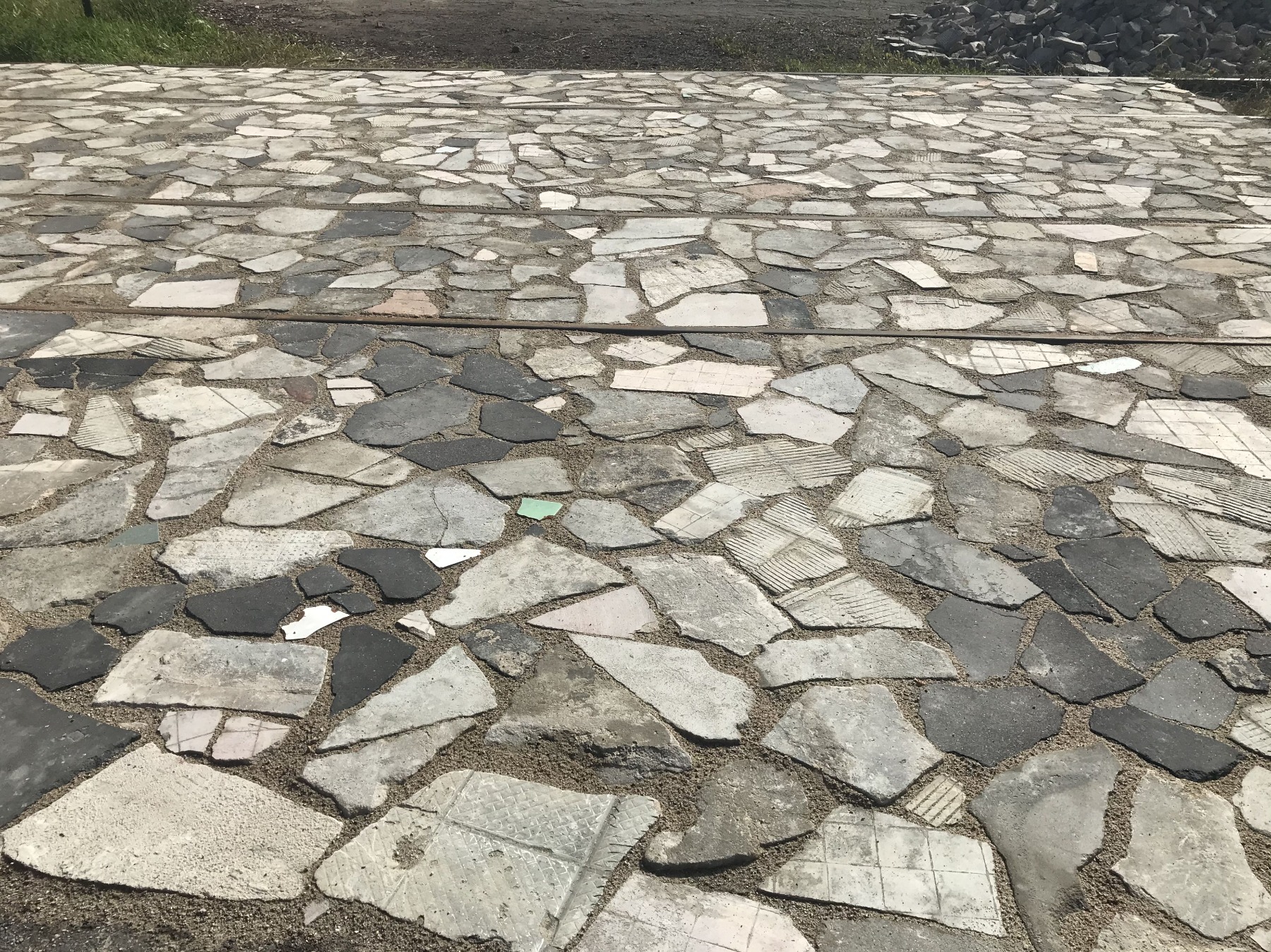
RIBOCA is quite a large exhibition, and our aim was to stay in the background – where visitors would perhaps only later start to realise that, actually, they were somehow being guided through a narrated space. This means that much more attention is given to detail, materials and building quality because you don't really want the background to become the foreground. We often first start looking at existing colours, materials and light conditions. For example, we were not bothered by the fact that light leaked into the concrete warehouse through all the loose cladding and gaps in the facade, and we actually started to replicate similar moments in our design as well, where the cardboard would start to bend with humidity and tiny light-rays started to come in. Such ideas would never come about and would even not be allowed by a curator if this exhibition were to take place in a neat white-box gallery.
Photo: LLRRLLRR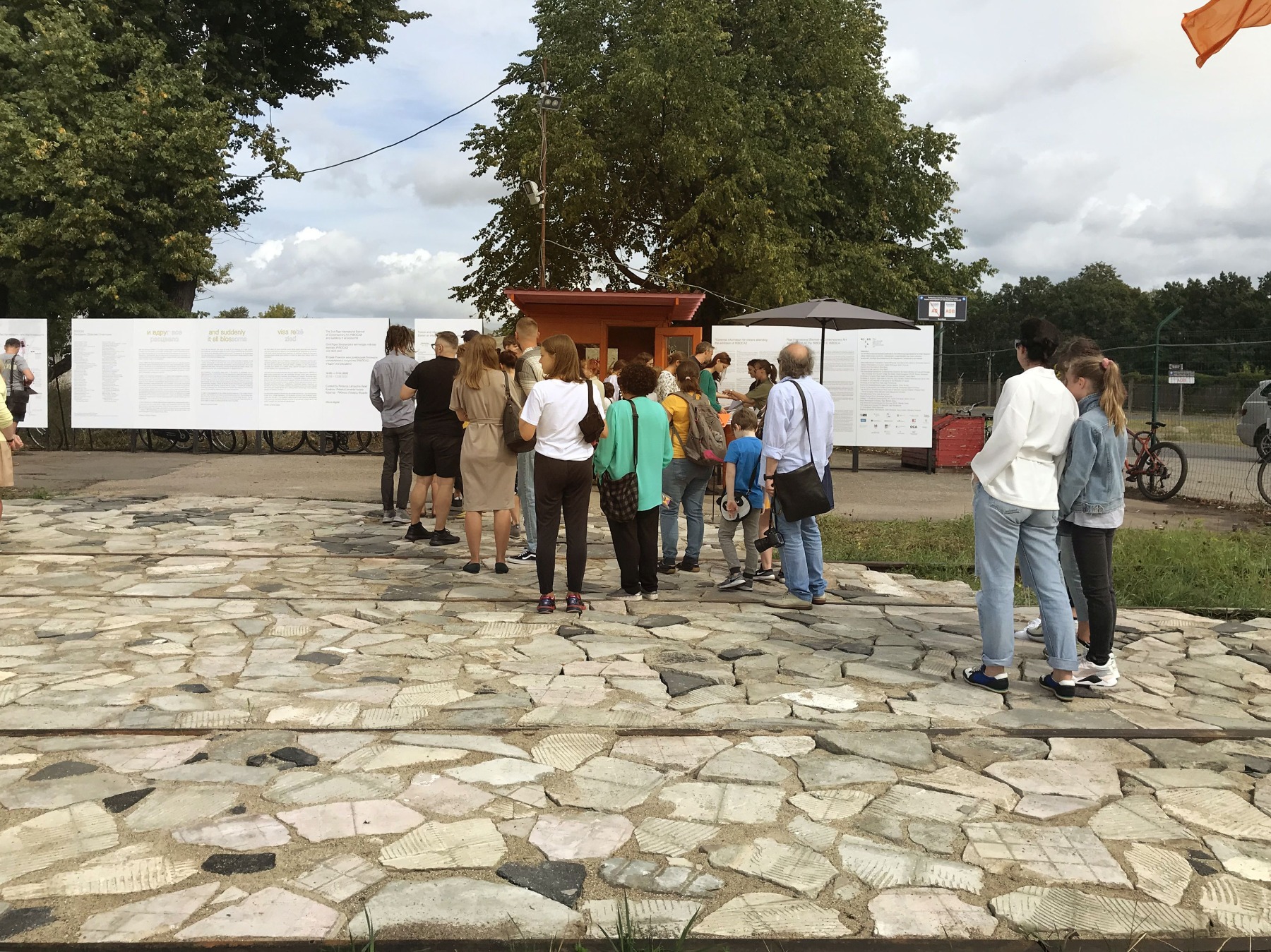
We think of it more as similar to the scenography that one experiences in theatres. If you start to mix scenography, landscape design, architecture and exhibition design, then the design process becomes very enriching. For example, while in ‘traditional’ architecture the faking of materials is not really in good taste, then it is absolutely allowed in other arts.
Could it be said that this project was a platform for testing your ideas? Was it an experiment for you?
Definitely, yes. We are experimenting here, but also, somehow our ideas matched the ideas of the curator. For example, the idea of keeping the site dusty, not aiming for the place to become extremely clean.
It has been so enjoyable to work with raw materials – part of the furniture is made out of big pieces of concrete weighing two tons each. As the harbour is still functioning, we’ve managed to negotiate with the port workers to use their services. For months and months we worked on these very precise drawings, and then suddenly, a big truck comes in and these guys just drop down big chunks of concrete. Once it's dropped, you cannot move it. I enjoyed this roughness versus well-thought-out ideas. It was super beautiful, and it was an experiment for me. And it was fun.
It has been so enjoyable to work with raw materials – part of the furniture is made out of big pieces of concrete weighing two tons each.
What is the biggest lesson this project taught you?
Collaboration. All of the technicians are the best in the region. The guy who is delivering the artwork is from Estonia, and when you need to transport something very well, he’s your guy. Then there’s the audiovisual technicians – they are based in Poland, and if you need somebody, then they are the only ones you should go to. So, I think the biggest lesson is to work with people who are really the best in their field of expertise.
How does the idea of ‘a desirable and re-enchanted nascent world’, to quote Rebecca Lamarche-Vadel, the curator of RIBOCA2, resonate in you (on both a personal and a professional level)?
For me, the most interesting was the political point that Rebecca touched upon. All of the politics in Latvia, Lithuania, and Estonia have always been in the middle of different ideologies – there were German reigns, there was the Russian Empire...there were periods when ideologies completely changed – and therefore, this area always has had to look to the West or the East. And the Baltic area is still a bit confused – should they follow Western ideas or Eastern ones? Andrejsala area has all of these historic layers built on top of each other – there are remnants of the early harbour in its heyday, then the later infrastructure, with this Soviet-period storage building built in the 80s. Here we can meet all of the layers of different eras, and this exhibition is just another one. It doesn't try to change it, it just goes with the flow.
Laura Linsi and Roland Reemaa. Photo: Sohvi Viik
Title image: Roland Reemaa and Laura Linsi. Photo: Sohvi Viik